
Eye tracking and patterns in UX design
UX patterns are an effective tool that can impact site traffic and guide users to the desired sections of a page.

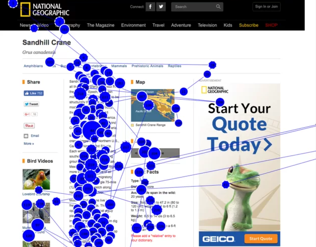
Eye tracking is an important and useful tool for designers. It helps us understand how users interact with our designs, allowing us to determine which elements of the page capture their attention and which are ignored. By using eye tracking, we can gain insight into how users search for information and where they focus their attention on a page. This information can be used to improve user experience and create more effective designs. It also helps us determine how long it takes users to navigate through different sections of a website.
Research using eye tracking has revealed several patterns in how people process information. At the moment, five main patterns of user behavior have been identified:
1. F-Pattern
The F-pattern is one of the most common ways people read information on the internet.
The user first scans the top of the page horizontally, then moves to the middle or bottom of the page and scans the text again horizontally at a shorter distance before reaching the end. At the same time, reference points where the user will focus their attention are located on the right and left.
Thus, their gaze forms an F, although it is not always perfectly smooth.
Using the F-pattern, keep in mind the following features:
1. The first few lines of the sentence (especially at the top of the "letter F") will attract the most attention. If the user finds the first few words boring, they are unlikely to read further.
2. Most of the sentences in the F pattern are skipped. Therefore, "catchy" words are located on the left and right sides, where the user's eyes slow down.
3. The F model is not universal. Its use depends on the language and culture of the information on a site. In Western cultures, users read from top to bottom, left to right, but in Arabic cultures, they read from right to left.
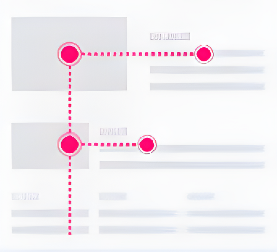
2. Z -Pattern
Another common way to read information on a website is by using a Z pattern. This pattern is often used when users scan the content according to the logical hierarchy in the layout.
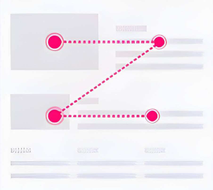
The user starts scanning the page from the upper-left corner, reading the content horizontally and then moving diagonally to the left. After that, they move to the second horizontal level, creating a "Z" shape with their eyes.
The reference points for this pattern are on the left and right sides of the page, but users also pause their gaze in the center of the "Z", or in the center of the page itself.
Using the Z-pattern, keep in mind the following features:
1. This pattern is suitable for pages with a small amount of information and key elements that can be highlighted using the placement of reference points.
2. The content on the page where the Z-pattern is used should be balanced, so none of the parts attract more attention.
3. When using the Z- pattern, there should be a clear narrative structure for the content, so users will be more likely to follow it.
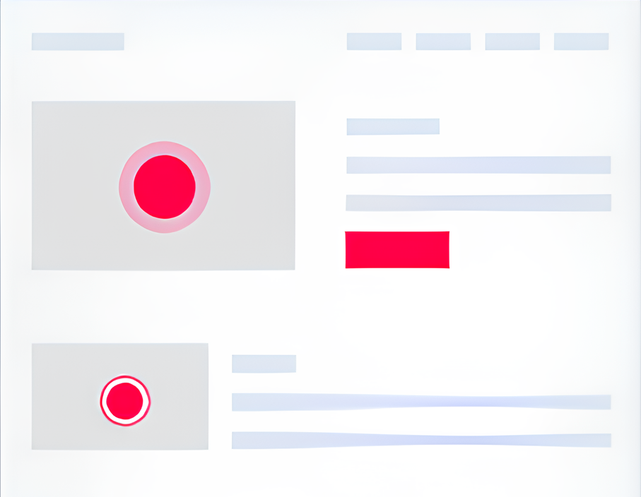
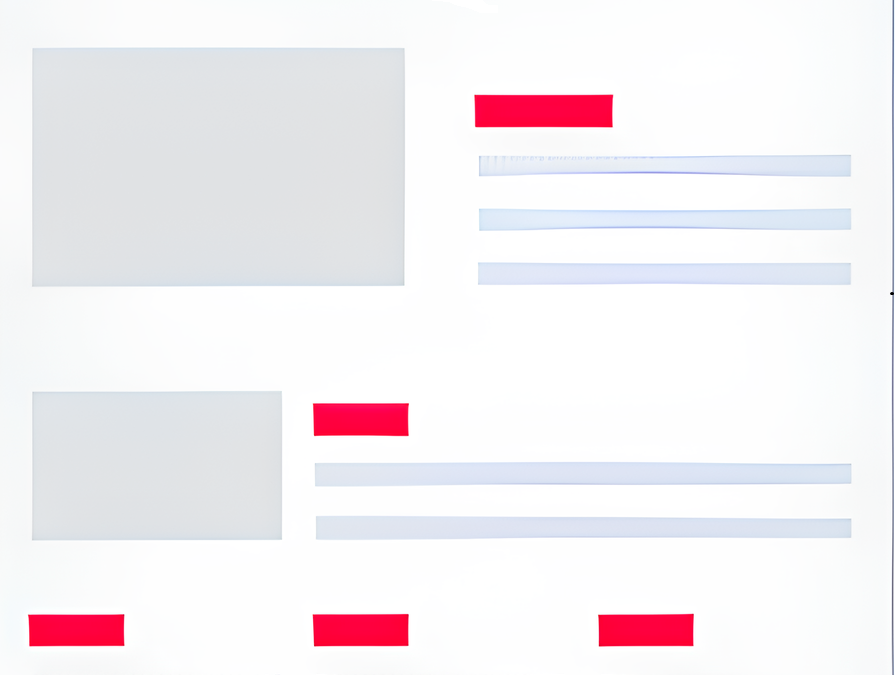
3. The "Spotted" Pattern
The "spotted" information scanning model involves the user's focus on certain words or phrases that are scattered throughout the text. Unlike the F-pattern,
the user does not typically read the first words in a sentence. Instead, they select words that stand out visually due to their color, font, or the presence of
a hyperlink. These words include those that match the user's search query, especially if they begin with a capital letter or contain numerical information.
A "spotted" pattern is sometimes even more effective than an F- pattern. Especially if designers work through the links, highlighting important elements and putting information in bullet lists. But, like the F pattern, this model is not universally applicable.
Using the "Spotted" pattern, keep in mind the following features:
1. The effectiveness of the pattern depends on the user's goals. If a user visits a site to get specific information, such as finding out the price or a historical date, then this model is best suited for them.
2. When using this model, users usually read more than when they use the F-pattern. Since they are searching for specific words and numbers, there is less chance of missing information. Therefore, the text on pages where the "spotted" pattern is used should be clear and easily understood.
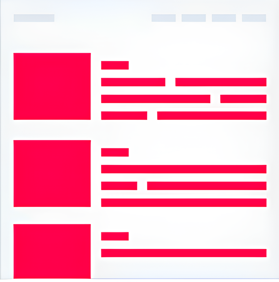
4. The "Layer Cake" Pattern
When using this pattern, the site visitor's attention is primarily drawn to the headings and subheadings. If a title catches their attention, they will continue reading the content below it. Otherwise, they may move on
to another title.
The "layer cake" pattern is designed with horizontal stripes (headings) separated by empty spaces (main text), much like the layers of a traditional cake are separated by icing. We can think of the headlines as the icing and the main text as the filling, just like in a layered cake.
Using the "Layer-cake" pattern, keep in mind the following features:
1. When viewing the headings and subheadings of a web page, it usually gives a general idea about what will be discussed in the page. Therefore, it is important to carefully choose the words for the title that clearly formulates the main idea of the text. Once the user has determined whether they are interested in the information presented in the title, they will decide whether to read the main text or skip it. An ideal header should be between 60 and 80 characters long.
2. Numerous studies have shown that the user's attention stops wandering when they find numbers in the text. At that point, they stop and focus on the numbers. People often subconsciously associate numbers with facts and truthful information, and therefore they pay attention to headlines containing numbers and consider them more interesting.
5. The "Commitment" Pattern
This model is mainly used by motivated or highly interested readers. They do not scan the information, but rather carefully fix their eyes on almost every word.
Such users are not seeking out specific information, but rather they want to read an article or paragraph in its entirety in order to gain all possible information. This type of reading can be compared to reading school textbooks, where we strive to learn as much as we can from the material provided.
Using the "Commitment" pattern, keep in mind the following features:
1. A dedicated reader can overcome any difficulties encountered while reading. They will not be stopped by incorrect formatting or errors in the text,
but this doesn't mean that we shouldn't try to make reading more enjoyable and easier. We should not forget about the rules of text formatting, because the presence of loyal users indicates that our website is interesting and valuable. You shouldn't neglect your reputation.
2. It will take the reader a long time to finish reading an article, so the accuracy of information when using this format should be 100%. The website should demonstrate reliability and have links to reliable sources so that users can
trust information without having to look for confirmation on other sites.
3. This format is often used for information, news websites and personal blogs. Therefore, it makes sense to include images and photos where appropriate.
They will help readers delve deeper into the context and dilute information.
Conclusion:
UX patterns are an effective tool that can impact site traffic and guide users to the desired sections of a page. The designer's primary task is to accurately determine the nature of the site and comprehend the primary goal of most users when they visit the page.
With a clear understanding of these factors, designers can organize content on the site in a way that is both engaging and easily understandable, leading to improve user engagement and increased site conversions.


