Figma has updated to UI3 for all users
Figma users gained access to the updated version of Figma, known as UI3.
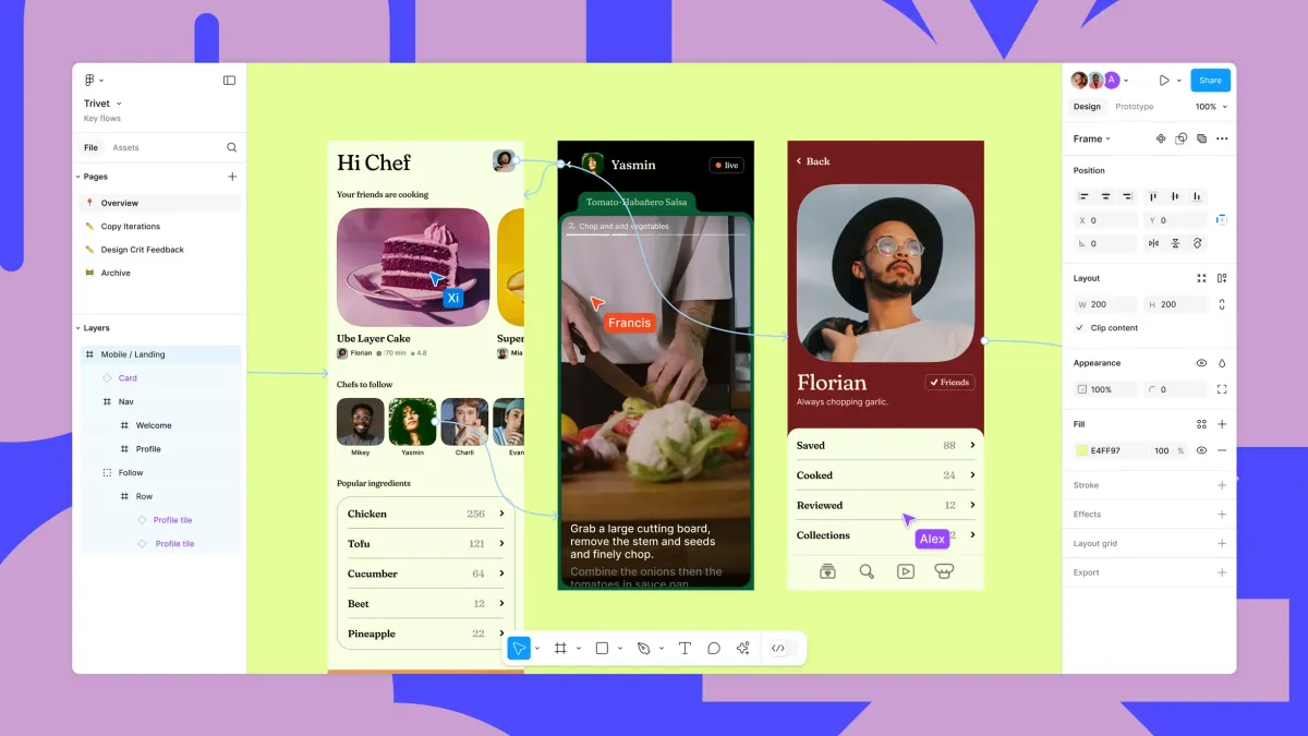
On October 10, Figma users gained access to the redesigned Figma, known as UI3, with the option to revert to the previous design while UI3 remains in beta. Since launching UI3 at Config in June 2024, the company has improved the user experience. Here are some changes that Figma has made to UI3 since the beta launch:
Fixed panels
The properties navigation panel in Figma is once again docked on either side of the canvas. The floating UI that debuted with UI3 will remain accessible when using Minimize UI in Figma, during grid mode for Slides, and at all times in FigJam. The toolbar will continue to float at the bottom of the canvas across all Figma products.
Components library information
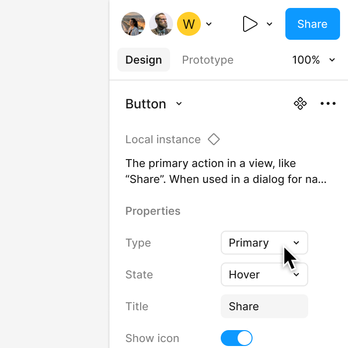
To determine if a component is local or not, Figma has added component library information to the properties panel, allowing you to see the source of each component.
Blend modes
Initially, the team placed the control element behind an icon button to open the menu. Changing the default blending mode also altered the icon. While this approach simplified the appearance panel, it slowed down workflows by making users wait for a tooltip to identify the active blending mode.
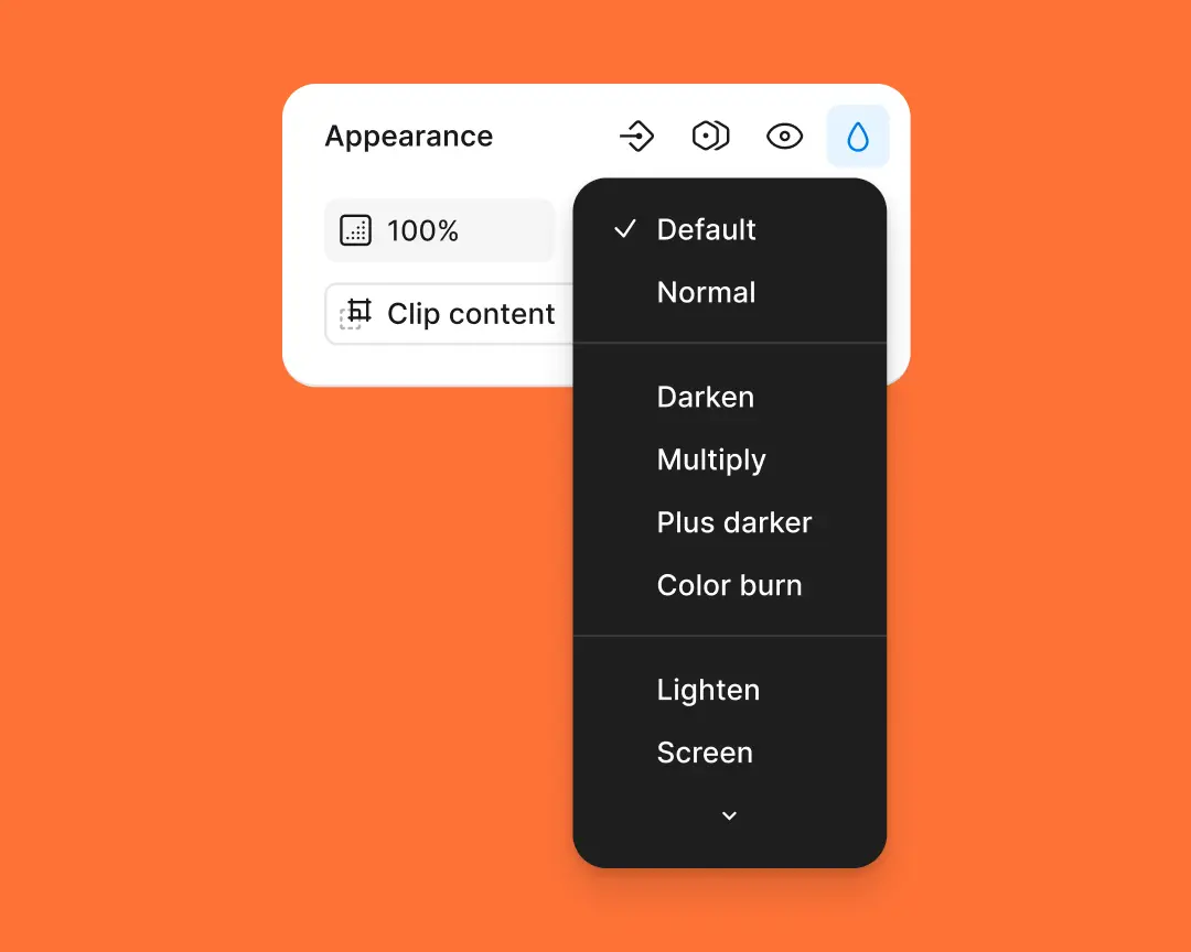
Now, when users select a custom mode, they can easily adjust or remove settings through a built-in dropdown menu. This solution streamlines the interface while returning to the early days of blending modes.
Properties panel
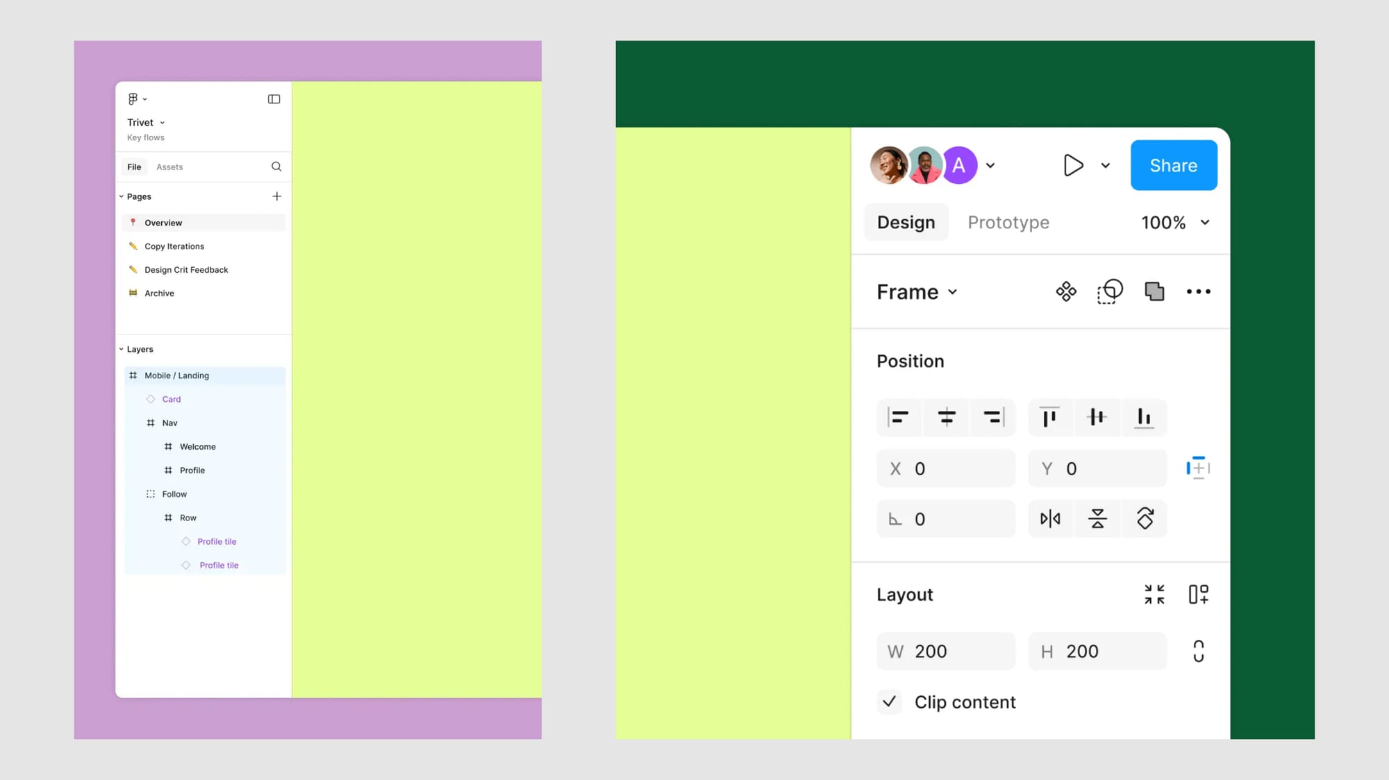
In developing the properties panel, the team focused on prioritizing component control elements, unifying all new layout-related options, and revising the header. Based on feedback received after the launch, the default expanding constraints were adjusted, library information for components was added, and the auto layout controls were updated to consistently display pixel values and resizing modes.
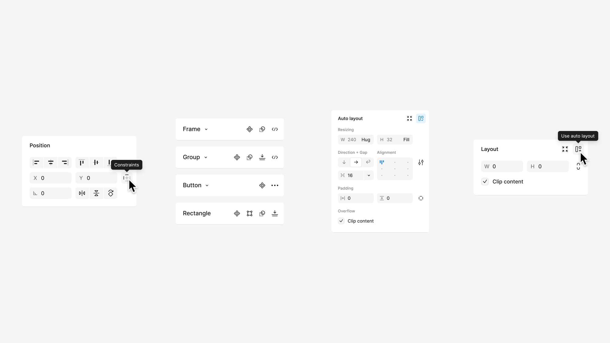
In the public beta version, the clip content was a dropdown option, which led to extra clicks and slowed down workflows. The team reverted to a checkbox as the clearest and most effective control element, updating its design to restore balance with the rest of the interface.
Constraints
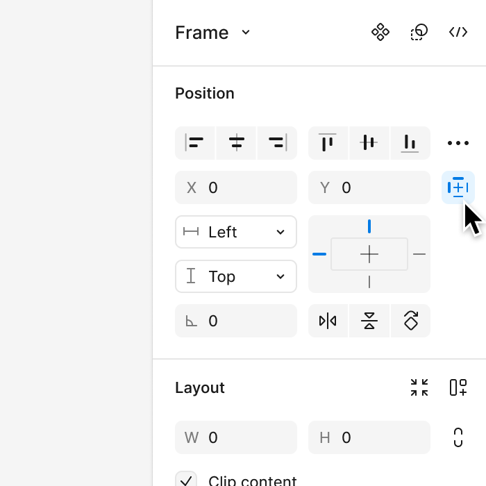
When you enable constraints, the control will be displayed inline in the properties panel, allowing for much faster edits. With a child layer selected, the Constraints icon will appear next to the X and Y position values in the Position section of the properties panel.
Labels
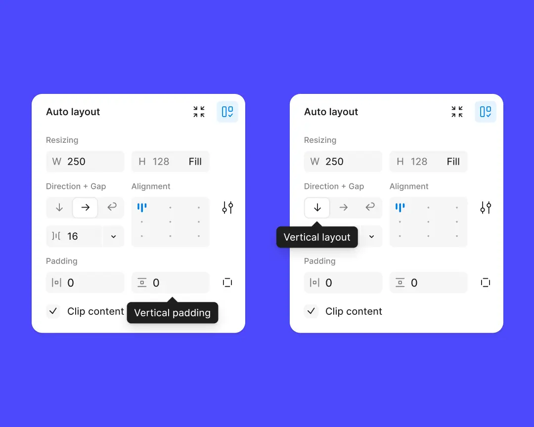
Now, all labels provide full context, making their implementation easier. The initial minimalist approach seemed promising, but the team later realized that it hindered accessibility.
New fonts
Added 450 new fonts from the Google Fonts library. All fonts can be found in the Google Fonts tab.
Video: Google

