Top 5 Web Design Trends for 2024
The first half of 2024 is almost over. It's time to look back and identify the most effective solutions in web design, as well as to predict trends for the rest of the year.
The first half of 2024 is almost over. It's time to look back and identify the
most effective solutions in web design, as well as to predict trends for the rest
of the year.
After analyzing the work on the well-known Awwwards website, we have identified 5 trends that make the site more modern and stand out from competitors.
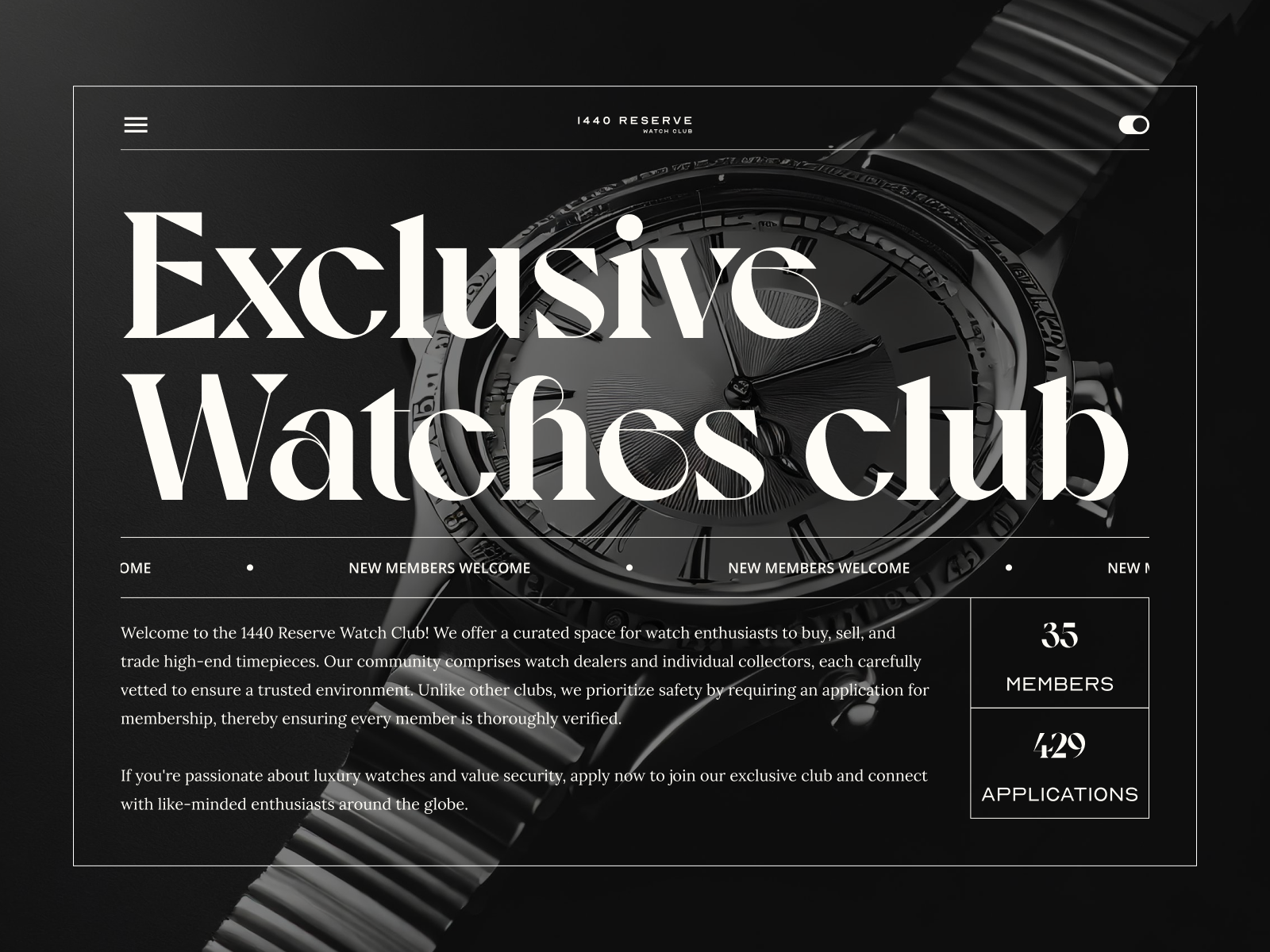
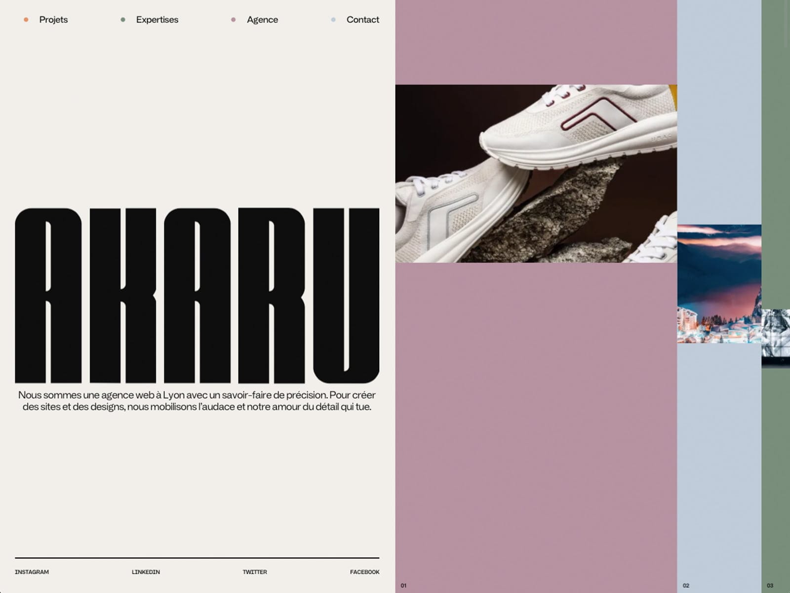
1. Bold typography
Designers are increasingly using text as a full-fledged design element, rather than simply adding it to a design. The variety of fonts allows text not only
to convey information, but also to become an art form with its own aesthetic and unique characteristics.
Although massive typography can violate the basic principles of balance and even “break” the composition, it can be stylish and rebellious at the same time.

2. Gradients and contrasting colors
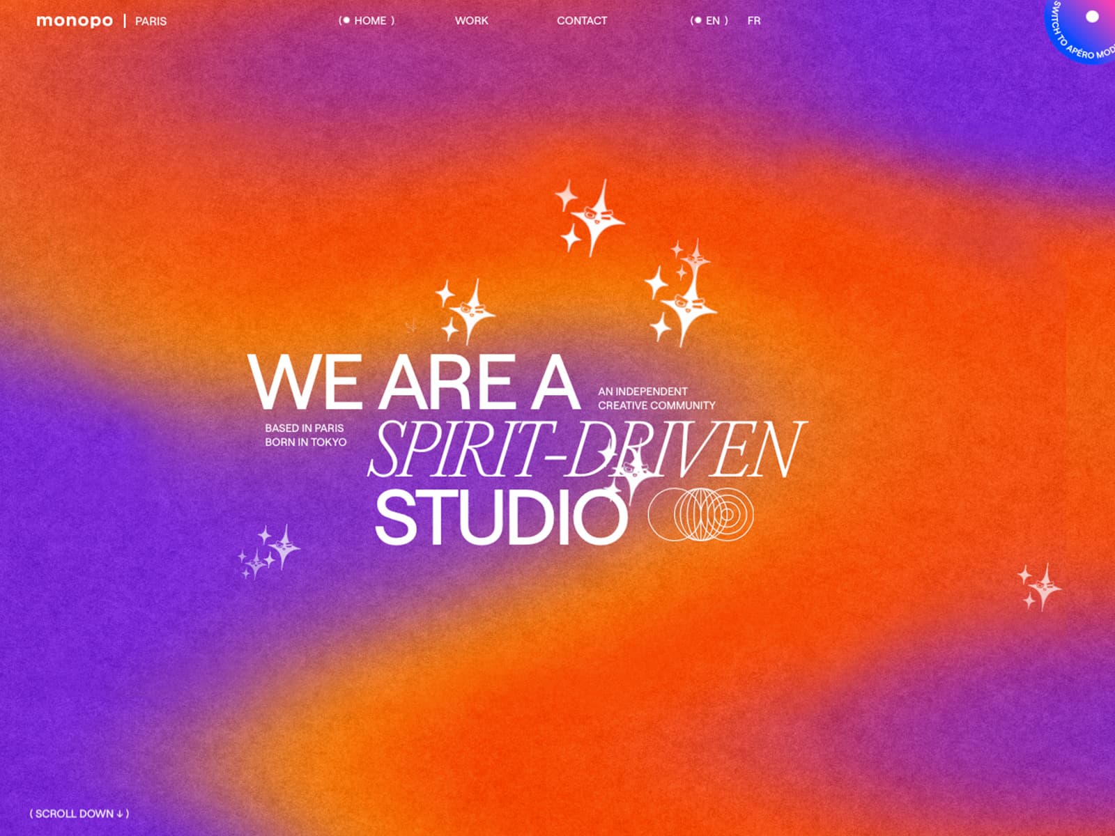
Complex gradients with complementary colors are currently experiencing
a real surge in popularity and have a significant impact on web and graphic design projects. A gradient with the right colors can make any website more vibrant
and dynamic. The bright transitions from one color to another add depth and vibrancy to the design, while adding animation to a gradient background makes the site more lively and memorable.
3. Illustrations
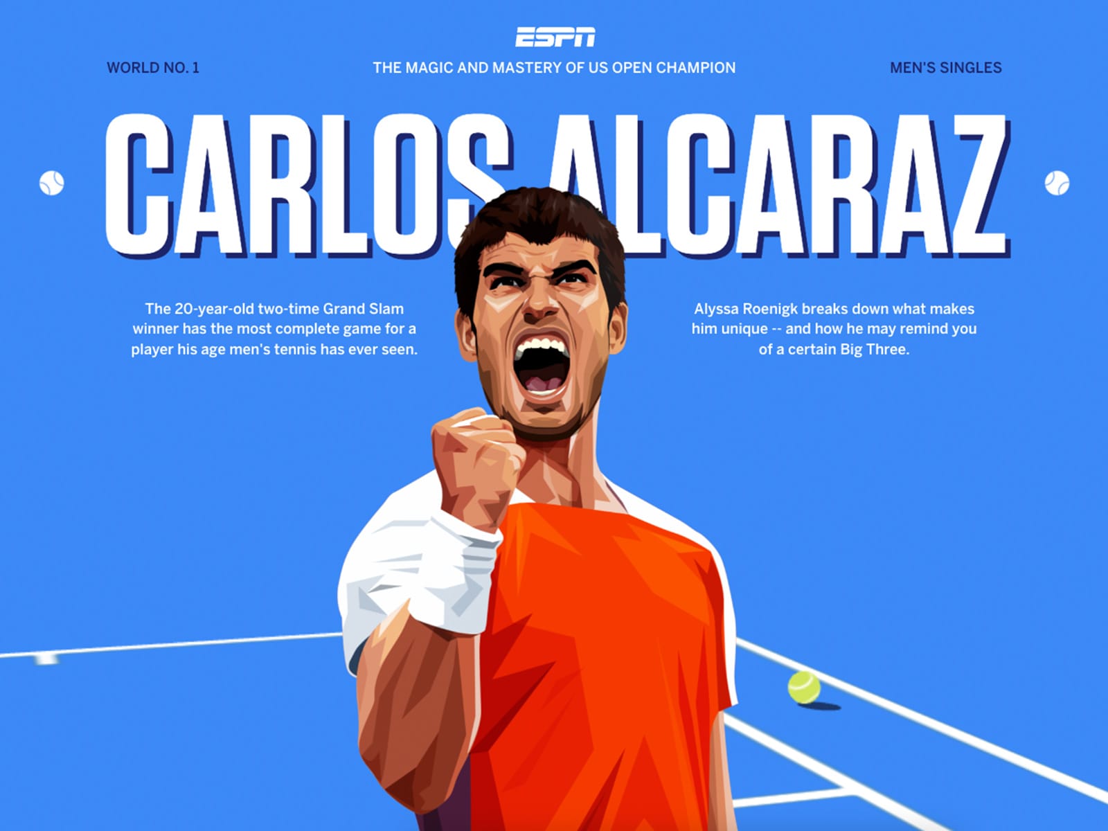
A good author's illustrations can attract a user's attention without the use of animation. Illustrations help to immerse the reader in the story and make the learning process more accessible and enjoyable. The author's drawings add a unique touch and evoke positive emotions, which directly influences the conversion rate and the time spent on the website.

4. Close-ups of objects and people
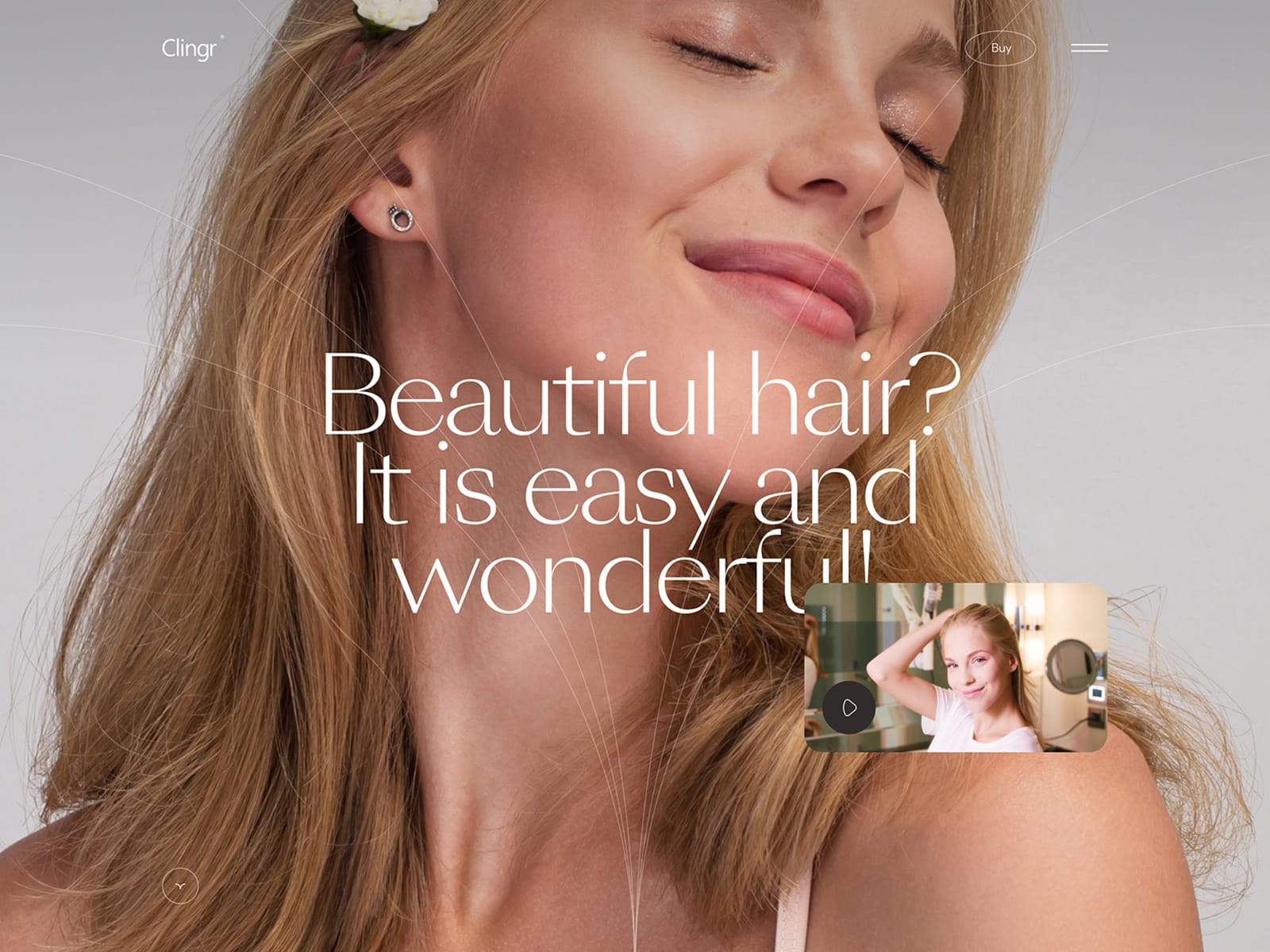
Close-up shots inevitably attract attention and draw the eye, which is perhaps why designers have begun to use them more frequently. Regardless of how one looks at it, a large image cannot be ignored.
Macrophotography enables one to showcase small details of an object, making the image more lifelike and helping to appreciate all the benefits of a product or service. A close-up can also be employed to create a distinctive and memorable brand identity.
5. Borders and Dividing Lines
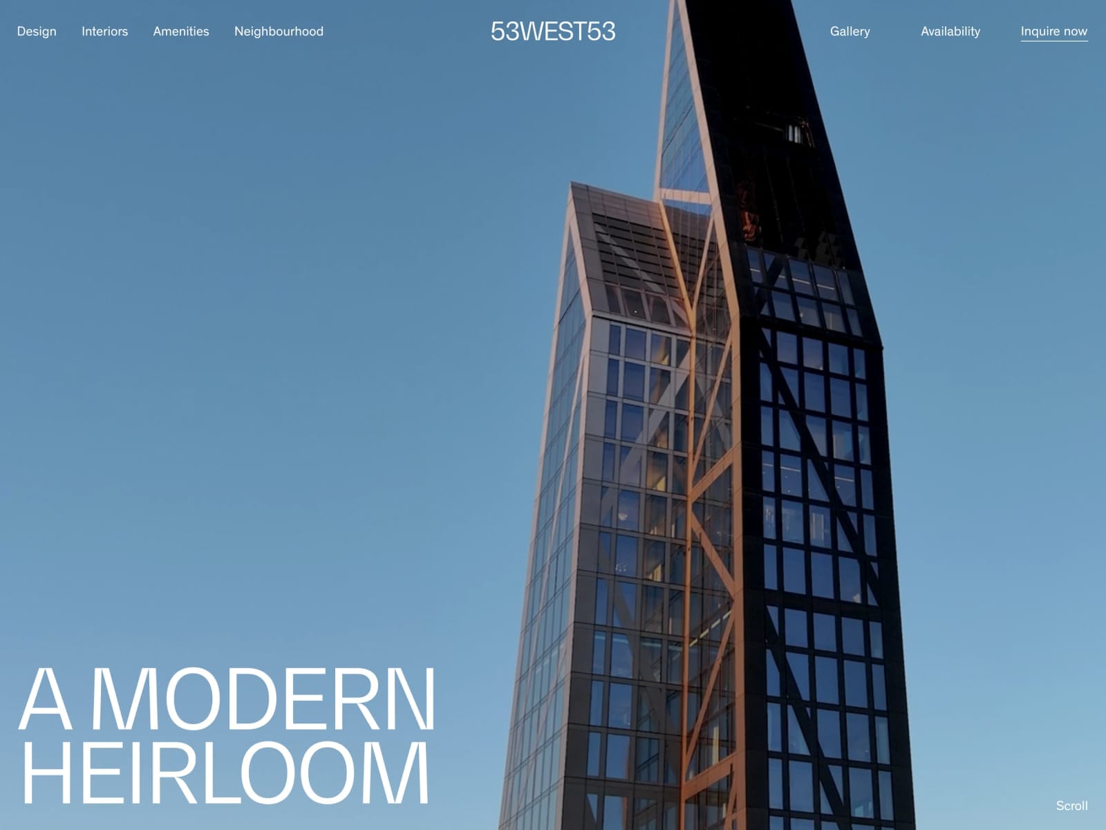
The trend of using clear boundaries and dividing lines in design has emerged relatively recently, and many designers now use it to create a unique and modern
look for their projects. These borders help to structure information on a website and organize elements.
At the same time, this technique of highlighting information helps maintain
a minimalist style and places almost weightless emphasis on important details. Clear borders work well for corporate websites with company services, portfolio sites, and business pages.
What's next?
It's difficult to predict with certainty whether the tends mentioned above will continue to be popular in the next year. The relevance of different techniques is constantly changing, and what might not seem interesting today could become a big hit tomorrow. However, it's still possible to track the development of some trends and make educated guesses about the rest of 2024, and perhaps even 2025.
1. Minimalism
This design trend has been popular for a long time and continues to be relevant.
It involves using simple shapes, clean lines, and a limited number of colors to focus on the essential elements of a design. This approach makes the site more straightforward and easier to understand. Although a more rugged and massive design in a "brutal" style has become increasingly popular among designers and minimalism stand aside. However, the use of bright colors and unusual shapes may soon become tiresome for designers, as it has been before, and minimalism
is likely to once again become a major trend in the design industry.
2. Holographic design and 3D elements
Holographic 3D design was a popular trend in 2022, but its popularity has since declined.
However, the addition of three-dimensional elements to websites continues to attract users' attention and give sites a sense of depth and space. Holographic effects, 3D models, and spheres are becoming increasingly common in new design projects. It is possible that this could be the beginning of another wave of popularity for this trend.
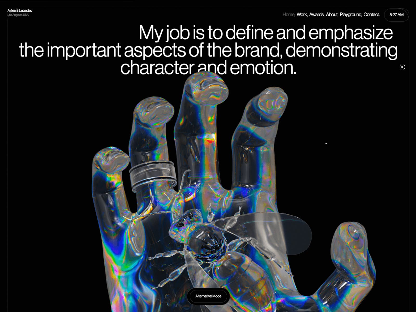
3. Dark mode
More and more apps and websites are offering users the option to use dark
instead of daylight mode. For many users, this feature is a crucial consideration when choosing an app, for example for reading or watching movies. In the near future, dark mode may not just be a matter of personal preference, but also a trend
in web design.
Using dark mode reduces eye strain, improving comfort when reading and watching and reducing the risk of vision problems.
Additionally, using dark mode on mobile devices and computers significantly saves battery power. Aesthetically, dark mode gives web pages
a modern and sleek look, emphasizing the design and highlighting certain interface elements.
