Color psychology in UX design
This article explores the fundamentals of color psychology, color selection methods, and successful examples in UX design.

Color psychology is one of the key components that influence how users perceive and interact with a product. Color can evoke emotions, shape associations, and even impact user behavior. In this article, we will explore the fundamentals of color psychology, methods for choosing colors for projects, and successful examples of color use in UX design.
Fundamentals of color psychology
Color perception is a complex process that involves both physiological and psychological aspects. Physiologically, color is determined by light waves that reflect off objects and are perceived by the eyes. When light hits an object, part of it is reflected while the rest is absorbed, defining the color we see. However, psychologically, color perception is shaped by cultural and personal factors.
Psychological impact of color temperature
Colors can be classified into warm (red, orange) and cool (blue, green) shades. This distinction can significantly influence the overall mood of a design. Cool colors, such as blue and green, typically evoke feelings of calmness, stability, and trust. They are particularly suitable for projects that require a serious approach, such as financial services or medical applications. For instance, a health app might use soothing blue and green tones to create a sense of tranquility.

On the other hand, warm colors like red and yellow often evoke associations with activity, energy, and joy. They can be used to create a sense of urgency or to attract attention. For instance, red call-to-action buttons may encourage users to respond more quickly. The choice of color should be intentional and justified, as it can significantly influence how users perceive your product.
Cultural context of color
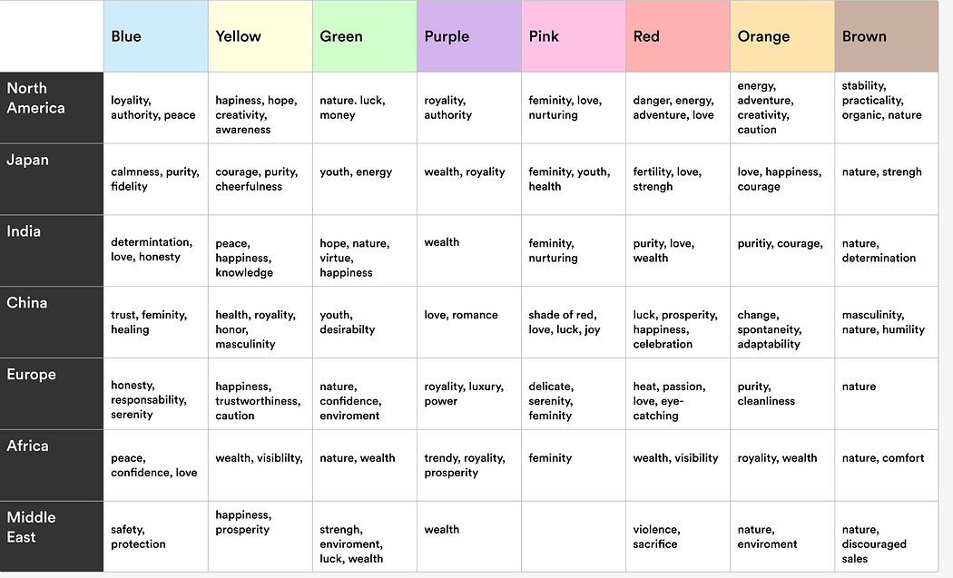
Colors have different meanings across various cultures, which can significantly impact how your product is perceived. For instance, while red in Western countries may be associated with love or danger, in India, it symbolizes purity and celebration. It's important to consider these nuances when developing products for a global audience.

Additionally, colors can have varying meanings even within a single culture. For example, white is often associated with purity and innocence in the Western world, while in many Eastern cultures, it may symbolize mourning. This highlights the importance of understanding cultural contexts when using color in UX design.
Сhoosing colors for your project
Identifying your target audience
The first stage in choosing colors is to comprehend your target audience. Who are your users? What are their requirements, interests, and beliefs? Recognizing demographic and psychographic elements will assist you in selecting colors that resonate with your audience.

Research indicates that different age groups respond to colors in distinct ways. Younger individuals may find bright colors more appealing, while older audiences often prefer more traditional and calming palettes. Therefore, it's essential to tailor your color scheme to suit your target audience.
Defining the project goal
Clearly articulating the project goal is also a crucial step in selecting colors. If your project is focused on providing information, colors like blue and green may be suitable for conveying a sense of reliability. For example, financial companies often use blue shades to emphasize trust and stability. Users visiting the PayPal website quickly feel that their data is secure.

At the same time, if your project aims to entertain or capture attention, bright colors like red or orange may be more effective. It’s important for the color palette to reflect the goal of your project and highlight its values.
Creating a color palette
Creating a color palette is a crucial step in design. Use tools like Adobe Color, Coolors, or Paletton to experiment with different color combinations. This will help you find harmonious pairings that align with your target audience and project goals.
Select a primary color, accent colors, and neutral shades. A classic design principle, the 60-30-10 rule, suggests that:
- 60% of the space should feature the dominant color.
- 30% should be the secondary color.
- 10% should be the accent color.

This balance creates visual harmony and enhances the overall user experience by effectively guiding attention. The primary color sets the overall mood of the product, while accent colors highlight important details. Neutral colors serve as a balancing element, allowing users to focus on the key parts of the interface.
Color testing
After creating your color palette, it's essential to conduct testing. A/B testing can help determine which colors resonate best with your audience and how they influence interactions. Research shows that color can significantly affect conversion rates; for example, changing a button color from green to red can greatly increase click rates.
In 2016, Instagram updated its logo to a minimalist gradient design, which initially received mixed reviews but was later appreciated for its modern look. Color testing not only increases the chances of product success but also provides valuable data for improvement. By gathering user feedback, you can adjust your palette to better meet their needs.

Tips for using color in UX design
Color contrast
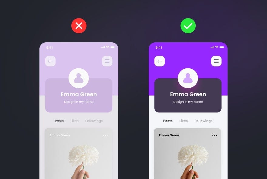
Color contrast is a crucial aspect that helps highlight key elements of the interface. Using contrasting colors for buttons, headings, and main text enhances readability and makes it easier for users to navigate content. For instance, light text on a dark background or vice versa draws attention to important elements.

Approximately 8% of men and 0.5% of women experience color blindness, making high color contrast essential for readability. This is especially important for brands with a large audience, as it can boost conversion rates. For example, Facebook uses blue not only for aesthetics but also because founder Mark Zuckerberg, who is colorblind, perceives blue best. Furthermore, contrast enhances accessibility for users with vision impairments, ensuring a user-friendly interface for all.
The impact of color on CTA
Call-to-action (CTA) buttons are essential components of UX design. The choice of color for these buttons can significantly affect conversion rates. Bright colors are often used to create a sense of urgency and attract attention, encouraging users to respond quickly to offers and enhancing campaign effectiveness.

However, it’s crucial that CTA colors align with the overall design of the product. Overly bright colors may appear out of place if they don’t harmonize with the rest of the interface. Maintaining a balance between drawing attention and visual appeal is essential.
Avoid using pure black (#000000)
Using pure black can often create an overly heavy impression. In reality, nothing is ever 100% black—neither screens, nor electronic devices. For instance, the bezels of most monitors and TVs often appear dark gray rather than pure black.
Similarly, keyboards on laptops, like those of a MacBook, typically feature keys that are slightly lighter than pure black. Even the darkest inks used in printers can have subtle undertones that make them appear less intense. Color psychology in design suggests adding a softer hue to black; for instance, using #111111 can be much easier on the eyes.

Conclusion
Color psychology is a crucial aspect of UX design that influences users' perceptions and interactions with a product. Making the right color choices can significantly enhance the overall experience and help achieve business objectives. By adopting a structured approach to color selection—considering your target audience, project goals, and cultural contexts—you can create an effective and appealing UX design that resonates with your audience.


