Evolution of the Threads logo: from Twitter alternatives to successful branding
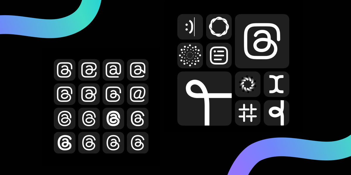
As part of Threads' first anniversary celebration, Instagram CEO Adam Mosseri shared rejected versions of the platform's logo. It offers an interesting insight into the development process and emphasizes the diversity of concepts considered, including even a departure from the "@" symbol.

In celebration of Threads' recent anniversary, Adam Mosseri, Head of Instagram, unveiled a selection of rejected logo designs, as reported by Android Headlines. This glimpse into the design process reveals the various directions explored by the company before settling on the current logo.
Initially conceived as a potential alternative to Twitter amidst uncertainties surrounding Elon Musk's leadership, Threads, an extension of Instagram, navigated phases of user adoption. While experiencing influxes and attrition, Threads has solidified its user base and aims for further growth.

The chosen Threads logo incorporates the "@" symbol, a widely recognized element across social networks for user tagging, particularly prominent on Twitter. This choice aligns with Threads' initial positioning as a direct competitor to Twitter. Mosseri's post illustrates the team's exploration of various stylizations of the "@" symbol to create the platform's logo.
Interestingly, the design team also experimented with logos that diverged significantly from the "@" symbol motif. These rejected designs explored concepts including knots, smiley faces, vortexes, and lists. User reception to Mosseri's post suggests a general preference for the final logo over the presented alternatives.

Mosseri's disclosure implies that the showcased logos represent only a selection of those considered, highlighting a comprehensive design exploration process. Selecting a suitable logo is crucial to a service's success, and Threads' current logo appears to have resonated positively with its user base, suggesting a promising start.


