Google app is testing a bottom search bar redesign on Android
Google App tests Material 3 redesign with integrated search bar in bottom bar. Update follows prior exploration & incorporates elements from iOS app. Design maintains prominent search field & replaces top logo with search filters.
A new design iteration is being tested for the Google App on Android. This redesign incorporates elements of Google's current design language, Material 3. Notably, it integrates a search field directly into the bottom bar.
This update follows an earlier exploration of a bottom search bar in 2021. The current iteration leverages the pill-shaped tab indicator introduced in the iOS version of the app. This change promotes visual consistency across platforms.
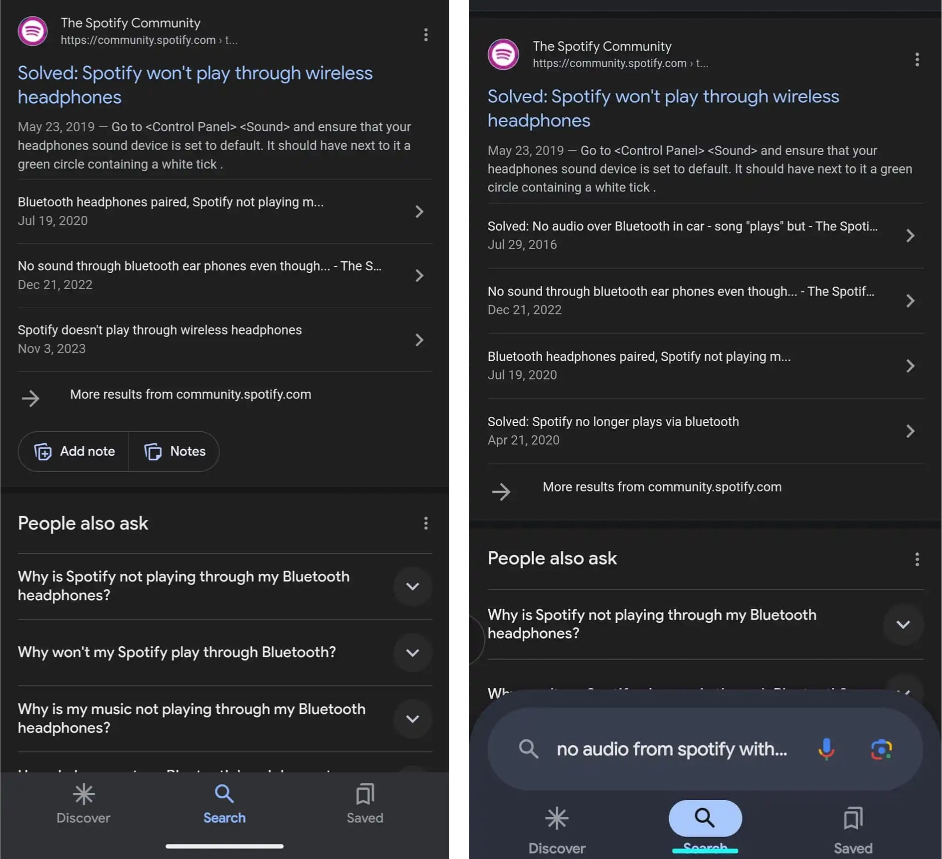
The redesign also includes a prominent search field, previously found at the top of the Discover feed. While the current implementation removes this field on search results pages, the redesign maintains it for consistency. This choice may impact the available space for search results.
However, the redesign eliminates the "Google" logo at the top of the app, replaced by immediate access to search filters. Additionally, the redesign utilizes a default blue tint instead of Dynamic Color.
Overall, this redesign presents a more modern aesthetic, potentially addressing perceptions that the current Google App appears outdated. Whether this design sees a wider rollout remains to be seen.