Google Arts & Culture now offers dark theme
Google Arts & Culture now offers a dark theme, joining other apps. The update removes light theme gradients, applies dark theme styles, and introduces a new theme menu in Settings. This update aligns with design trends and offers a more comfortable viewing experience in low-light conditions.

Google Arts & Culture has joined the ranks of apps offering a dark theme. Previously, the app only featured a light theme with gradient accents.
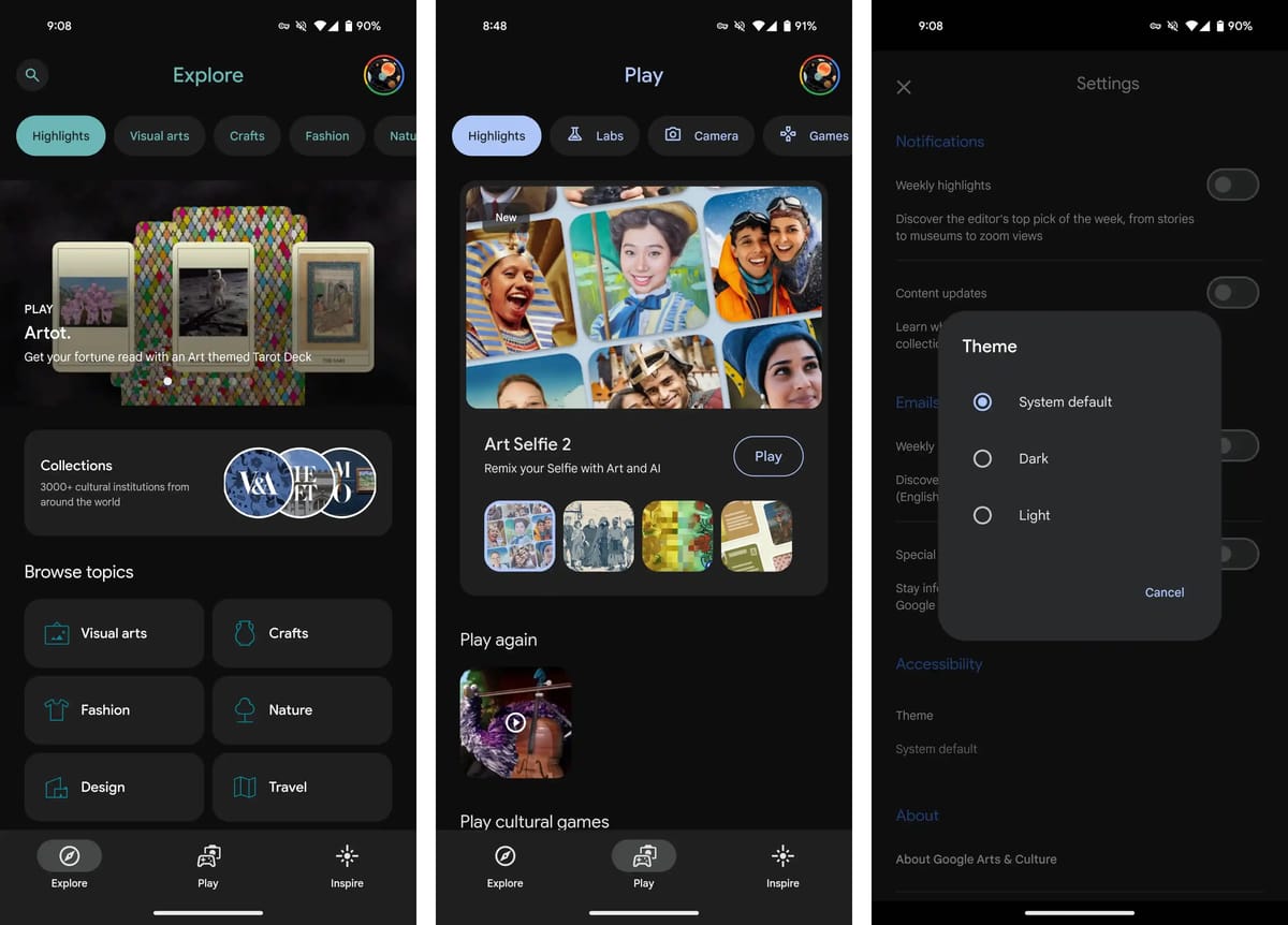
The new dark theme removes the gradient effect and applies appropriate theming to titles, buttons, and filter chips. Additionally, the splash screen has been updated to match the dark aesthetic, which complements the dark "&" logo introduced last year.
The update also introduces a new "Theme" menu within Settings, allowing users to choose between system default, dark, or light themes. This menu utilizes the new Material 3 design language.
This update brings Google Arts & Culture in line with current design trends and offers users a more comfortable viewing experience in low-light conditions.
Availability
Version 10.9.x of Google Arts & Culture is rolling out with dark theme support for Android and iOS devices.


