Google Maps unveils interface redesign for improved user experience
Google Maps undergoes significant UI revamp, optimizing clarity and user interaction. Key updates include refined location sheets, minimized search interfaces, and accessible transportation options, enhancing overall user experience.

Google Maps is receiving a comprehensive interface update across key areas, including the directions search experience, aiming to enhance user interaction and information clarity.
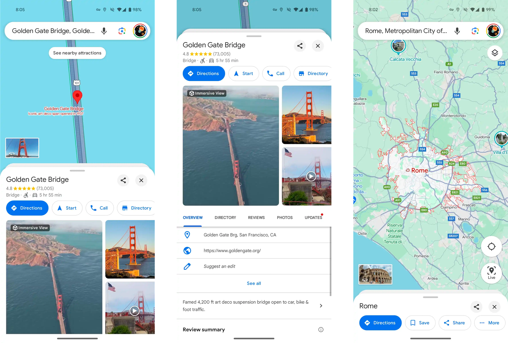
This update introduces a new sheet design when tapping a location, featuring prominent close and share buttons for streamlined access. Additionally, a subtle background sheet preserves context by partially displaying the underlying map.
Locations are no longer displayed fullscreen, instead revealing a portion of the map background at the top, further contributing to context retention.

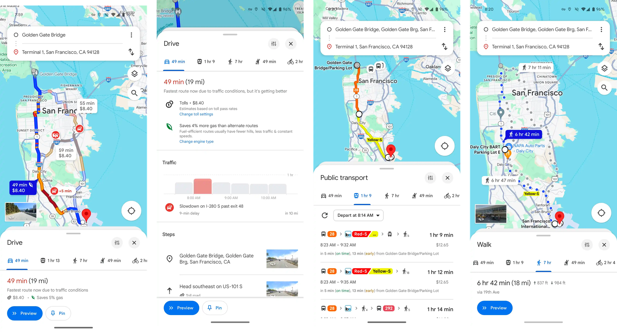
The most significant change impacts the directions search experience. The search bar is now confined to the top of the interface, dedicated solely to address input. This reduces visual clutter and streamlines the user journey.
Furthermore, the transportation method carousel, previously presented full-screen, has been relocated to the bottom. This enhances reachability on mobile devices and allows for a quick swipe-up to reveal available navigation options, including public transport, all while keeping the map visible.

These design alterations aim to provide a less crowded and more intuitive user experience. While currently available on a limited basis for Android users (version 11.113.x), a wider rollout is anticipated. iOS compatibility is also expected in the near future.


