Google redesigned the Phone app with the Material 3 expressive style
While these changes are currently available only to beta testers, the new visual design is expected to roll out to all users in September.
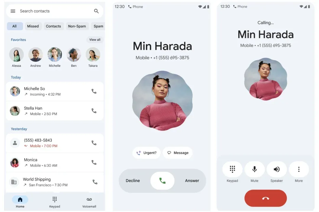
Google has revamped the Phone app, giving it a more expressive look inspired by the Material 3 design language. The updates aim to simplify call navigation and make it easier to find contacts.
The bottom menu now includes just three tabs: Home, Keyboard, and Voicemail. The previous tabs — Favorites, Recents, Contacts, and Voicemail — have been removed.
The Home tab displays favorite contacts at the top of the screen. Instead of the familiar call log that grouped multiple calls from the same person into a single entry, users now see a list of individual calls.
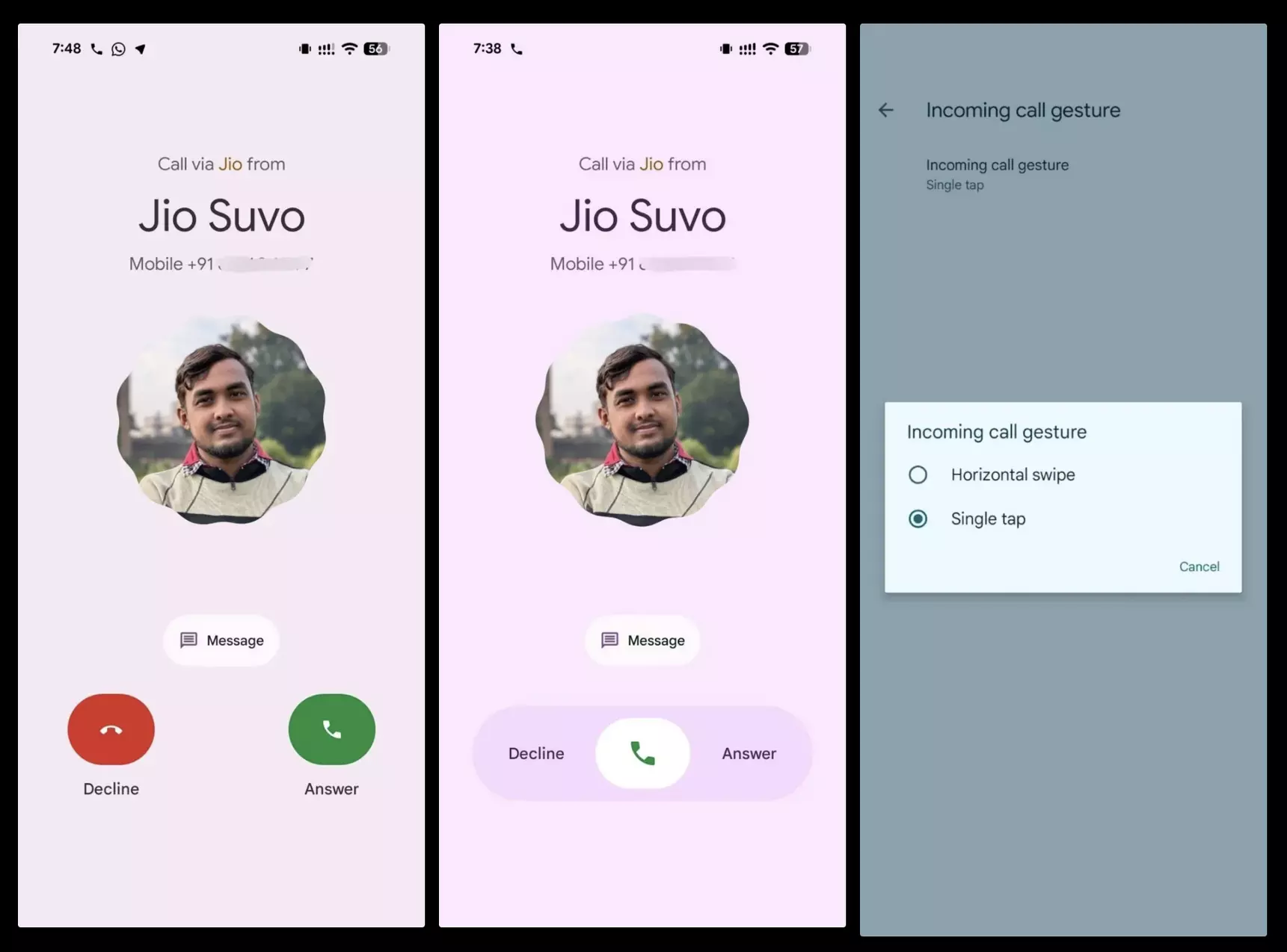
Google is also experimenting with a new gesture-based system for handling incoming calls. To answer a call, users swipe right; to decline, they swipe left.
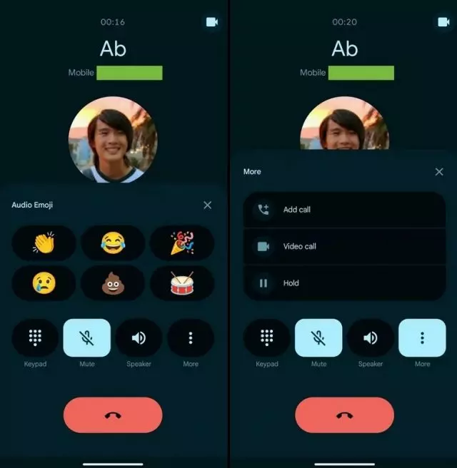
The app has also received several visual improvements. On the incoming call screen, the contact’s name now appears inside a circular element with smooth edges. The end call button has been made larger and more prominent, improving visibility. Additionally, the recent calls list now features rounded corners and a contrasting background for better readability.
While these changes are currently available only to beta testers, the new visual design is expected to roll out to all users in September.