Instagram is updating its web interface to better fit large screens
Instagram CEO Adam Mosseri promised that the new design is cleaner, faster and easier to use.

If you've ever used the desktop version of Instagram, you've probably noticed that it doesn't take advantage of large screens at all. The photos don't take up a really large area of the screen, and there's a lot of empty, unused space on the sides.
Now Instagram is finally redesigning its website. Instagram CEO Adam Mosseri announced the redesign yesterday, along with the scheduled posting feature we wrote about earlier.
🎉 New Features 🎉
— Adam Mosseri (@mosseri) November 8, 2022
Some “finally features” that I think you’re going to be excited about…
- Schedule Posts (coming soon)
- IG Web Updates pic.twitter.com/5tyMxWh1n8
Mosseri promised that the new design is cleaner, faster and easier to use.
In the new design, the explore/search page now displays a full grid covering the entire monitor. Menus and icons such as home, search, messages, and notifications have been moved to a side pane. The new sidebar expands and collapses based on the screen you're on.

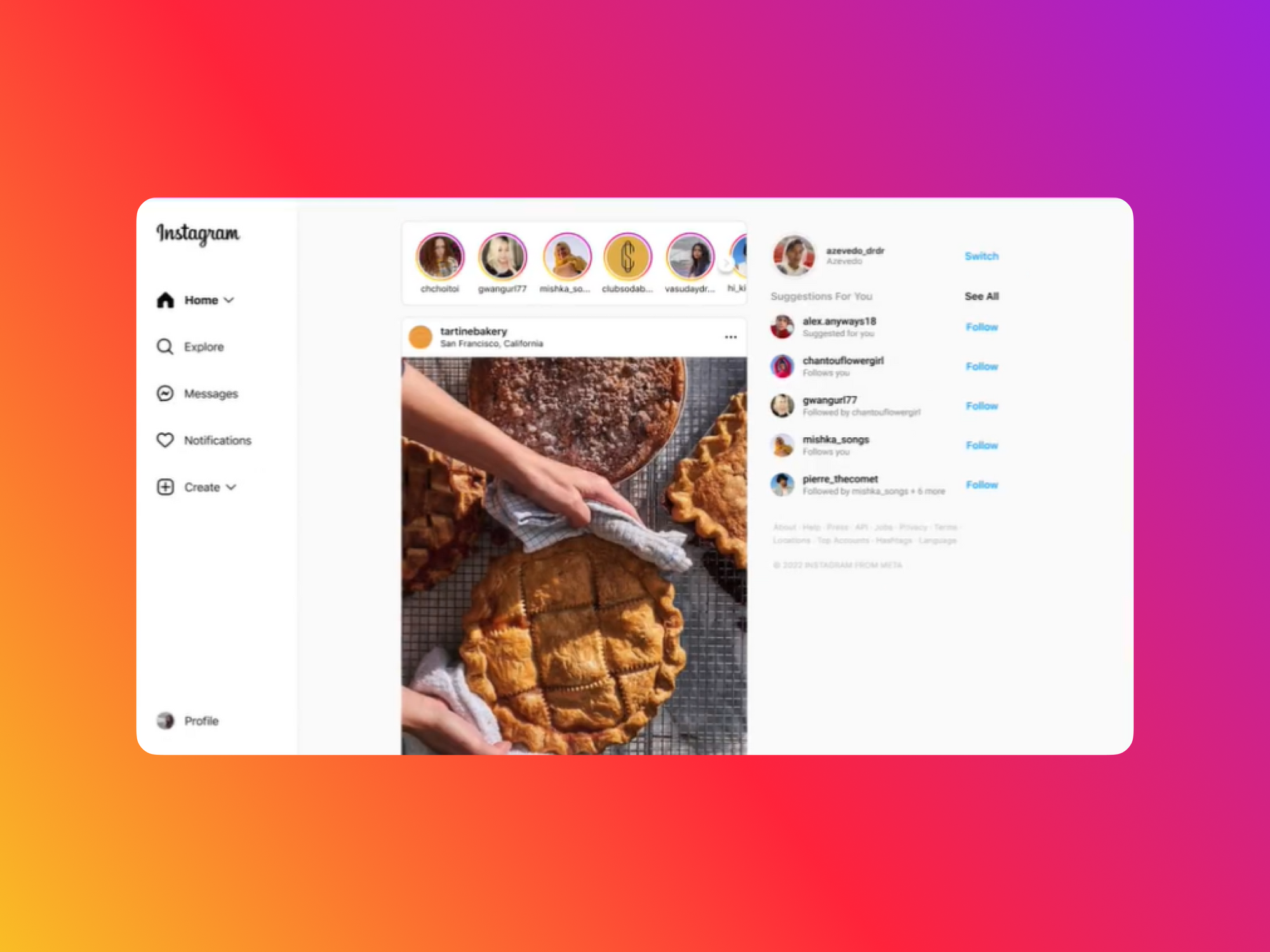
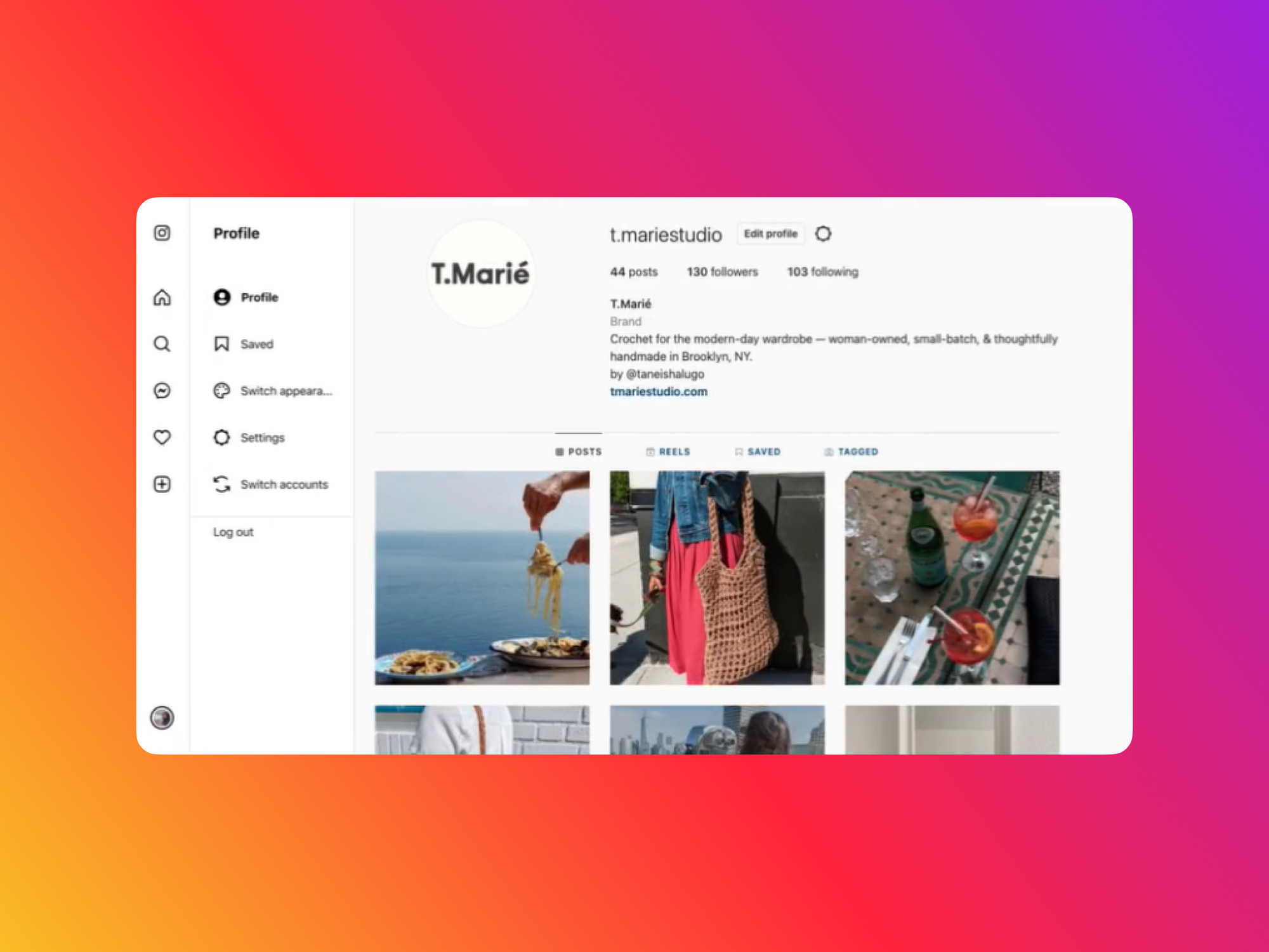
This redesign will make it a little easier to use Instagram on large monitors when switching between different tabs. Unfortunately, the iPad version is still not considered a priority, so it will definitely not appear in the near future.
New Figma update adds Sections, FigJam text formatting and more
— UX News (@uxnewscom) October 29, 2022
Yesterday Figma released 10 new very interesting features. Among them: sections, music for the timer, text formatting in FigJam, and tablets.
Read more: https://t.co/PugdhSH8z9 pic.twitter.com/nqOIanpBQX

