Lamborghini's Iconic Logo Redesigned After 20 Years
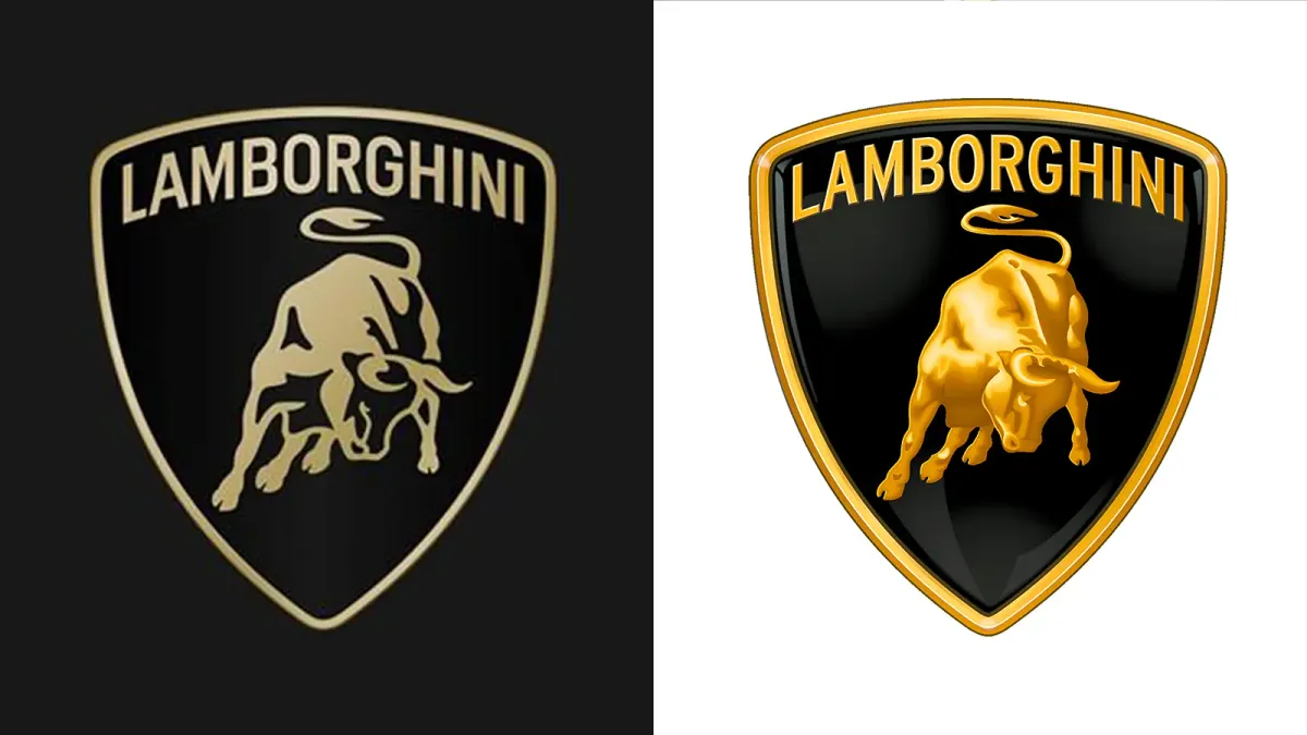
Automobili Lamborghini unveils revamped logo, reflecting brand's commitment to innovation & a focus on the future. The updated design features a wider typeface & a simplified color palette, aligning with Direzione Cor Tauri's emphasis on sustainability.

In a move reflecting its commitment to innovation and a renewed focus on the future, Automobili Lamborghini has unveiled a refreshed version of its iconic logo. This marks the first significant change to the logo in over two decades.
The updated logo embodies the brand's core values of courage, unexpectedness, and authenticity. It aligns with the company's broader transformation strategy, Direzione Cor Tauri, which prioritizes sustainability and emissions reduction.
The new design features a wider Lamborghini typeface and a simplified color palette. Black and white remain the primary colors, while yellow and gold accents add vibrancy.
The renowned raging bull emblem, synonymous with Lamborghini, has also been refined. It now appears independently on digital platforms, separate from the traditional shield, for increased visual impact.
Lamborghini has additionally introduced an official font inspired by the design language of its automobiles, further solidifying its brand identity. A new set of icons, developed in collaboration with Lamborghini Centro Stile, will ensure consistent brand representation across all digital channels.
This strategic update signifies a broader shift in the company's direction. The redesigned logo not only represents a visual evolution but also reflects Lamborghini's commitment to progress and a sustainable future, building upon its rich heritage of innovation and challenging the status quo. The fresh logo marks a new chapter for the brand, inspiring future generations while remaining true to its core essence.


