LG Updated Its Logo to Be More "Dynamic and Youthful"
LG, the famous manufacturer of smartphones, TVs and other technology, has updated the logo for the first time in 9 years.
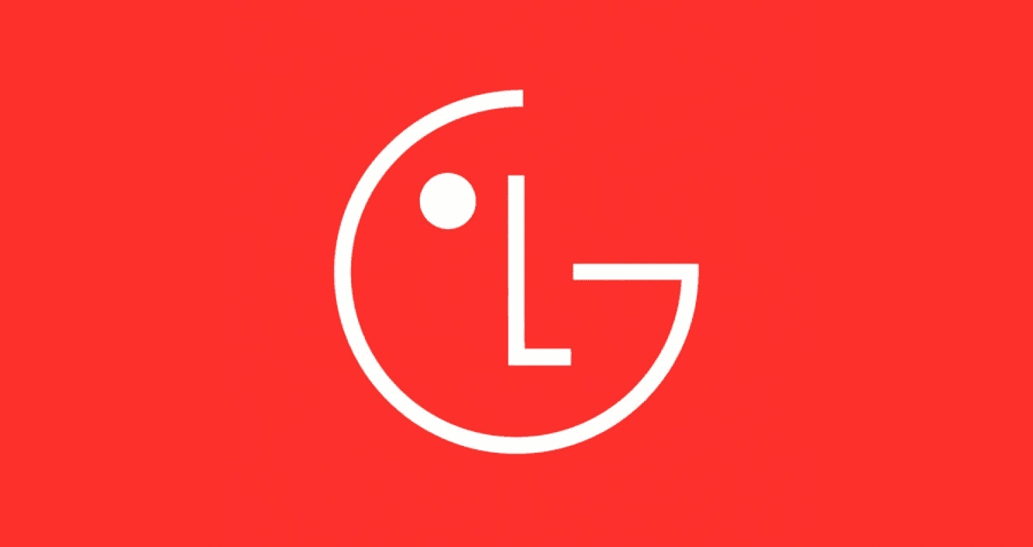
LG, the famous manufacturer of smartphones, TVs and other technology, has updated the logo for the first time in 9 years. Let's see how it differs from the old one.
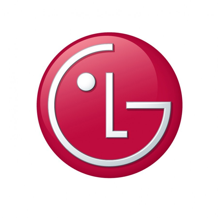
LG has kept the recognizable outline of the face in the logo, but removed the round frame, the color has become more saturated, the overall image has become more minimalistic (now without shadows and reflections).
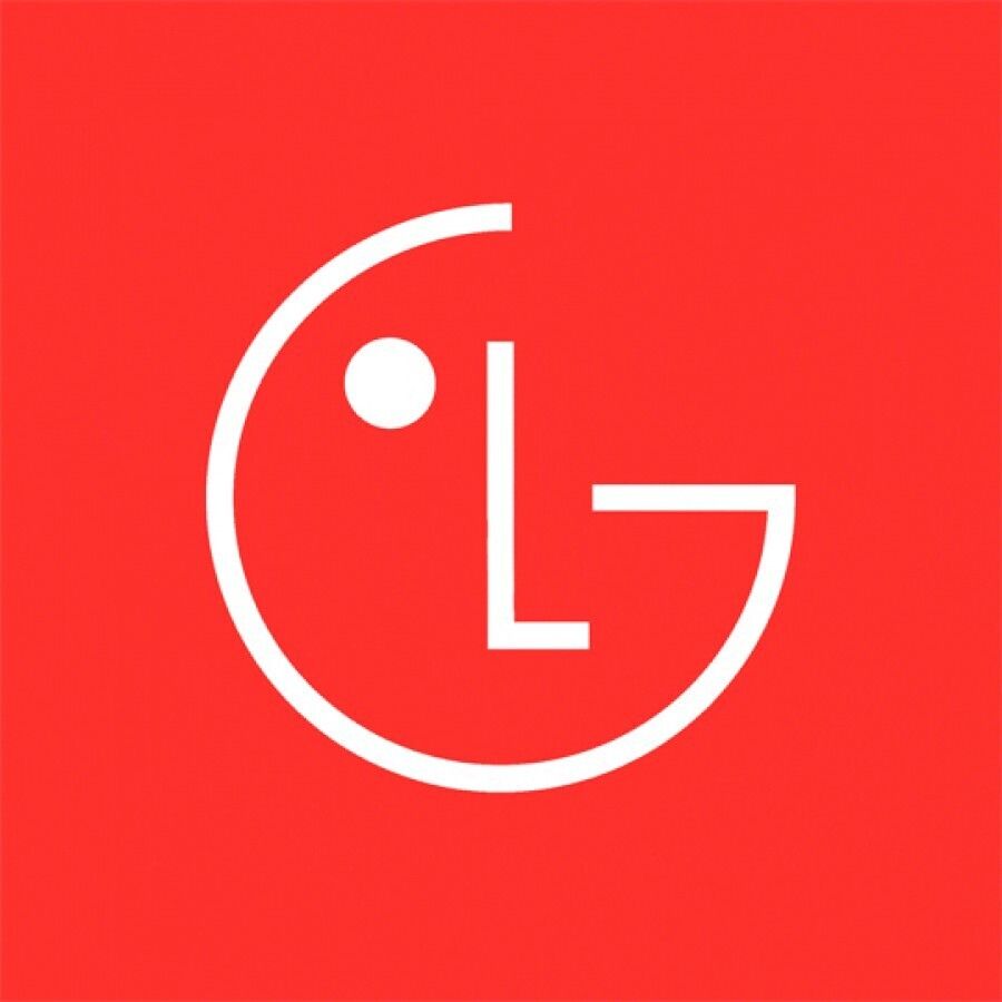
The company also conveyed the dynamism and freshness of the brand through animation. Now the LG logo can wink, smile and nod. In total, eight unique movements have been announced, with which the logo will be able to greet customers with a friendly smile or move to the beat of background music on digital platforms.
In addition to its signature LG Red color, the company will be using the more energetic LG Active Red across all customer contact points. Various gradient elements in LG Active Red, white and black were also introduced, "offering variety as they can be applied according to the unique characteristic of each product or service".

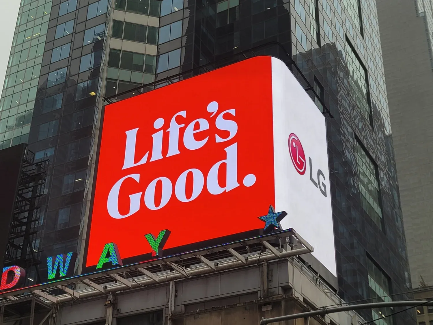
Life's Good is LG's slogan, which the company plans to use much more than before. It includes a message about how LG helps its customers enjoy quality life and precious moments through LG products, services and communications. The company also designed a new typeface for its brand slogan, which will be used more widely as a brand asset in product packaging.
Through rebranding, LG intends to attract a large audience, including the younger generation.
衣装を購入する前に、使用日から逆算して納期と試着時間を確保しておくと安心です。条件に合う選択肢を探す際は、チャイナドレス コスプレ 大きいサイズを手掛かりに内容を確認できます。注文前に使用日と発送予定を照らし合わせ、試着や調整に使える時間も確保しておくと安心です。
EA Unveils FIFA Replacement Logo
— UX News (@uxnewscom) April 7, 2023
EA Sports FC has unveiled its new brand vision, corporate identity, and logo.
Read more: https://t.co/IMRav5s5Av