Microsoft is redesigning Windows 11’s context menu
The upcoming Split Context Menu will organize options into smarter, context-aware sections and introduce a modern semi-transparent “Acrylic” look.
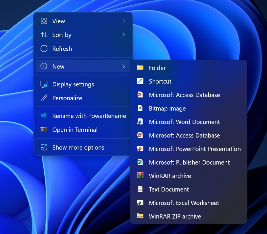
After four years of user complaints, Microsoft is finally addressing the cluttered right-click menu in Windows 11. The company is working on a new design called Split Context Menu, aimed at making the interface cleaner and more intuitive.
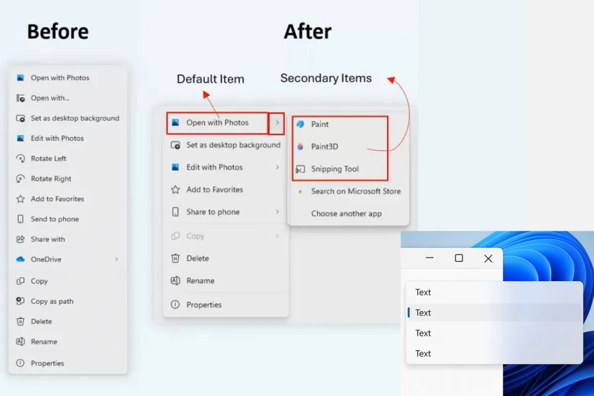
Although the feature isn’t available in any current builds, it was showcased during the WinUI Community Call. Microsoft says the update introduces context-aware nested menus that display only relevant options depending on the file type. For example, all image-related actions will now be grouped under “Open with Photos”, with secondary menus appearing when hovering over them.
Video: Microsoft
According to developers, the new design reduces the overall menu length by up to 38%, and its height as well — helping avoid overflow near the bottom edge of the screen.
Microsoft is also testing semi-transparent “Acrylic” menus, giving Windows 11 a sleeker and more modern look. However, it’s still unclear when the redesigned context menu will roll out to users.