Microsoft Office icons get a modern redesign
All 10 core Office icons are being refreshed with a bigger focus on gradients and contrast.
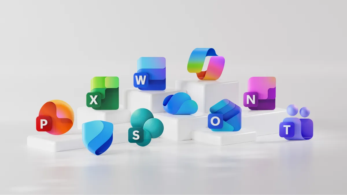
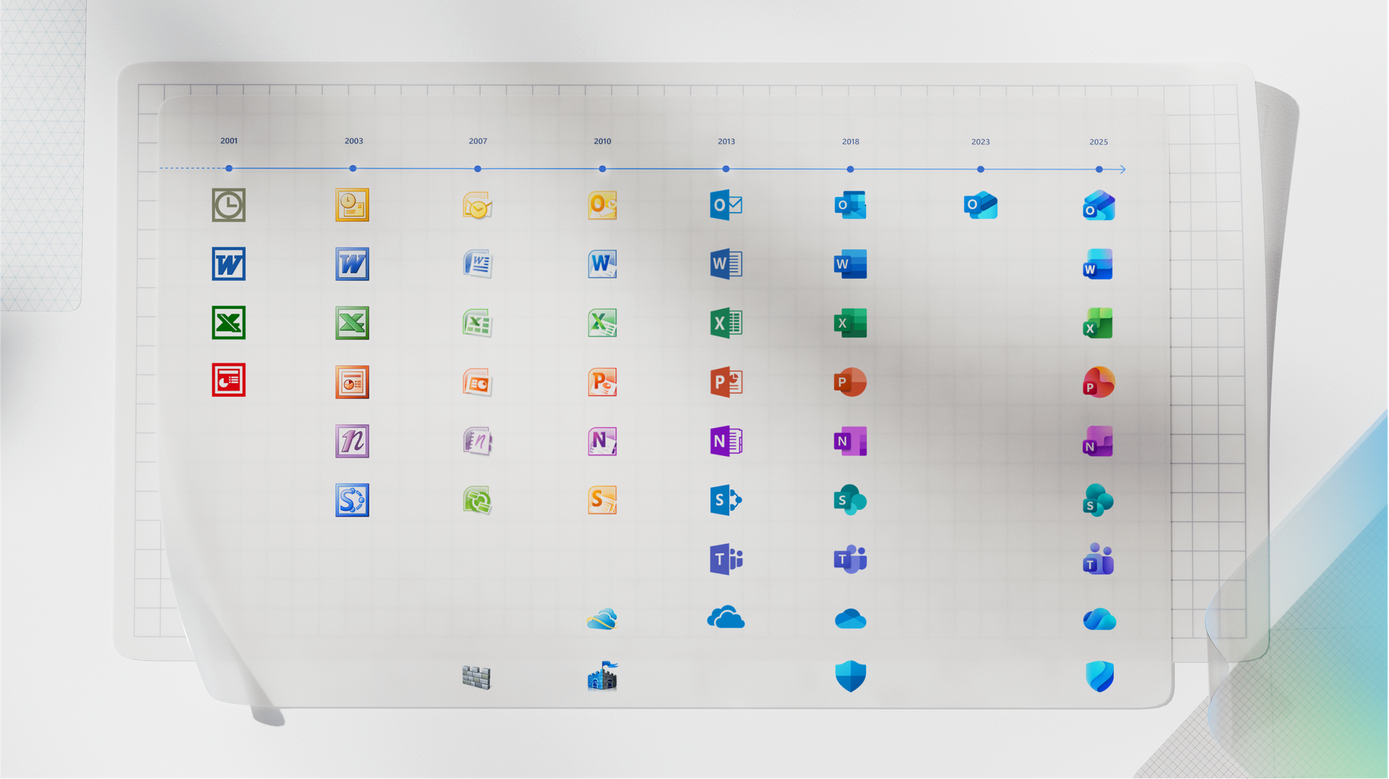
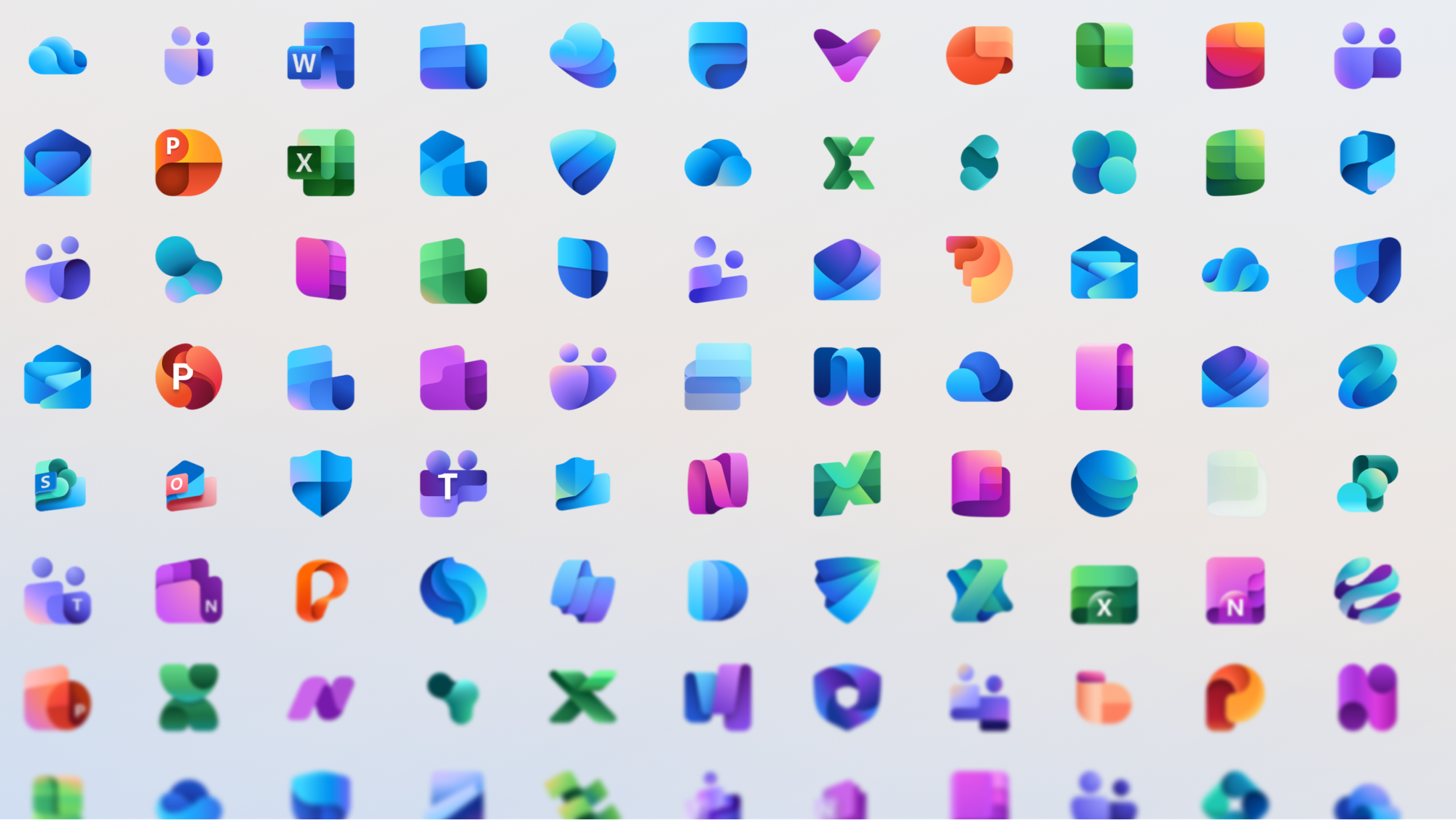
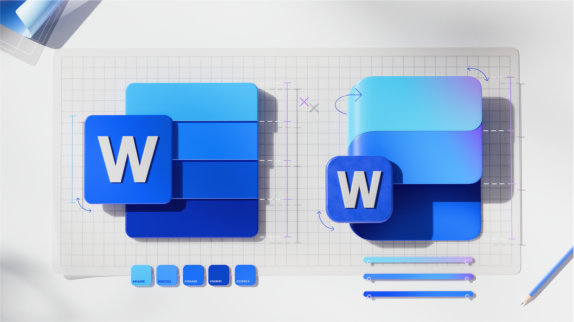
Microsoft has unveiled refreshed icons for the 10 core Microsoft 365 apps. This is the first major update to the icons since 2018, reflecting the influence of Copilot on Microsoft 365. The new icons combine a modern, colorful design with fluid shapes, simplified elements, and rich gradients, making them more recognizable and accessible.
“The icons reflect a new paradigm: today, connection is not just about visual consistency, but the seamless flow of work between humans and AI in Microsoft 365,” says Microsoft. For example, the updated Word icon now features three horizontal bars instead of four, improving legibility at smaller sizes.
The refreshed icons convey a sense of motion and approachability, and their shapes and colors integrate the Copilot experience, reflecting the modern concept of “effective human-AI collaboration.” The updated icons will soon roll out in web versions, on PCs, and mobile devices for both consumer and enterprise Microsoft 365 users.