Modern typography trends in Web Design
Modern typography trends help achieve a balance between aesthetics and functionality, offering vast opportunities for experimentation while maintaining a focus on user convenience.
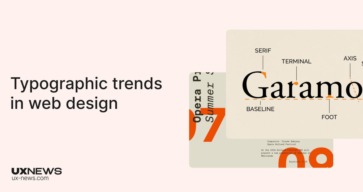
Typography plays an important role in web design, influencing how content is perceived and creating a unique visual style. In 2024, fonts are not just tools for conveying information, but also key elements of brand identity, aesthetics, and user experience. In this article, we explored modern typography trends, their impact on content readability, and current popular fonts and styles
1. Experimental Fonts: Creative and Unique
Experimental fonts have become a way to help brands stand out from competitors. These fonts often break traditional typography rules by using unusual letterforms, increased line spacing, or unconventional size combinations. They create emotional accents and draw attention, especially on main pages or in headlines.
Fashion and art brands often use non-standard fonts to express a creative or innovative approach to their products. For instance, headlines can be in fonts with asymmetrical shapes or shifted lines, creating a dynamic feel.
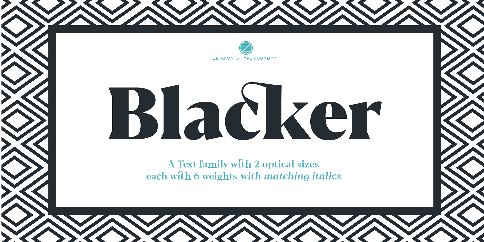
Examples of experimental fonts:
Blacker – a serif font with expressive serifs that adds drama and uniqueness.
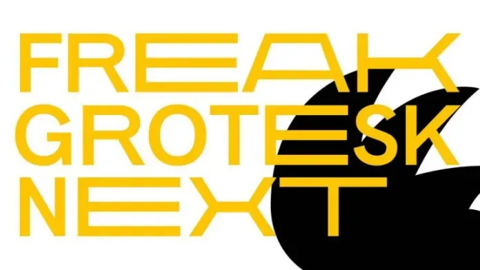
Freak Grotesk – an experimental grotesque font with unconventional proportions and lines.
Neue Machina – a tech-inspired and futuristic font that grabs attention with its unusual letterforms.

2. Return to Retro Typography
Retro trends continue to gain popularity in design, and typography is no exception. In 2024, designers are actively using vintage fonts inspired by the styles of the 1960s, 1970s, and 1980s. These fonts give designs a sense of nostalgia, warmth, and trust.
Fonts with rounded forms and bold letters from the 1970s are frequently used in web design to evoke a retro-glamour feeling. They are often seen on websites related to the music industry, vintage fashion, or cultural projects.
Examples of retro fonts:
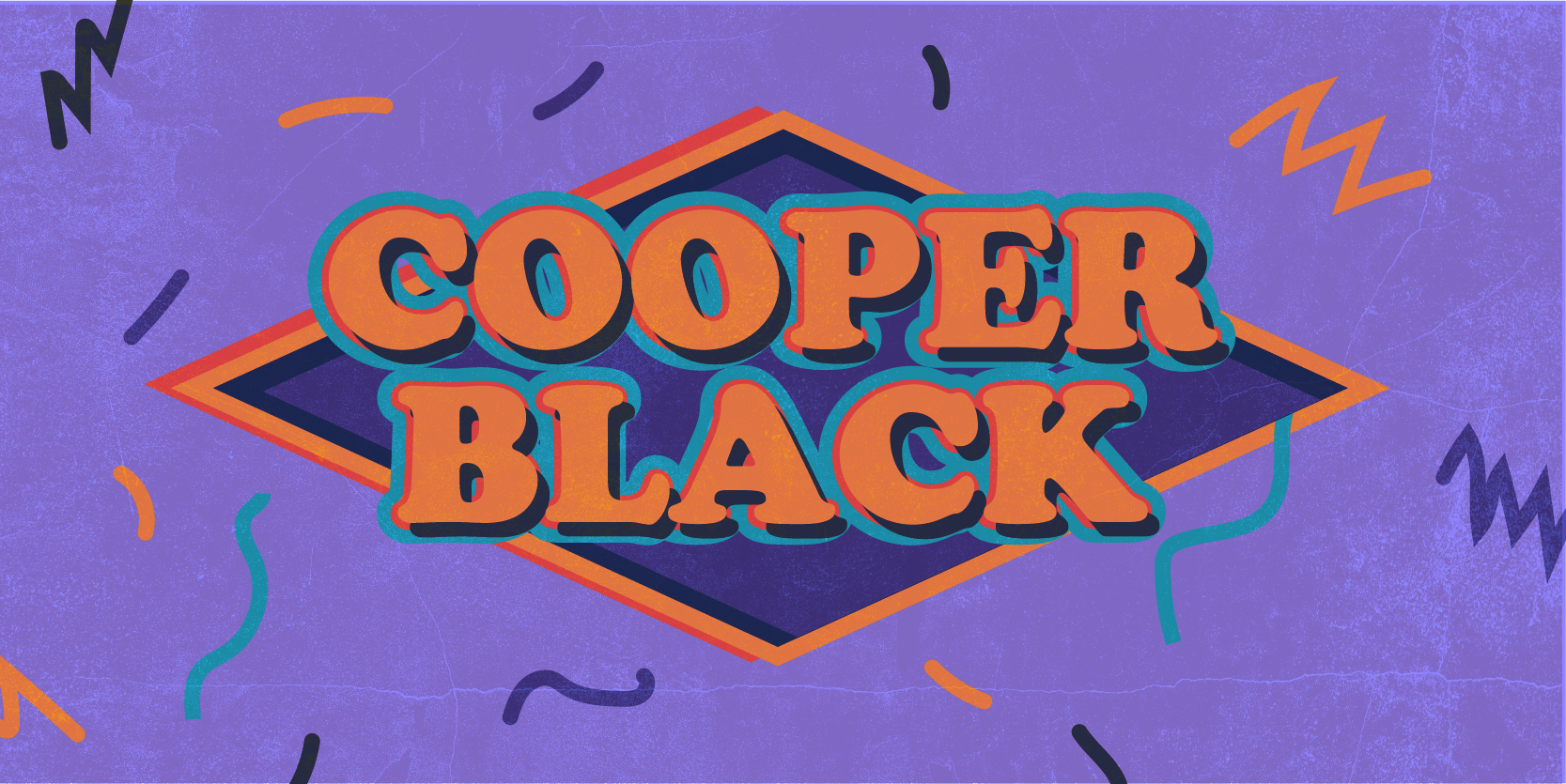
Cooper Black – an iconic font with rounded forms, popular in the 1970s.
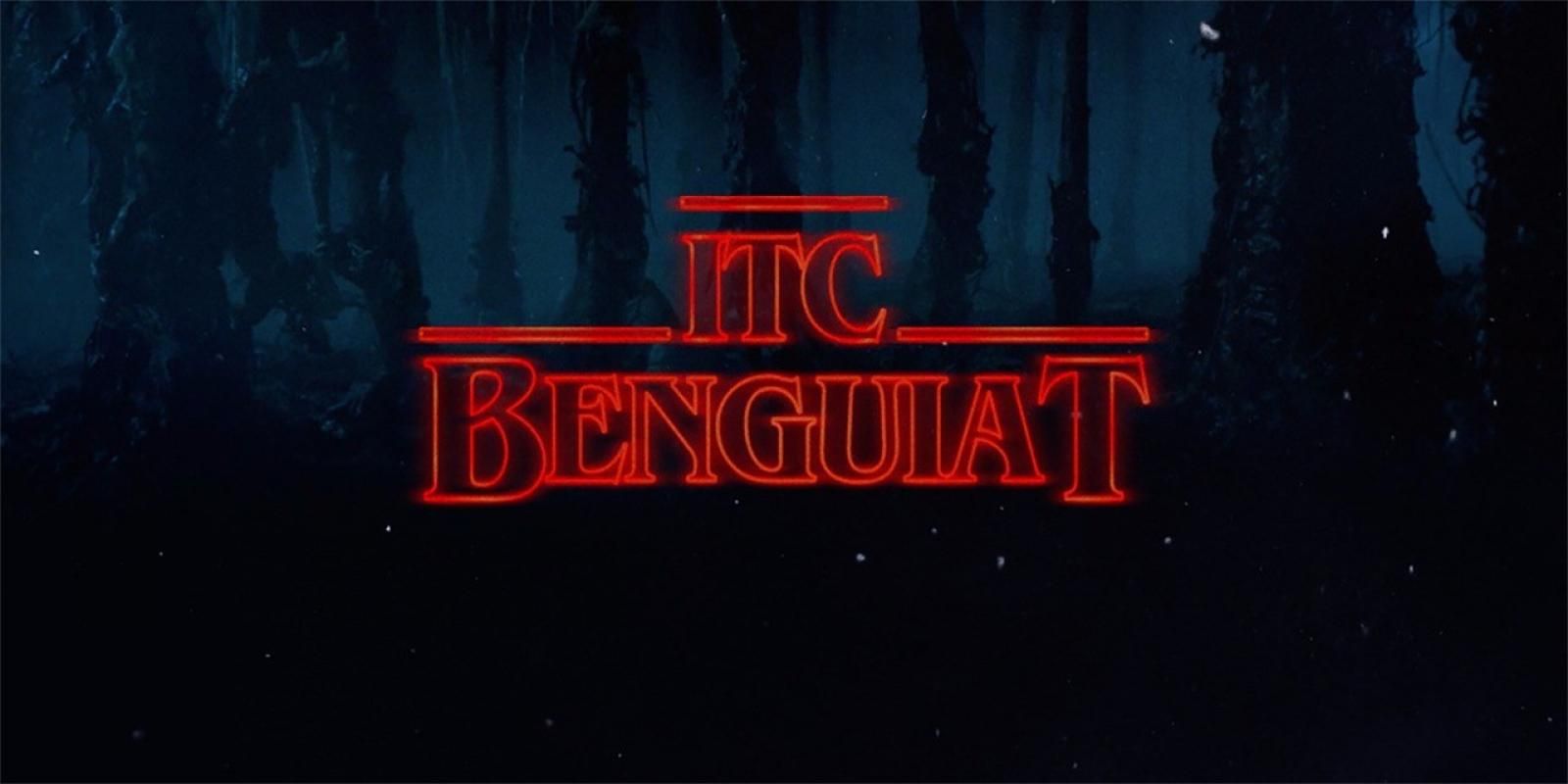
ITC Benguiat – a vintage font associated with the aesthetics of films and posters from past decades.
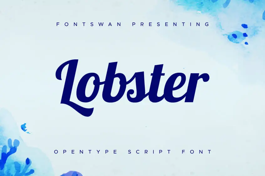
Lobster – a retro font with decorative lines, often used in designs inspired by the styles of the 1960s and 1970s.
3. Bold and Expressive Headlines
One of the key trends remains the use of bold and noticeable headlines. Such fonts help clearly convey the main idea of a site and immediately catch the user's attention. Bold fonts are often used for short messages or important elements, while the main content remains light and easy to read.
Minimalist websites often feature large, bold headlines combined with simple text to highlight key messages. This works well for agency sites, portfolios, or projects where the first visual contact with the user is crucial.
Examples of bold fonts:
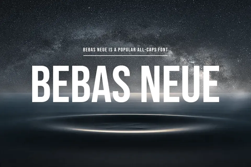
Bebas Neue – a powerful sans-serif font, perfect for large headlines.
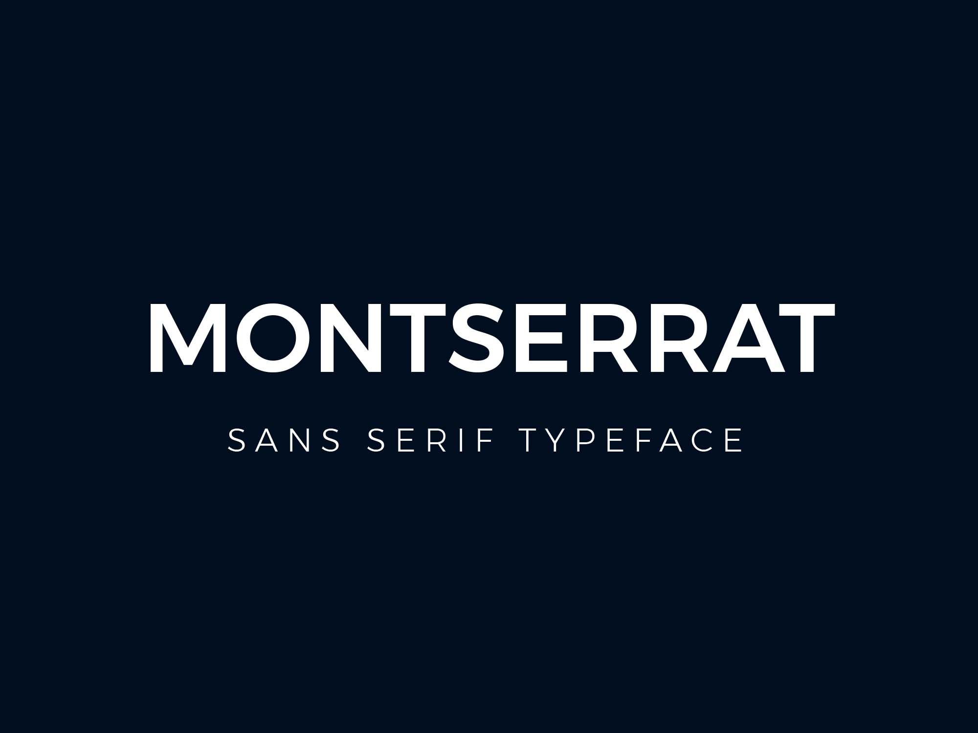
Montserrat – a modern font that works great for headlines in its bold version.
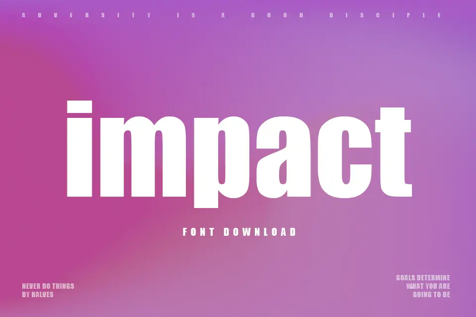
Impact – a classic bold font that grabs attention with its heavy weight.
4. Minimalist Typography
Minimalism continues to be a key trend in web design, and this directly impacts typography. Simple, clean fonts with minimal decorative elements help create neat and elegant designs. In minimalist approaches, maximum clarity and text readability are essential.
Sans-serif fonts like Helvetica or Arial are often used on minimalist websites, where the focus is more on content than decoration.
Examples of minimalist typography:
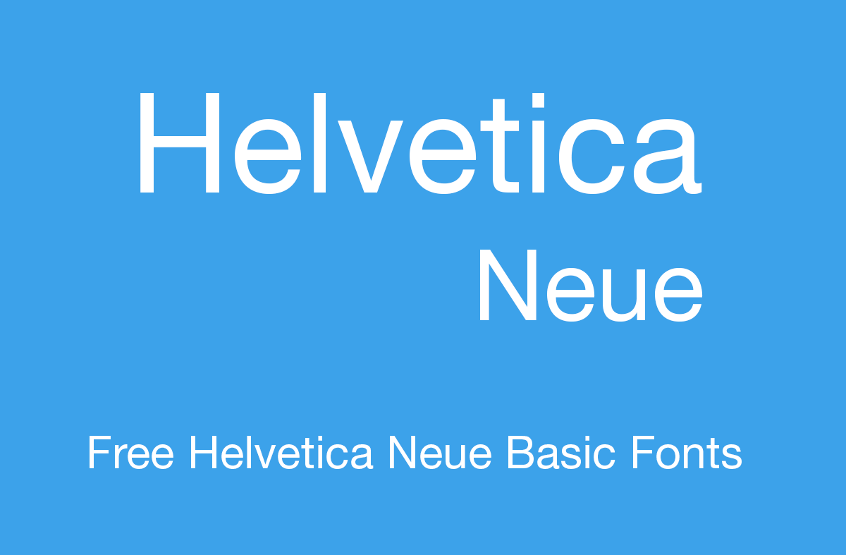
Helvetica Neue – a classic minimalist font, versatile for any project.
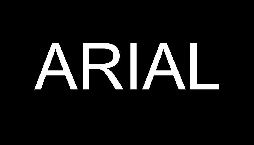
Arial – a simple and clean font, perfect for minimalist design.
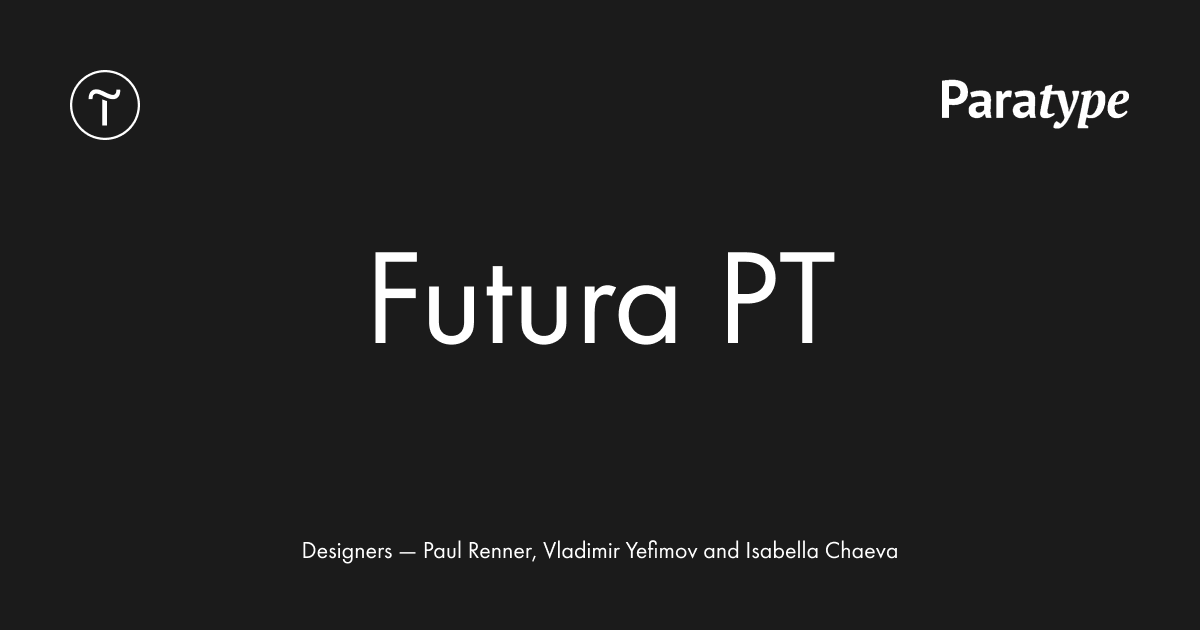
Futura – a geometric font with clean lines, which pairs well with minimalist styles.
6. Combining Fonts
A growing trend is the combination of multiple fonts in one design. This can be a classic pairing of serif and sans-serif fonts or more experimental approaches, where designers combine different font styles to create visual contrast and dynamism.
In one project, you might use one font for headlines, another for body text, and a third for subheadings or accents, creating a balanced and interesting composition.
Examples of font combinations:
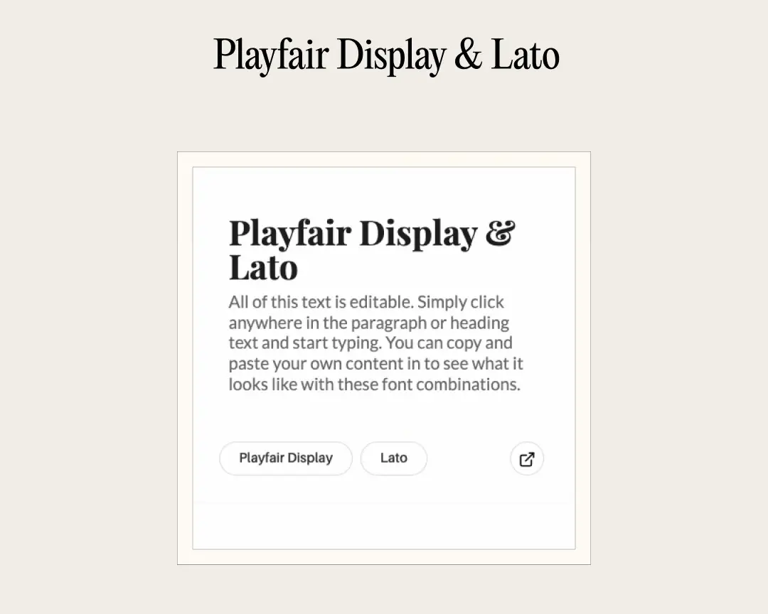
Playfair Display (for headings) + Lato (for body text) – a stylish combination of a serif and a sans-serif font.
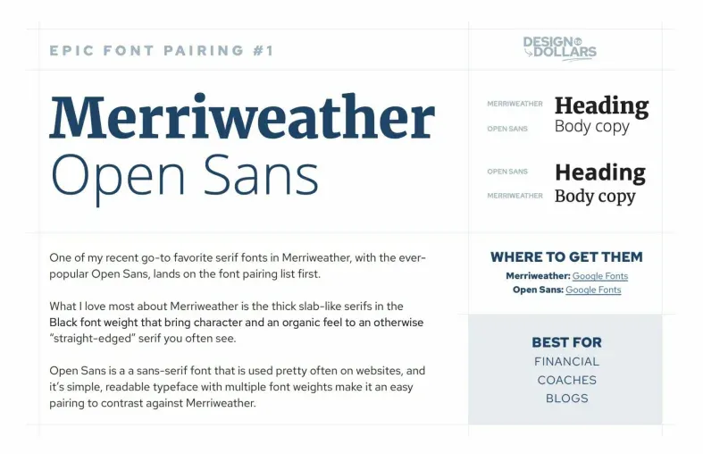
Merriweather (for headings) + Open Sans (for body text) – a contrast between a classic serif font and a modern grotesque.
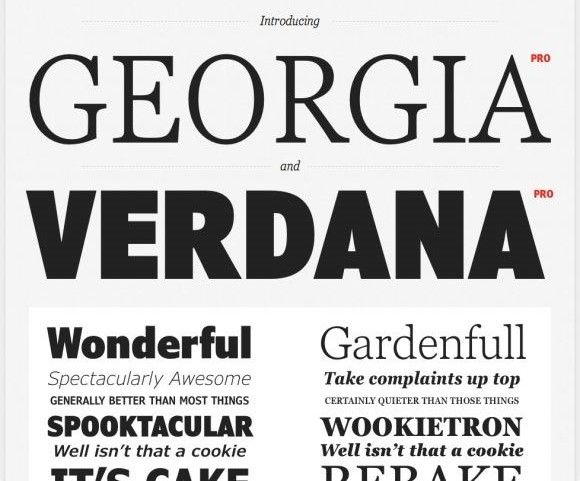
Georgia (for headings) + Verdana (for body text) – an example of a classic and modern pairing.
7. Thin and Elegant Typography
Light, delicate fonts with refined lines also have a place in modern web designs. These fonts create a sense of luxury, sophistication, and are often used in premium segments. They add a sense of "airiness" and lightness to the design.
Thin-lined fonts are used in the designs of elite brands, such as jewelry companies or beauty salons, to emphasize elegance and attention to detail.
Examples of elegant typography:
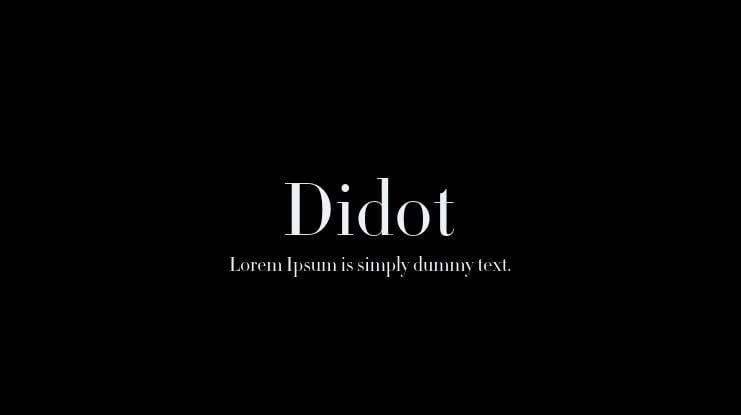
Didot – a refined and elegant font with high contrast, perfect for premium designs.
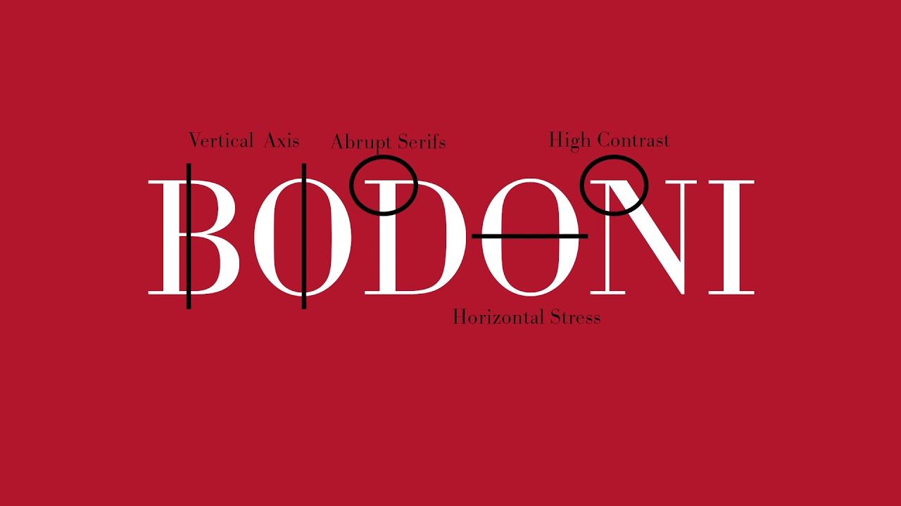
Bodoni – another high-contrast font that adds a sense of grace and sophistication to the design.
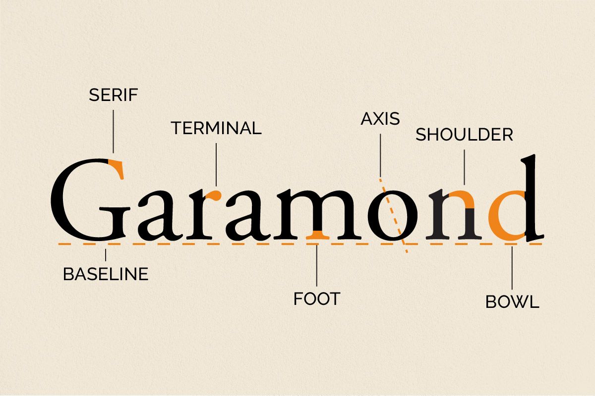
Cormorant Garamond – a thin font with a classic, delicate style.
8. Asymmetrical Typography
Asymmetry in web design is gaining popularity, and this extends to typography as well. It’s no longer necessary to strictly follow alignment rules: modern designers experiment with text placement, creating unusual compositions. This helps draw attention to certain elements on the page.
On trendy websites or creative portfolios, text may be arranged asymmetrically, forming unique shapes and giving the design a dynamic look.
Examples of asymmetrical typography:
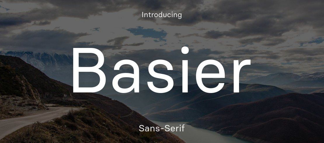
Basier Square – a square, grotesque font that pairs well with unconventional layouts.
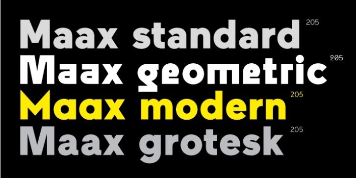
Maax – a font with different versions, allowing for the creation of dynamic asymmetrical compositions.
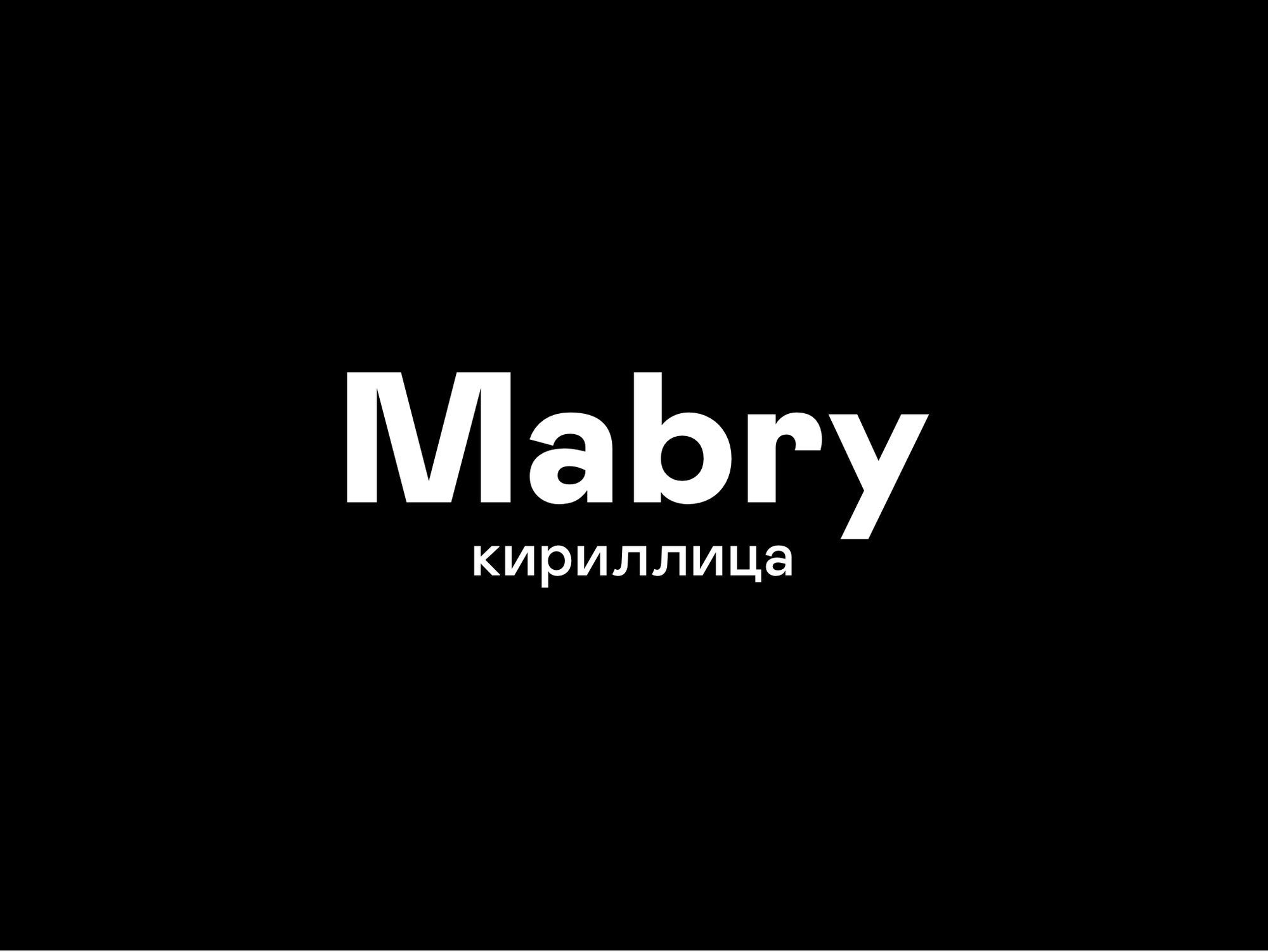
Mabry – a geometric font with unconventional proportions, which looks great in creative layouts.
The Impact of Typography on Content Perception and Readability
Typography plays a key role in how users perceive content. It can evoke emotional responses, highlight important points, and ensure easy navigation throughout the page. Well-chosen fonts can increase interest in the information, while overly complex or cluttered styles can distract and hinder readability.
For successful design, it’s important to maintain a balance between aesthetics and functionality: text should not only be beautiful but also readable. Modern typography trends help achieve this balance by offering wide opportunities for experimentation while keeping the focus on user convenience.