Nickelodeon Brings Back the Splat in its Updated Logo
As part of a new brand campaign, the Nickelodeon channel has updated its logo for the first time in 6 years and returned to its famous splat.
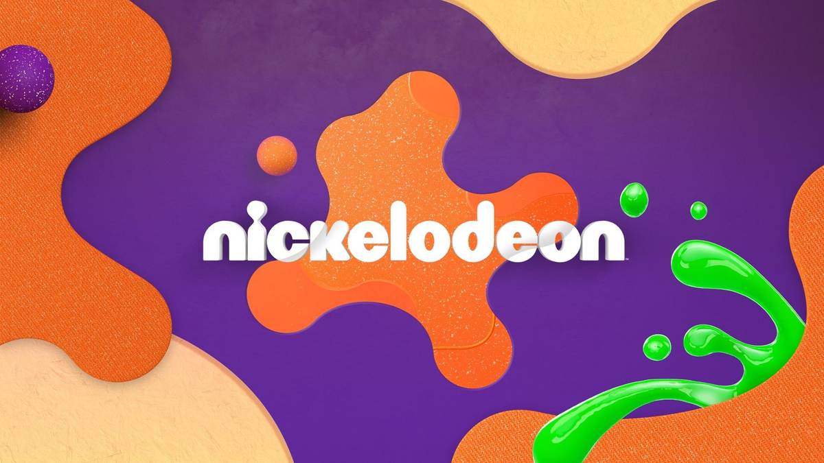
As part of a new brand campaign, the Nickelodeon channel has updated its logo for the first time in 6 years and returned to its famous splat.
The splat was last used in 2009. In 2017, the Nickelodeon logo got rid of any additional elements, keeping only the text logo.
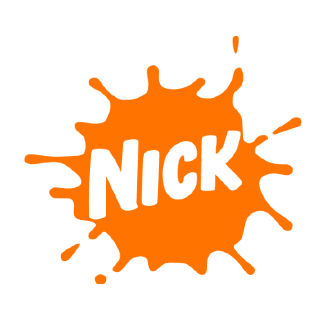
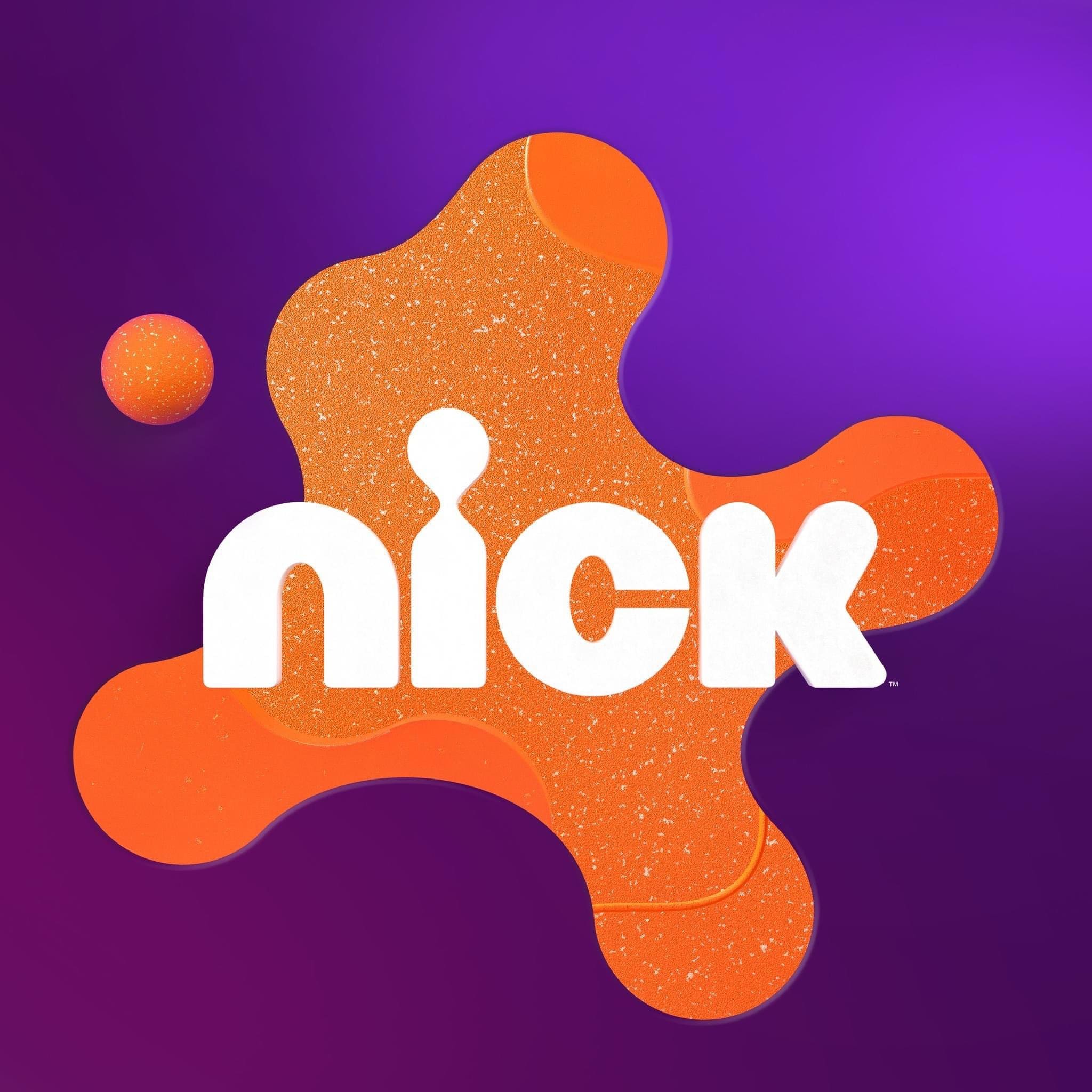

The new logo has become softer, rounded and textured to match modern design trends. Similarly to the recent Pepsi's redesign, Nickelodeon has embraced a nostalgic approach by reverting back to its 1980s style. In this way, the company wants to make the logo and the entire brand more recognizable.
Also, the updated Nickelodeon logo is designed to emphasize the dynamism and cheerfulness of the channel. Since May 8, it has already been used in the US market, and in July the rebranding, which includes various updates, will start in the UK, and will reach other markets by the end of this year.
Pepsi Updates Its Logo for the First Time in 15 Years
— UX News (@uxnewscom) March 31, 2023
Pepsi has unveiled a new logo in honor of the brand's 125th anniversary.
Read more: https://t.co/8CEbbOgI3g

