Nokia changes its logo for the first time in 60 years
Nokia has decided to change its logo for the first time in nearly 60 years due to a new "aggressive growth" strategy.
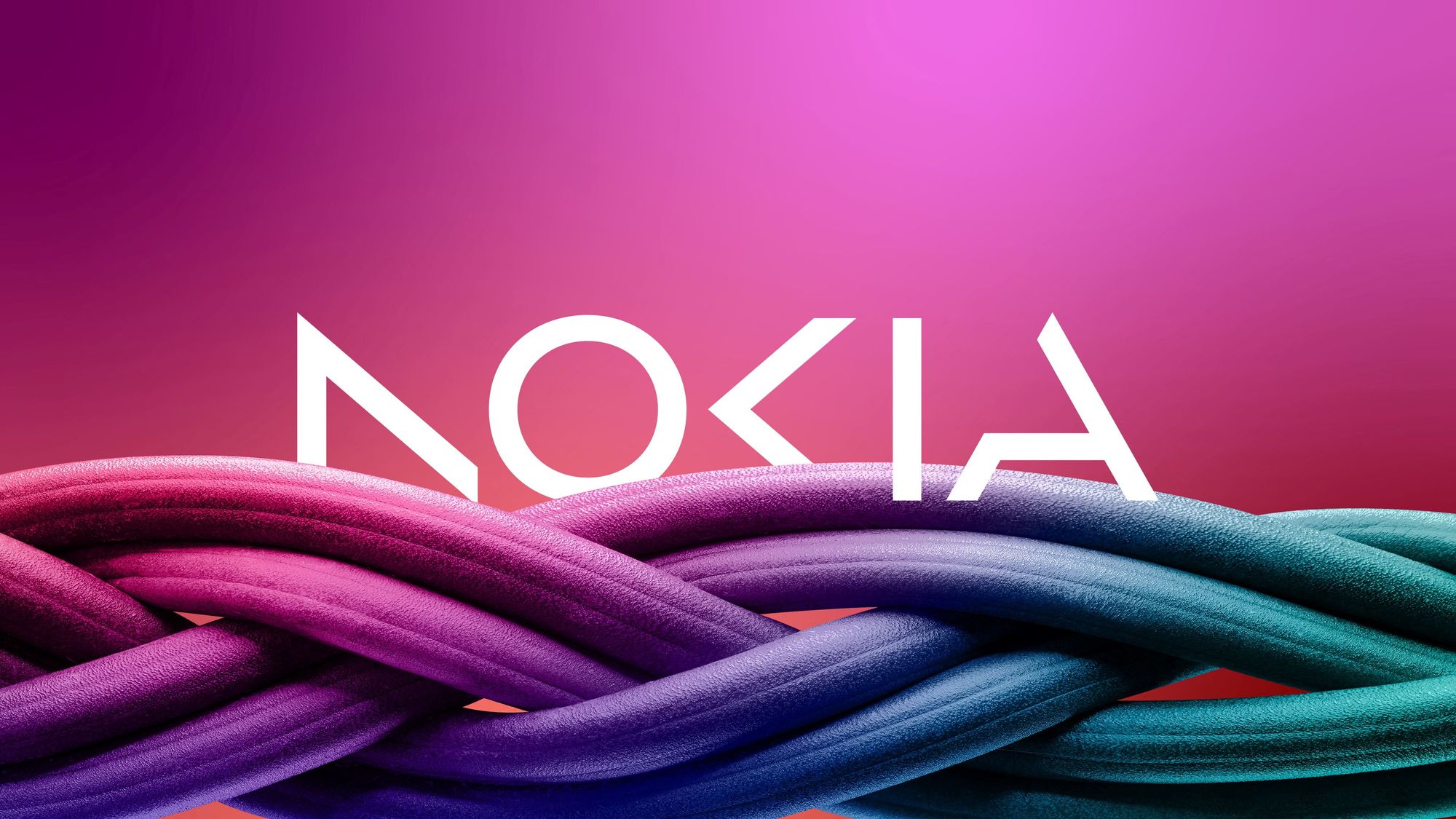
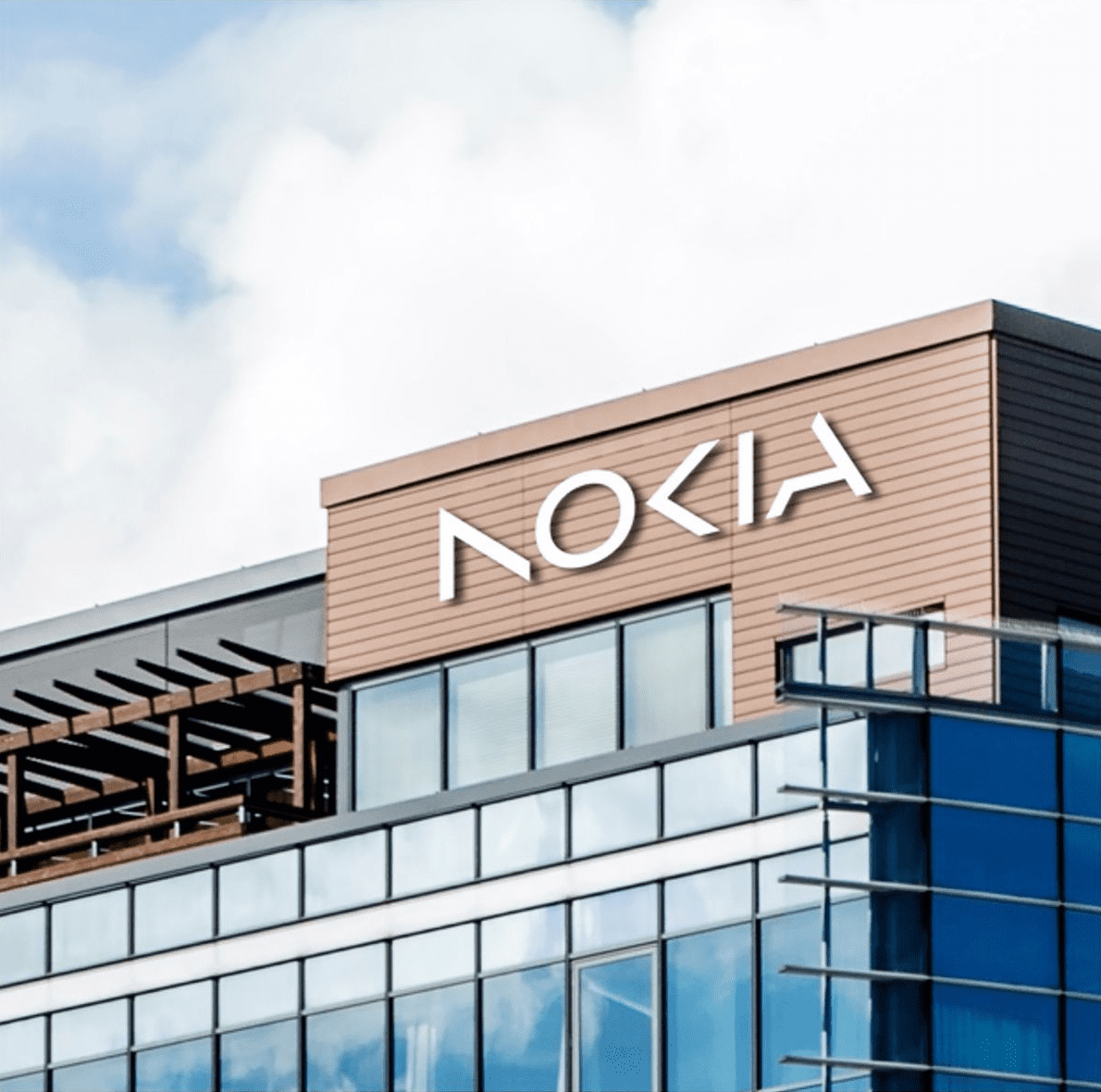
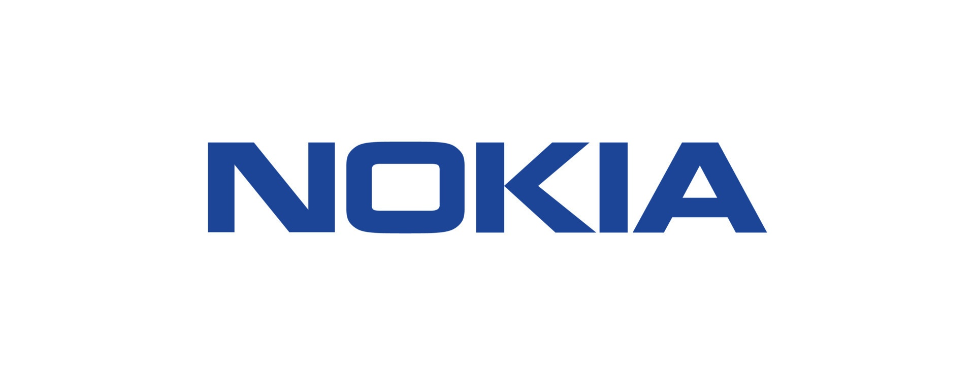
Nokia, the Finnish telecommunications giant, is known for its iconic logo that has remained unchanged for nearly six decades. However, the company has recently announced that it will be changing its logo for the first time since 1967.
The new logo is made up of different shapes that come together to form the word "Nokia". The logo no longer has the canonical blue color. It is versatile and can be used in different colors and combinations, depending on the context and application.
The redesign is linked to the company's new strategy, which consists of three phases: reset, accelerate and scale. The strategy was outlined in 2020 by the Chief Executive of the company Pekka Lundmark. According to him, the first stage has already been passed and the second stage is beginning.
Lundmark says the company used to be strongly associated with smartphones, while Nokia is now a business technology company.
US Department of Justice to block Adobe's $20 Billion Figma Acquisition
— UX News (@uxnewscom) February 26, 2023
DOJ to block the takeover of the design service Figma by Adobe for $20 billion and is now preparing an antitrust lawsuit.
Read more: https://t.co/Iz8YM1ZkIE