The use of Negative Space in Web Design
Negative space is far more than just empty space in design. It's a powerful tool that enhances readability, creates visual hierarchy, and improves user experience.
In web design, every pixel counts, yet negative space—also known as white space—is often overlooked. When used effectively, negative space can greatly enhance user experience, visual appeal, and content communication. This article delves into the importance of negative space in web design, its proper usage, and its impact on user engagement.
What is Negative Space?
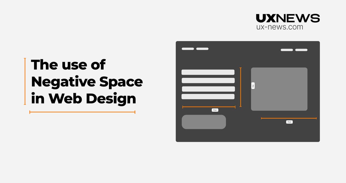
Negative space refers to the empty areas around and between elements on a webpage. It lacks content such as text or images, allowing the design elements to "breathe."
Despite its name, negative space is far from being negative. In fact, it's a crucial component of a well-balanced design. It helps to direct attention, create visual hierarchy, and improve readability, making the overall design more user-friendly and aesthetically pleasing.
The Role of Negative Space in Web Design
Enhancing Readability
Negative space improves readability by reducing clutter and creating a more organized layout. Well-spaced text allows users’ eyes to move comfortably across the page, promoting better comprehension and deeper engagement with the content. This clean visual environment reduces cognitive load and lowers bounce rates, enhancing user satisfaction.

Creating Visual Hierarchy
Negative space helps establish visual hierarchy by guiding the user's eye to important elements. Strategic spacing around key components, like call-to-action buttons, draws attention and increases the likelihood of interaction.
Balancing the Design
A balanced use of positive (content) and negative space creates a cohesive, functional, and aesthetically pleasing design. While too much content can overwhelm users, excessive empty space can make a design feel incomplete. The right balance ensures a harmonious layout.

Encouraging Focus and Interaction
Negative space draws attention to surrounding elements, making it easier to emphasize headlines, images, or CTAs buttons. This focus encourages user interaction by highlighting intended actions.

The Psychological Impact of Negative Space
Beyond aesthetics, negative space influences user psychology. Cluttered designs can induce stress and confusion, leading to a negative user experience. Conversely, designs with well-used negative space feel open, calm, and inviting, enhancing user comfort and interaction.
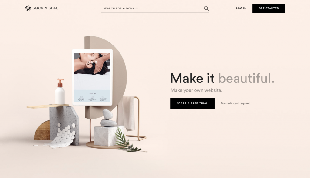
Additionally, negative space can convey luxury and sophistication. Many high-end brands use generous amounts of it to communicate exclusivity and elegance.

How to Use Negative Space in Web Design
- Start with Minimalism: Begin your design with a minimalist approach, adding elements only as needed to ensure negative space is integrated from the start.
- Increase Line Spacing: In text-heavy areas, increasing line spacing improves readability by reducing eye strain and making the content more approachable.
- Prioritize Key Elements: Give important elements more room to stand out, while grouping less crucial ones with less space to guide user attention effectively.
Conclusion
Negative space is far more than just empty space in design. It's a powerful tool that enhances readability, creates visual hierarchy, and improves user experience. By mastering the principles of negative space, web designers can create websites that are not only visually appealing but also highly functional and engaging. Whether pursuing a minimalist design or refining an existing layout, leveraging negative space is essential for achieving a clean, effective web design.