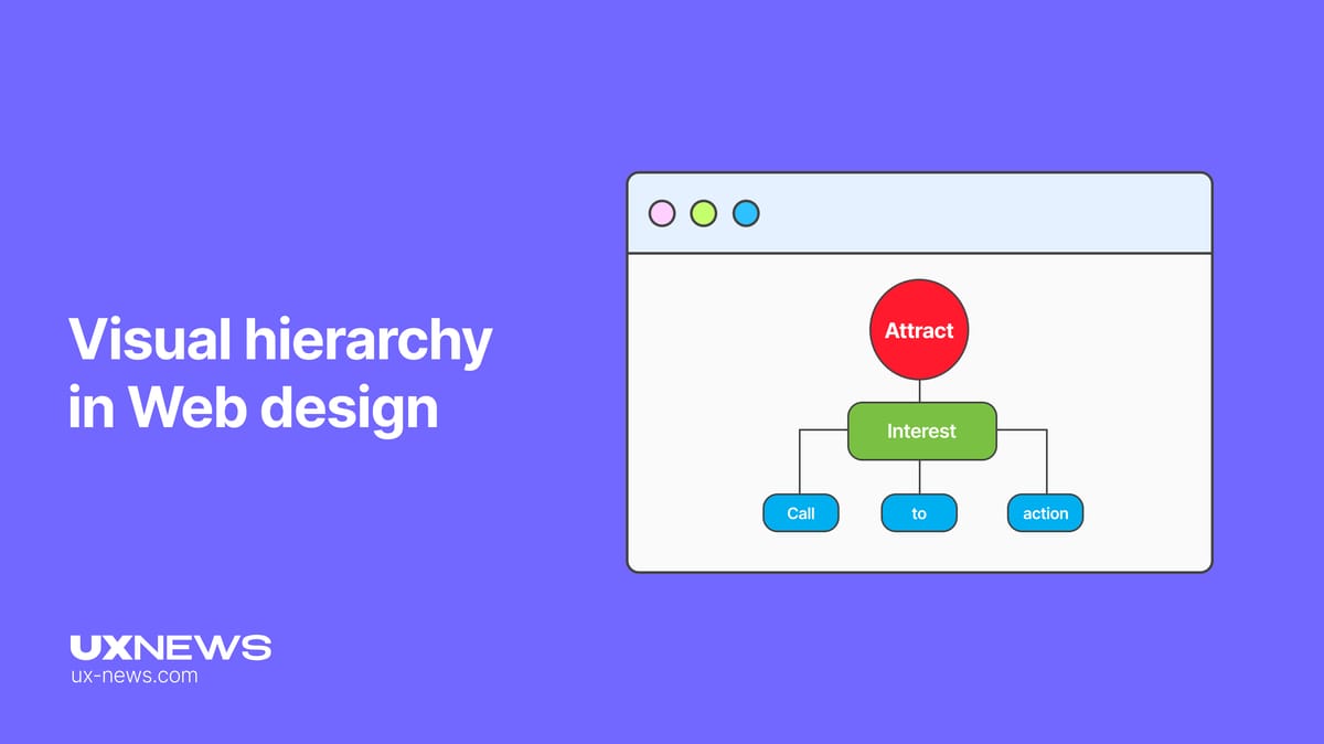
Visual hierarchy in Web design
The article emphasizes how visual hierarchy in web design improves user experience and engagement by directing attention to essential information.
What is Visual Hierarchy?
Visual hierarchy in design is a principle that determines the order of information perception through visual means. It helps users navigate content more quickly by emphasizing the most important elements and organizing them in a logical sequence. Therefore, visual hierarchy in web design includes the following components:
Size
Size is a powerful tool in visual hierarchy that can significantly affect how information is perceived and valued. Larger elements attract more attention than smaller ones. This is based on our natural tendency to notice bigger objects first. The size of an element also matters in relation to other elements. For example, a large heading indicates importance, while smaller text may be less significant.

In other words, you can use size to increase or decrease the visibility of visuals. Naturally, the most important parts of a design will be larger. Use no more than three sizes: small, medium, and large. This allows for enough variety, for instance, for header, subheader, and body text fonts, while maintaining a clear hierarchy.
Color
The color palette is an essential design element that can vary in brightness, shades, and saturation. Bright colors help highlight the most important information or images. Different colors evoke different emotions: for example, blue is associated with relaxation and calmness, while green is linked to tranquility, making them popular choices for websites.

However, it is important to avoid an excessive number of colors; a combination of two to three colors is often optimal. When too many colors of similar value or saturation are used, people’s perception of hierarchy among elements often deteriorates.
Contrast
Contrast defines the difference between two objects and is a key element of visual hierarchy in web design. Effective use of contrast makes your site attractive and capable of capturing users' attention. For example, bright colors on a dull background can emphasize important elements. Designers often use warm and cool colors to enhance visual appeal, creating contrast that makes the site more effective. Contrast can manifest through color choice, font style, patterns, temperature, and color saturation.
To build visual hierarchy, it is important to allow important elements to stand out through contrast with other parts of the design. For instance, if the body text is set in a serif font, try using a bold sans-serif font for headings to draw attention. Instead of limiting yourself to cool tones, add warm colors to create a contrasting hierarchy in the design.
Alignment
To achieve effective visual hierarchy in web design, it is important to ensure harmony. Proper alignment of components creates a clean and organized appearance, reducing visual clutter and simplifying navigation for users.
However, alignment is not just about neatly arranging elements. It is also important to establish visual connections between them, which supports hierarchy and helps users focus on key aspects. For example, large elements such as headings, subheadings, and quotes often look better when centered, while body text can be placed in columns or left-aligned to maintain a tidy appearance.
Use space to balance left-aligned text and ensure adequate margins to enhance readability. While alignment is usually related to typography, this principle can also be applied to patterns, lines, and other illustrations. Using a grid approach in design helps maintain a sense of organization across all components.
Repetition
Repetition is another effective method for creating visual hierarchy in web design. It involves reusing specific elements and styles in a composition. Repetition promotes consistency, which, in turn, keeps users engaged on the screen.
Additionally, repetition can strengthen branding. Using your logo, brand colors, and typography helps reinforce brand identity. Thus, repetition aids in recognizing and recalling your brand, creating a more cohesive user interaction.
White Space
White space, or negative space, is a key element of visual hierarchy in web design. It improves balance and readability, providing users with visual space to rest, making content more appealing.
The stereotype that white space is only important in minimalist design is incorrect. It enhances user attention in any style. Proper use of white space means removing unnecessary elements and leaving only the most essential ones.

Texture and Style
Using appropriate textures and styles is critical for maintaining visual hierarchy in web design. For example, both subtle and bold textures can make your web elements more appealing and attractive. You can also use them to delineate sections.
The most common textures and styles are gradients, shadows, and patterns. For instance, a call-to-action (CTA) button with a slight gradient and shadow is more attractive. This can quickly draw users' attention and encourage them to purchase your product or subscribe to your newsletter.
However, excessive use of textures and styles can lead to a cluttered design. Always maintain balance and use textures and styles thoughtfully.
Conclusion
Visual hierarchy is about making your website easy to use and enjoyable to browse. It’s the secret to turning visitors into regulars. Keep it simple, clear, and watch your site do the work for you.