WhatsApp unveils refreshed design for iOS and Android apps
WhatsApp unveils refreshed design for iOS & Android apps, featuring a new green accent color, redesigned UI elements, and enhanced Dark Mode for improved readability. The update streamlines the user experience across both platforms.
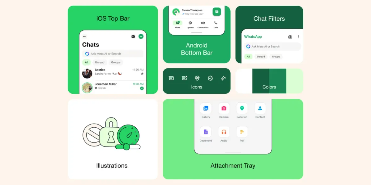
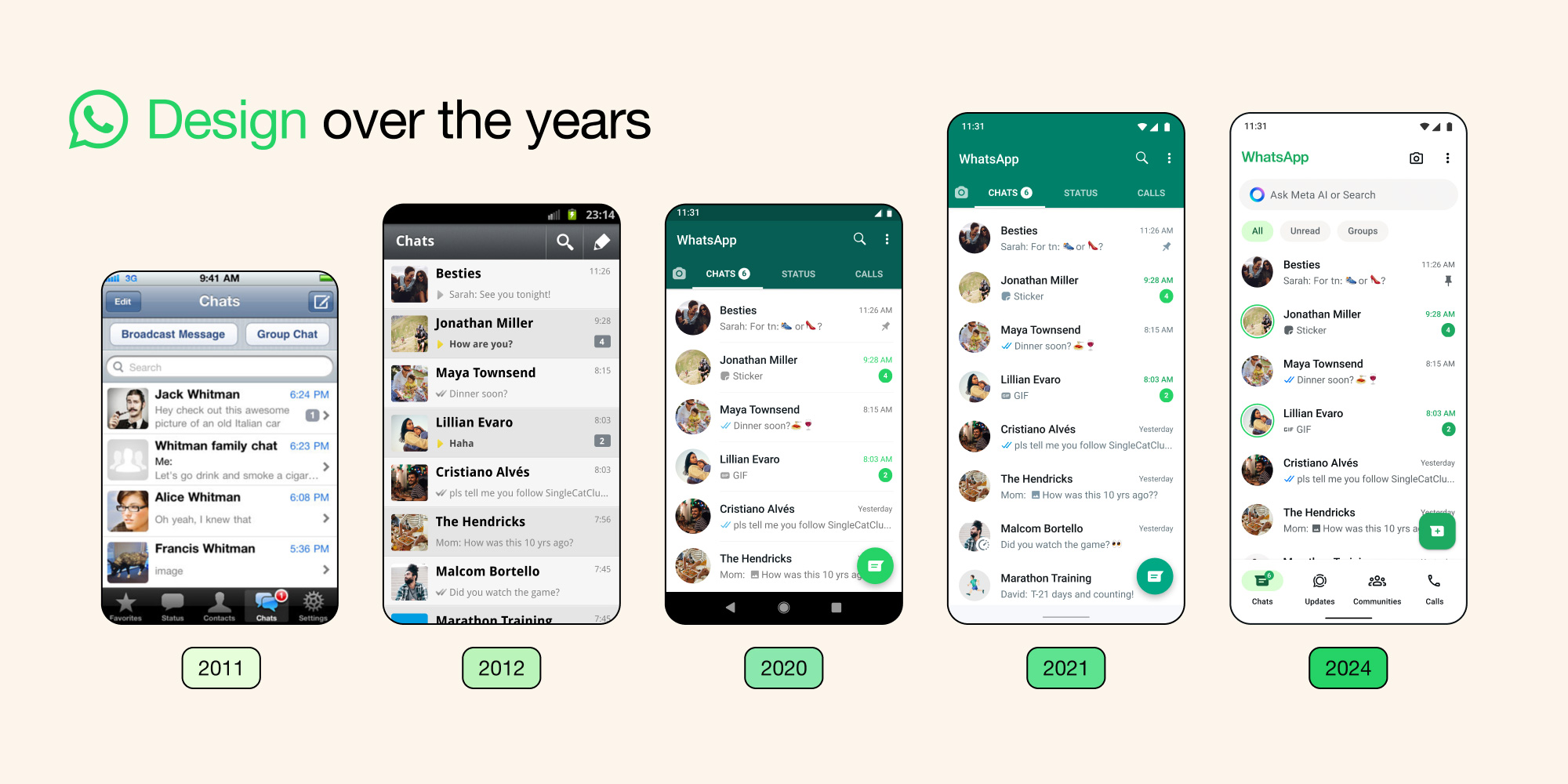
WhatsApp has released an update featuring a refreshed design for both iOS and Android users. This update streamlines the user experience across platforms with a new color palette and other visual enhancements.
A Focus on Green
The update introduces green as WhatsApp's primary accent color. This is reflected in various UI elements such as notification badges and buttons.
For Android users, a significant change is the relocation of the tab bar to the bottom of the screen, mirroring the layout of the iOS app.
Enhanced Dark Mode and Updated Aesthetics
In Dark Mode, the color scheme has been adjusted to provide higher contrast and darker tones, addressing user requests for improved readability in low-light environments. Icons and illustrations have been redesigned with a more rounded and contoured style. Additionally, the update incorporates new animations and chat wallpapers.
Prioritizing User Experience
WhatsApp emphasizes its commitment to providing a seamless and intuitive user experience. The design refresh aligns with the core principles of simplicity, reliability, and privacy. The updated UI aims to be universally functional and complements existing user habits, ensuring easy navigation for all.
Availability and Updates
Following a testing period with beta users, the refreshed design is now available for global rollout. Last month, WhatsApp introduced passkey support for its iOS app. The app remains free to download on the App Store, requiring iOS 12 or later. Users are encouraged to update the app to access the latest features.

