YouTube enhances TV App experience with redesigned video player
YouTube revamps TV app with dual-column video player. New UI enhances user engagement by showcasing channel details, descriptions, and comments alongside video, all without interrupting playback.

Focuses on Increased Engagement While Maintaining User Immersion
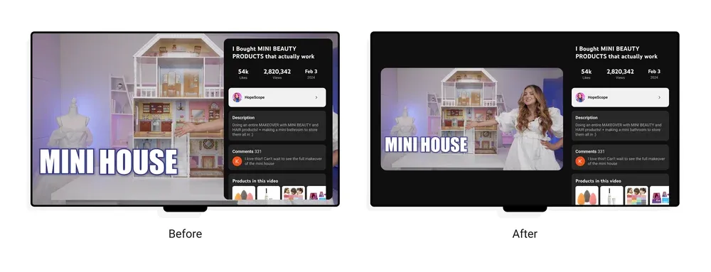
YouTube announced an upcoming redesign of its video player for smart TVs and streaming devices. This update aims to enhance user engagement in the living room environment by introducing a dual-column user interface (UI).
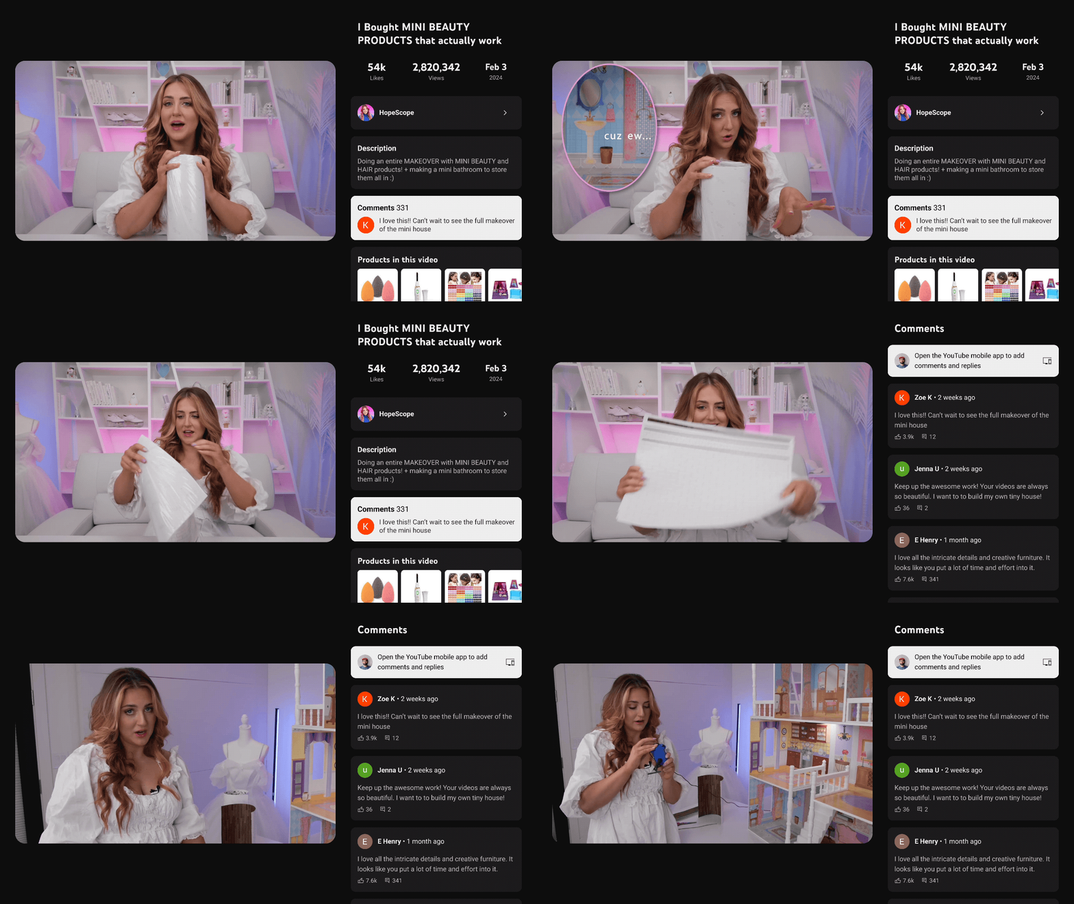
Previously, accessing video information required an overlay that partially obscured the content. The new UI addresses this by shrinking the video window slightly and incorporating a dedicated column to display channel details, descriptions, comments, viewing statistics, and even shopping features – all readily available without interrupting the viewing experience.
Prioritizing Ease of Use and Core Functionality
The design prioritizes ease of use. Core video controls such as pause, rewind, and fast-forward remain readily accessible and intuitive. The development process involved prototyping various UI complexities, ranging from a simple on/off toggle for the dual-column view to options with integrated video player controls.
Unlocking New Experiences for Users
This dual-column UI paves the way for future innovations. YouTube envisions a "broad range of new experiences," including the ability to directly purchase products endorsed by creators or view live sports updates. Additionally, the design offers more prominent access to chapter markers and key highlights within videos.
Availability and Future Developments
The redesigned video player will be rolled out to the YouTube app on TVs within the next few days. YouTube TV subscribers will also benefit from this update, allowing them to explore additional content without interrupting their live broadcasts.

