YouTube is testing a new design that you'll probably hate
YouTube tests new desktop UI layout in A/B experiment. Titles, descriptions, comments relocated to right panel, video recommendations positioned below player.
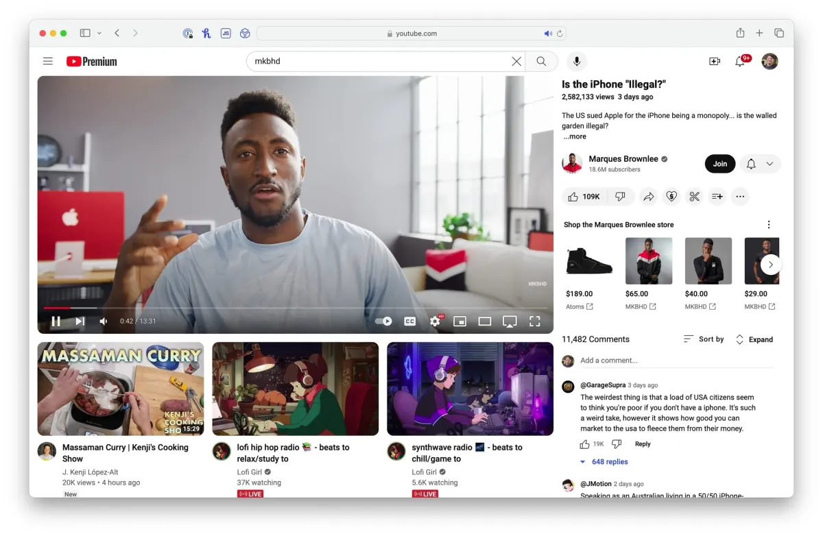
A/B testing is a frequent practice for YouTube, allowing users to preview potential design changes. Currently, a small portion of users are experiencing a significant UI alteration that relocates video information and comments to a right-hand panel, with video recommendations positioned directly below the video player.
Previously, titles, descriptions, and comments resided beneath the video, while recommendations appeared on the right side. This revised layout seemingly prioritizes comment visibility without requiring users to scroll away from the video content.
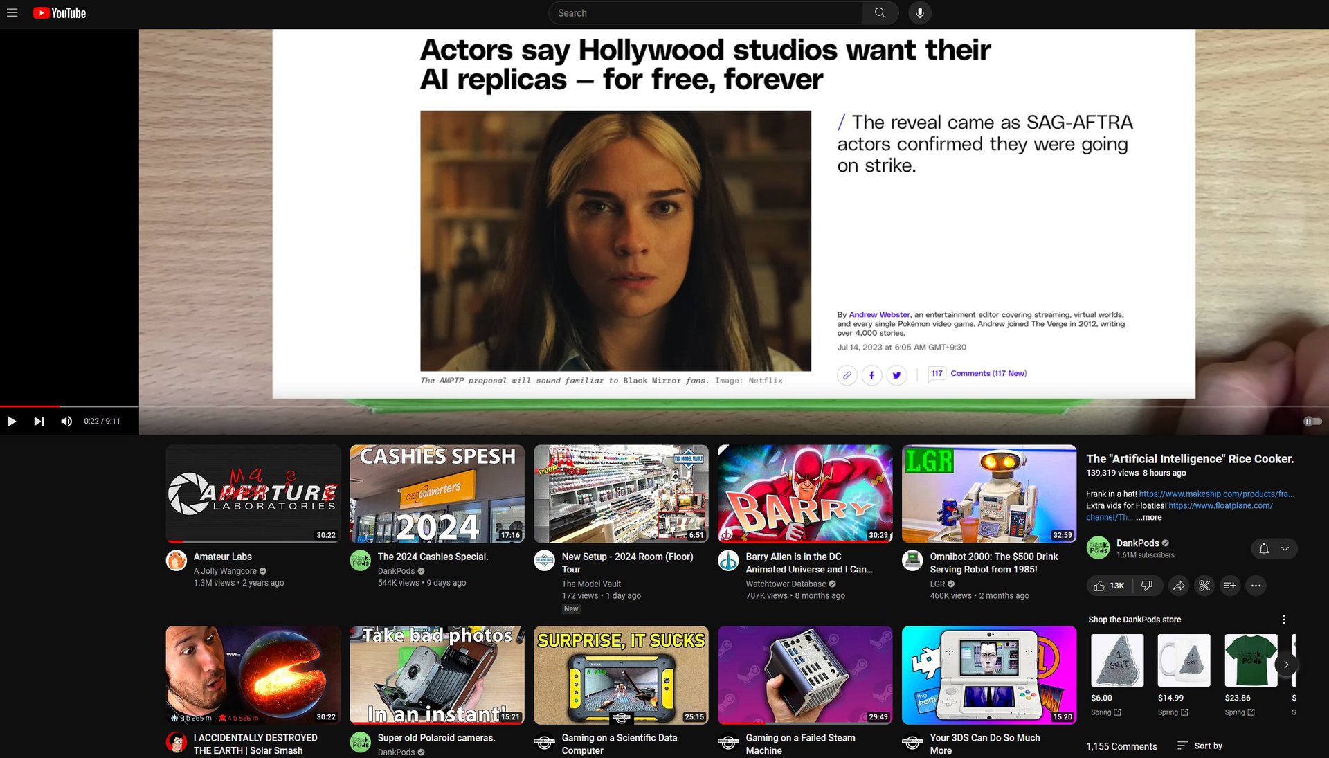
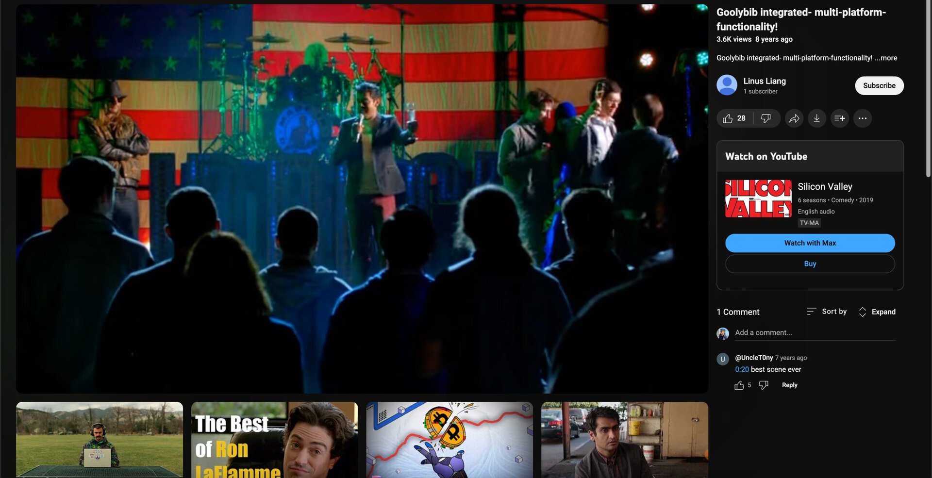
Initial user reception appears divided. While the functionality of the new design holds merit, some users express concerns regarding potential visual clutter and a less aesthetically pleasing presentation. YouTube has acknowledged this feedback, confirming the layout is an experiment intended to evaluate improvements to features and user experience.

