YouTube is testing a new player design on Android
YouTube has started testing a new player design for smartphones. Some users were dissatisfied.

YouTube has started testing a new player design for smartphones. Some users received the update a few months ago and were dissatisfied.
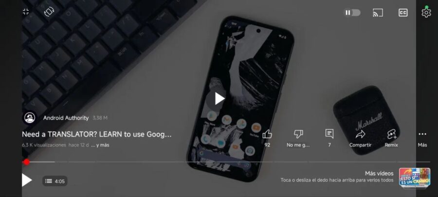
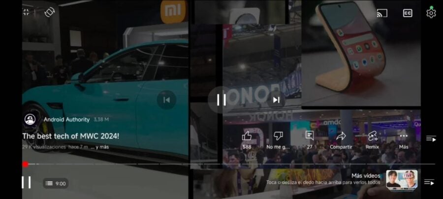
The new interface is more compact, featuring additional controls. For example, the video title now appears at the bottom, along with the view count and upload date.

The channel name has also been moved down, now accompanied by an icon and subscriber information. The fullscreen and rotation buttons have been relocated to the upper left corner, where the title used to be.

The main change is the absence of forward/backward buttons in horizontal mode, while they remain in vertical mode. Additionally, when watching videos from a playlist, users can "swipe" through them like in Shorts.
Video: Android Authority
Users on Reddit who have already experienced these changes express their dissatisfaction, arguing that there's no need to alter something that already works well. In the comments, they note that the new player design resembles the YouTube interface for smart TVs. Overall, the updates have received a negative response.


