Dribbble Refreshes Its Logo for the First Time in 14 Years!
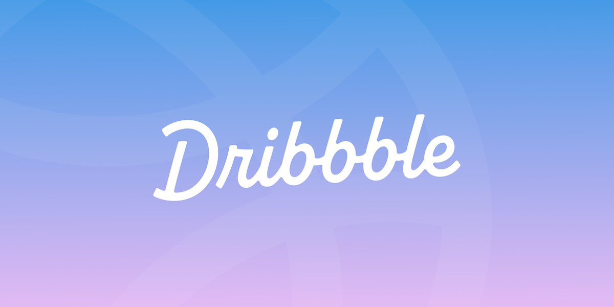
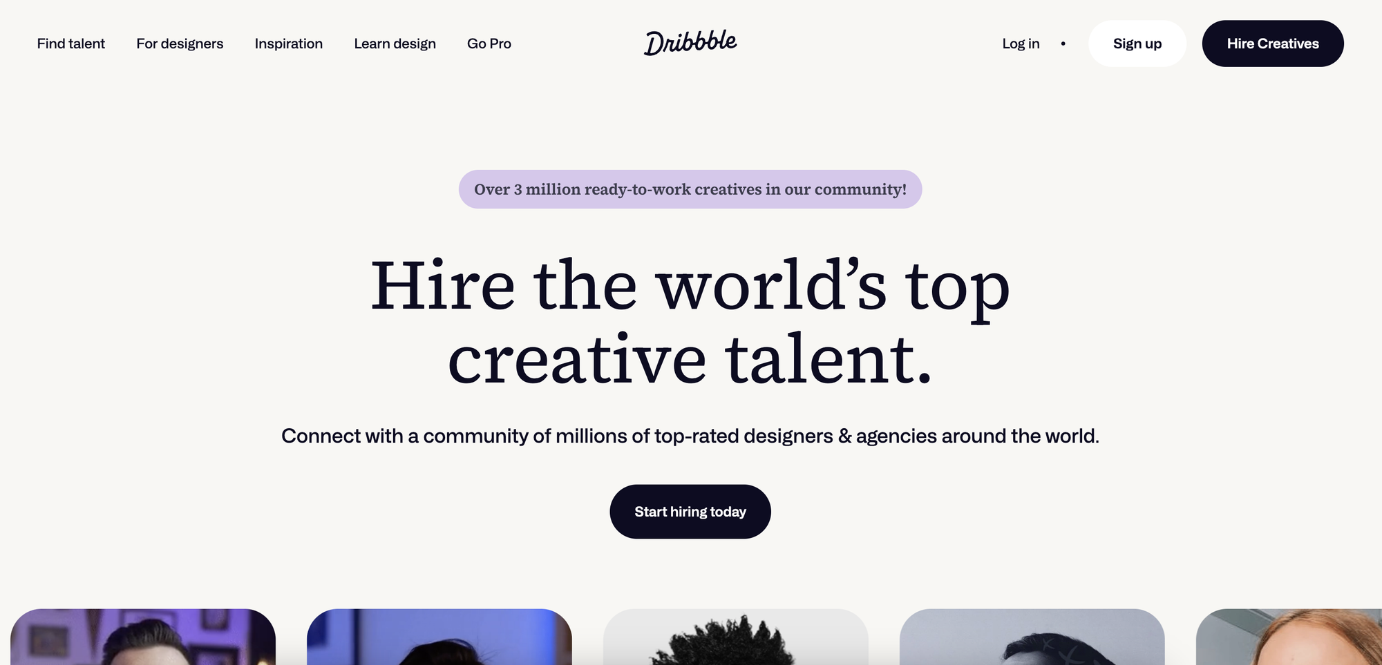
Dribbble is marking a major milestone in its 14-year history with a refreshed logo and some great platform upgrades.
Dribbble is marking a major milestone in its 14-year history with a refreshed logo and some great platform upgrades.
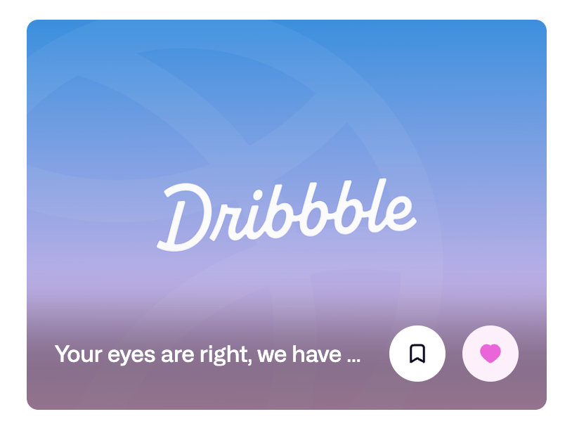
The new logo is supposed to better represent its vibrant and diverse community and to reflect its goal to become the premier global destination for hiring top design talent. And after all, it really looks fresh and dynamic.
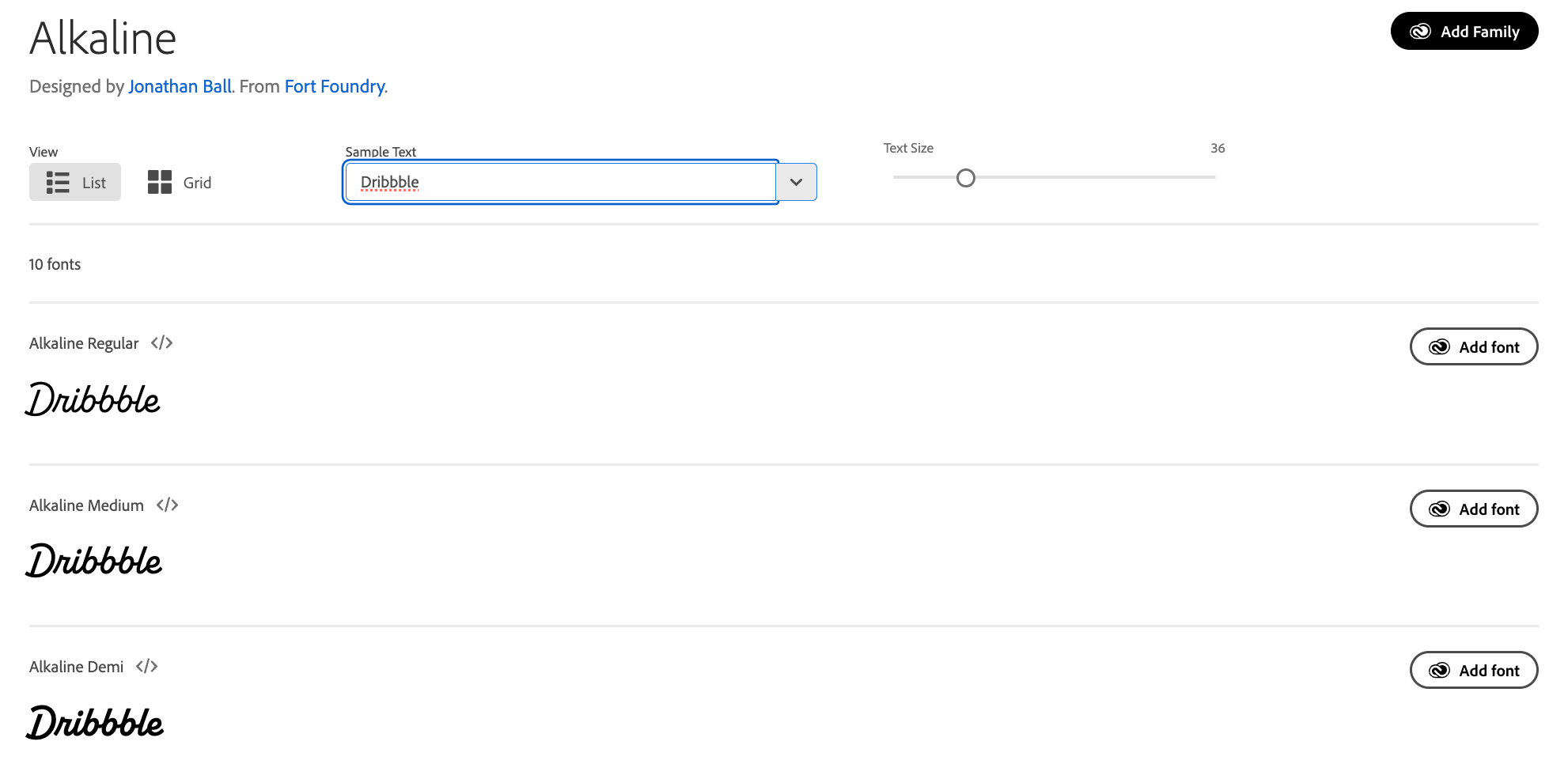
Dribbble has also changed the font family as now the logo's font is Alkaline.
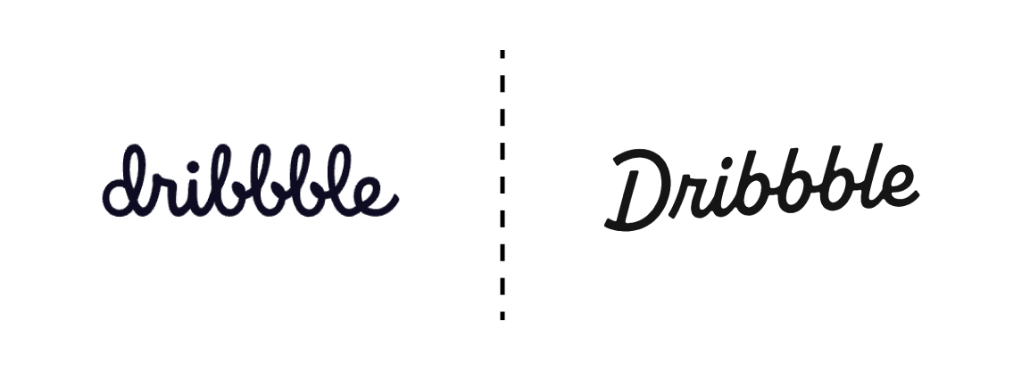
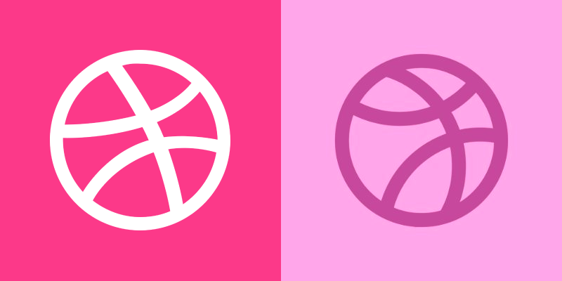
The ball symbol of Dribbble Team has also been renewed — now it's in violet and soft pink colours instead of white and acid pink.
There are also some small changes in the platform details:
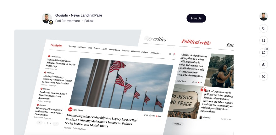
1.The covers in the profile have become rounded and the background is now transparent.
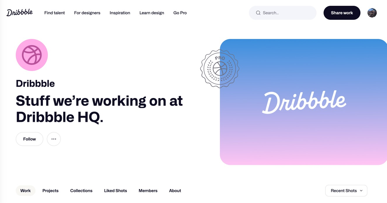
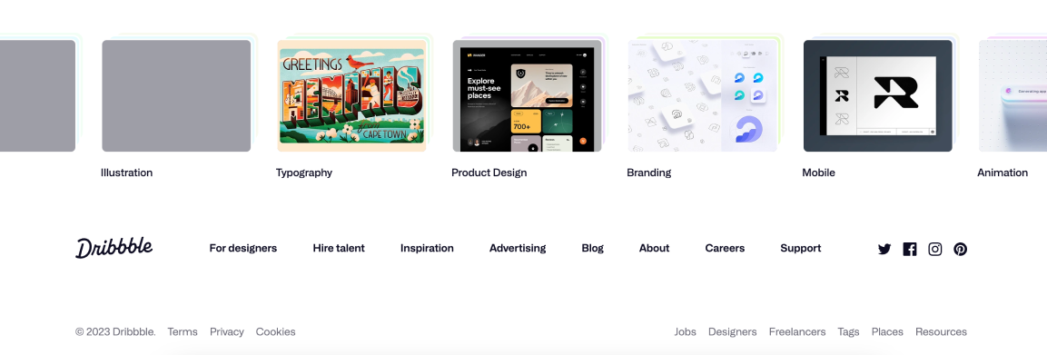
2. The buttons are now round.
3. When opening a shot the hiring button has become accentuated, and the like button is now in the right panel.
4. The footer has become a lot more simple and the branded counter of published shots has been removed.
We're expecting a lot more new design updates and innovative features to roll out in the upcoming weeks and months.
This rebranding reflects Dribbble's commitment to become the global go-to destination for hiring talented creators all over the world. These changes signal a pivotal moment as Dribbble continues to evolve, enhancing the design experience for its vibrant community and customers, reaffirming its position as a design industry leader.
⚡️ The Release Date and Key Features of Windows 12 Unveiled
— UX News (@uxnewscom) July 9, 2023
Windows 12 is slated for a fall 2024 release. Among the notable updates, users can expect the introduction of a floating taskbar and an array of AI features.https://t.co/ehICPHELkv.