Google Maps Undergoes a Colourful Transformation: A Closer Look
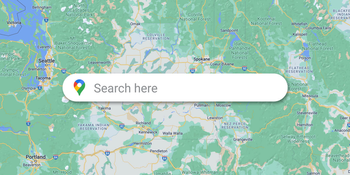
Google Maps refreshes its look for a better user experience. The familiar white roads on a gray background are now gray on white, and the blues are brighter.
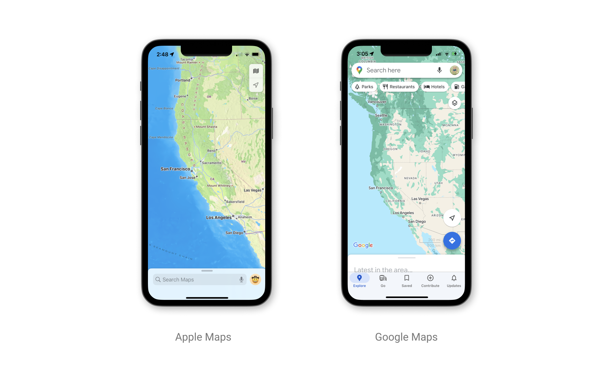
If you've been using Google Maps recently, you might have noticed something different about its appearance. The popular mapping service seems to be in the midst of a visual overhaul, one that's drawing comparisons to its rival, Apple Maps. Although Google has yet to make an official announcement about these changes, they haven't gone unnoticed by eagle-eyed users and tech enthusiasts.
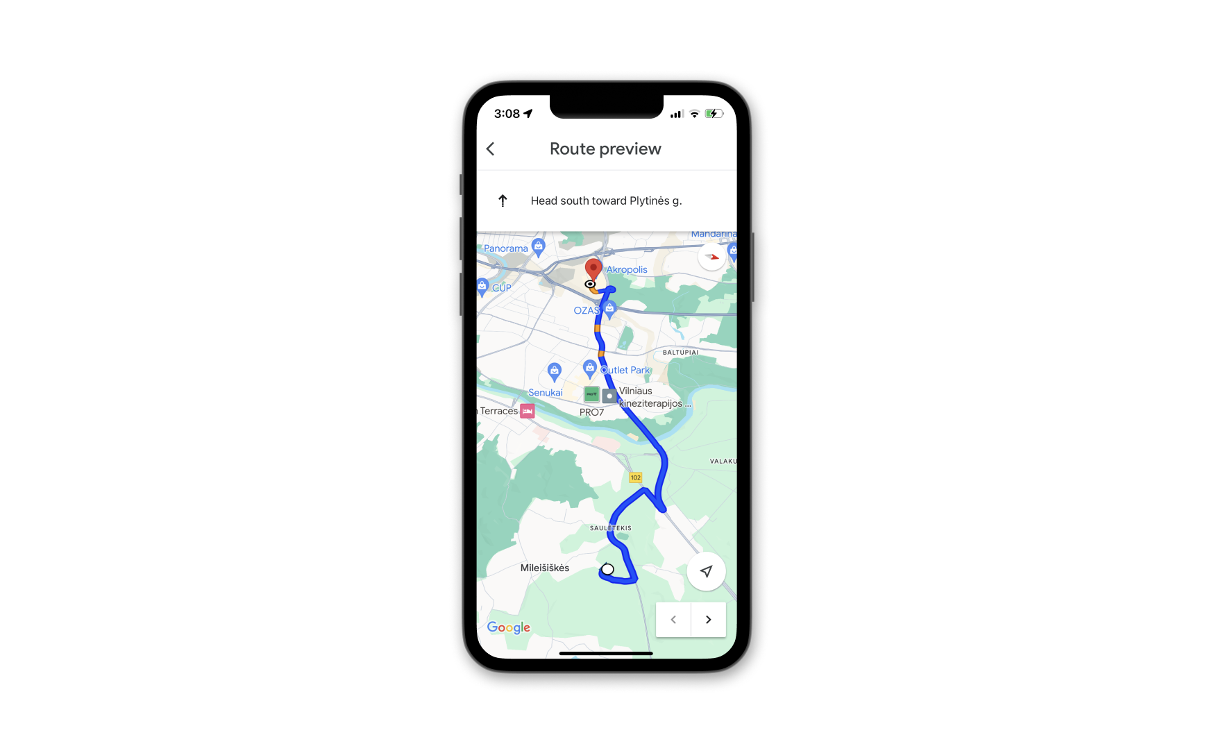
So, what's the buzz all about? It's the new color scheme that's catching everyone's attention. Instead of the familiar white roads on a gray background, Google Maps has now embraced gray roads against a white backdrop, mirroring the aesthetics of Apple Maps. Even the colours of the oceans and lakes have been brightened, further blurring the line between the two mapping giants.
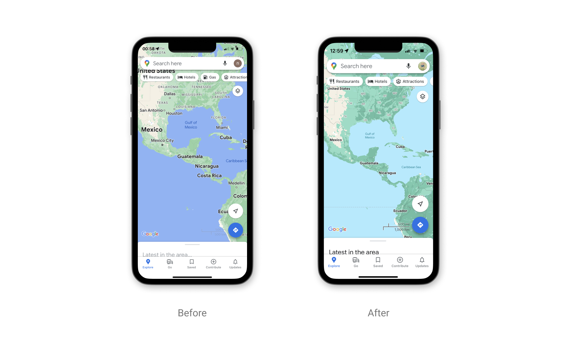
Not just limited to roads and water, the color palette revamp extends to greens, which have taken on a darker hue. Even the navigation route arrow has changed, adopting a deeper shade of blue. It's all part of Google's efforts to refine its user interface, including tweaks to the bottom bar, which now features a more compact series of tabs beneath the map.
This visual facelift is the most significant one Google Maps has seen since 2020, with the previous update dating back to 2017. If these changes become permanent, it would align with Google's historical update schedule. However, not everyone has received this update yet, as it appears to be rolling out gradually, according to Android Police.
One might wonder why Google is adopting a color scheme that resembles its competitor. The answer is quite simple: user experience. Both Apple and Google have likely conducted extensive research and examined focus groups to determine the most visually appealing and user-friendly colours for maps. Similarity between the two apps also makes transitioning from one to the other more seamless for users.
💥Shazam gets two new widgets for the iPhone lock screen
— UX News (@uxnewscom) September 6, 2023
Two minimalistic widgets can now be added to the iPhone lock screen: a button for quick music search and a panel with the last found song.https://t.co/P7rn5Uco9v