Google Unveils Material You Redesign for Translate App on iOS
Google Translate is now the first app on iOS to fully receive the Material You design overhaul. Let's see what has changed.
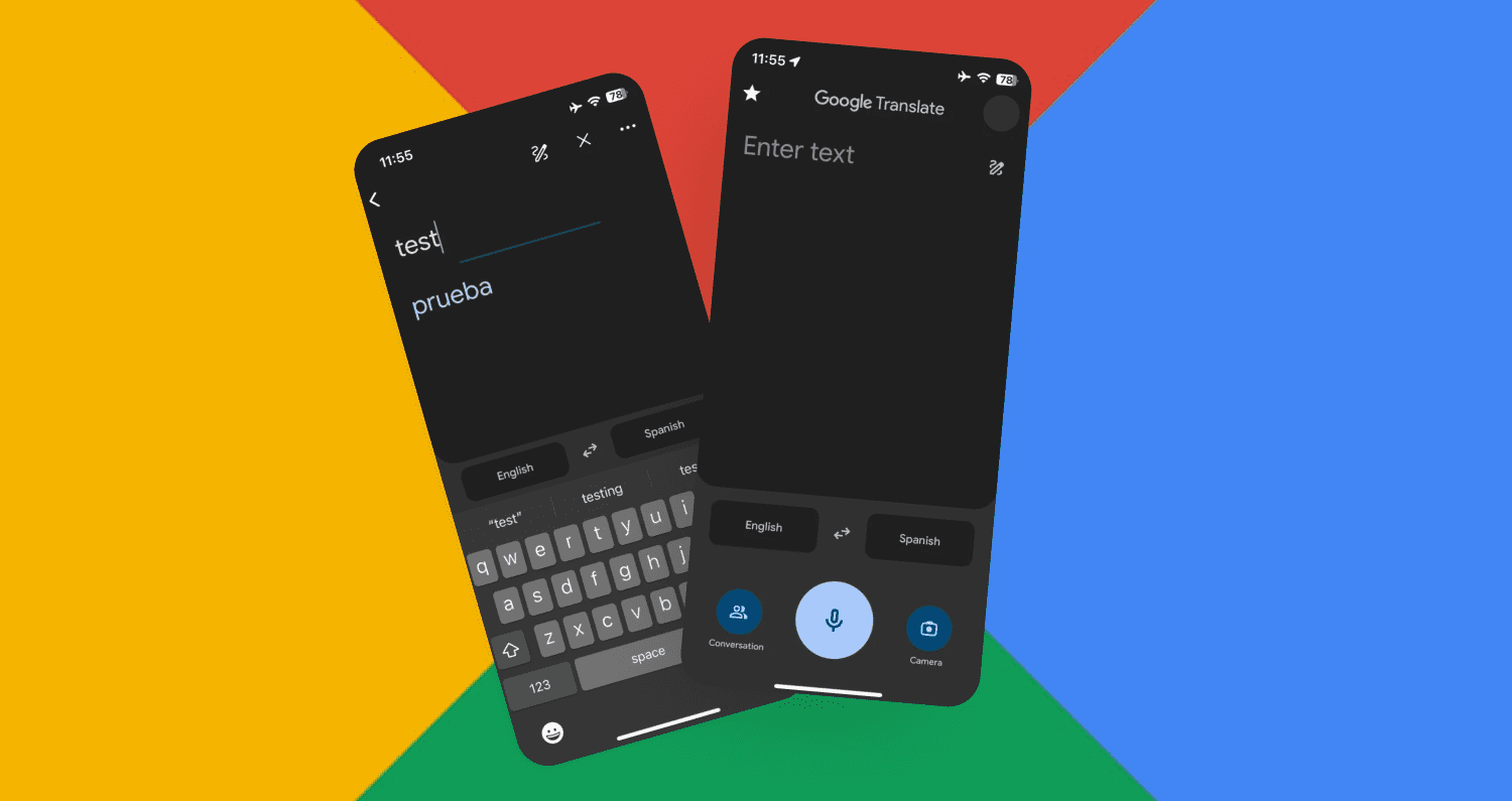
Google has updated its Translate app to finally add the Material You design language to the iOS version. Google Translate is now the first app on iOS to fully receive the Material You design overhaul. Let's see what has changed:
- Firstly, the overall theme of the app has changed to the Material You theme.
- The bottom navigation bar is now gone and replaced with custom input options. The input field has become much larger.
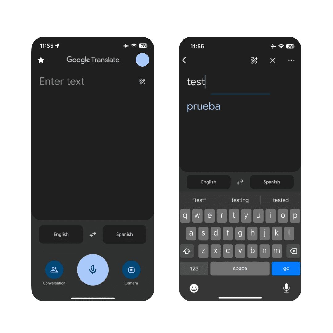

- At the bottom there is now a talk button, a slightly larger microphone button and a camera icon.
- Above them are language selectors that allow users to select the main language and target language.
- In the upper left corner there is the ability to access saved phrases, transcripts.
- The avatar icon allows users to navigate to the translation history.
- The ability to quickly select a language with a long press, which is on Android, unfortunately, is not yet available in the iOS version of the application.
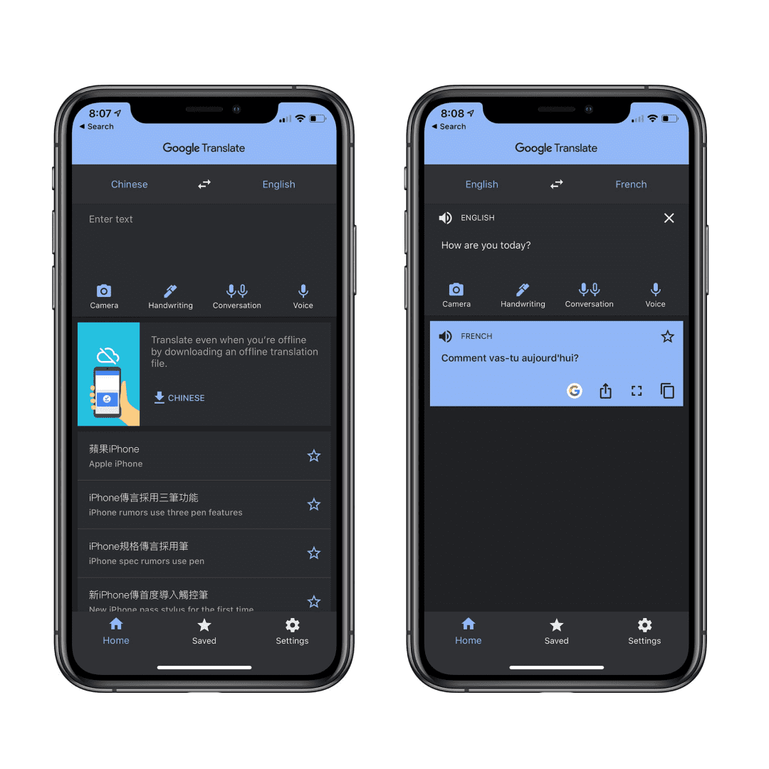
A few years ago Apple released its own translator. The new version of Google Translate for iOS visually resembles it, but is more convenient and accurate. Below you can compare the interface of Apple's translator and the new version of Google Translate for iOS.
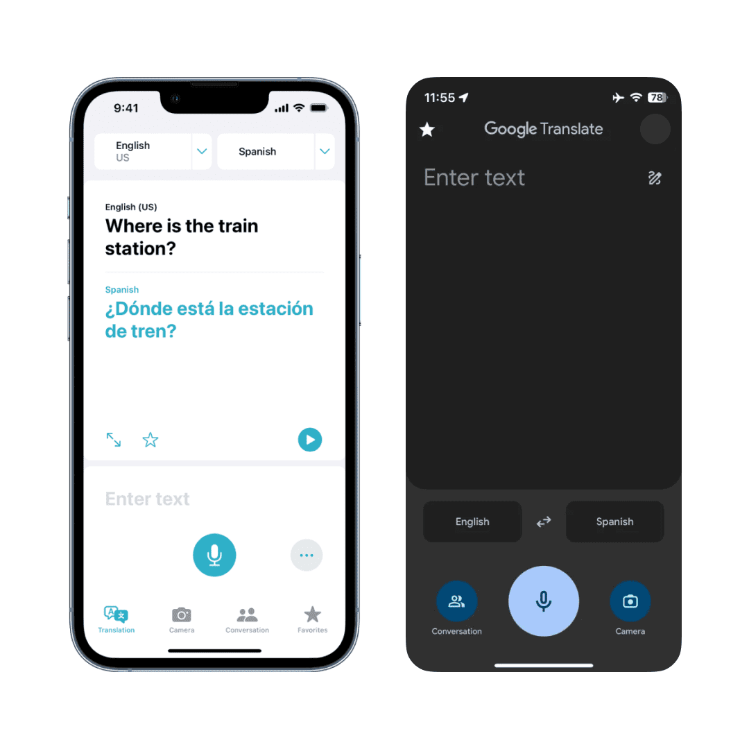
The latest iteration of Google Translate has been accessible on the Apple App Store for a certain period, and the updated MaterialYou design is now rolling out to all users.
Top 5 New AI-Powered Design Services That Will Save You Time
— UX News (@uxnewscom) April 15, 2023
Each day, a multitude of AI services are being developed to make our lives easier. We've handpicked 5 of the most promising ones for designers and want to share them with you!
Read more: https://t.co/3rGLmHUTCO

