Netflix unveils its fluid and more interactive iPhone app design
Netflix released an update to its iOS app. In the new interface: smoother animations, a new billboard layout, and more.
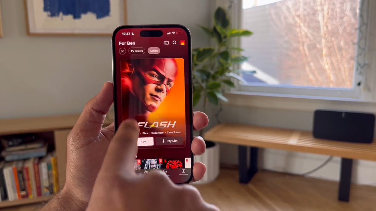
On Monday, Netflix released an update to its iOS app. In the new interface: smoother animations, including a parallax effect when moving the device, a new billboard layout, new card transitions, and more.
The development of the redesign began back in 2022, and its goal was to make the application more intuitive, pleasant and polished in order to stand out amongst competitors.
Janum Trivedi, who led the Netflix user interface update, described the main features of the new design on his Twitter:
- New billboard layout responds as you move your device, with a subtle lighting effect
- Beautiful wallpaper gradients that are created on-the-fly from the art
- A new card transition that's fully interruptible/interactive
- New launch/profile animations, haptics, and more!
• New billboard layout responds as you move your device, with a subtle lighting effect
— Janum Trivedi (@jmtrivedi) January 16, 2023
• Beautiful wallpaper gradients that are created on-the-fly from the art
• A new card transition that’s fully interruptible/interactive
• New launch/profile animations, haptics, and more!
For ourselves, we have identified the following most pleasant features of the redesign:
- Home screen redesign: Now when you open the Netflix app on your phone, you see a large card in front of you promoting a movie or series. The card moves with a parallax effect when the user moves the device, which adds a wow effect.
- More thoughtful color scheme: Title cards are now surrounded by a colored border that matches the base color of the movie/TV series cover.
- Easier and more intuitive interaction: Now it's even easier to filter content by category, switch between profiles or use search at any moment of interaction with the application.
- There's a new profile animation: Instead of the classic side swipe that occurred when a user switched profiles in the old app design, users will see the profile icon now enlarge as it moves towards the center, then shrink back to its normal size and bounce to the top right corner.
- The Info tab at the bottom of the card has been removed: Instead, users can simply click on the card of the movie/series they are interested in, and this will take them to a separate page with information.
- Redesigned "Coming soon" tab: Now it's called "What's new" and it also displays recommended content for the user.
Share your impressions of the new design in the comments under the news in our social networks. What do you think, is Netflix's new design really smoother and more polished?
What will the iPhone 15 Ultra be like | Appearance and characteristics
— UX News (@uxnewscom) December 5, 2022
Renders of the future iPhone 15 Ultra have appeared on the Internet. Titanium case, dual front camera, USB-C port and other rumors.
Read more: https://t.co/UDomCRJHGj