UI/UX Color Trends for 2026
UI/UX Color Trends for 2026
In 2026, color in digital design becomes more than decoration - it becomes a tool for emotional connection and usability. The industry is moving away from cold minimalism toward warmer, more natural and human-centered palettes.
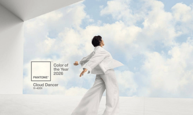
Cloud Dancer - the base color of the year
Cloud Dancer is a soft, warm off-white tone that works perfectly as a background color.
It:
• reduces eye strain
• highlights content
• pairs well with accent colors
Widely used in SaaS and product interfaces.
Pastel and digital tones
Pastels return in a more mature form:
• soft mint
• light blue
• sand
• muted lavender
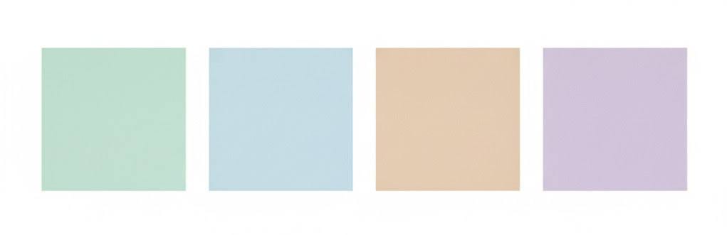
They create a feeling of lightness and trust.
Earthy and warm neutrals
Design becomes more human and grounded.
Popular tones include:
• terracotta
• olive
• warm beige
• soft brown-gray
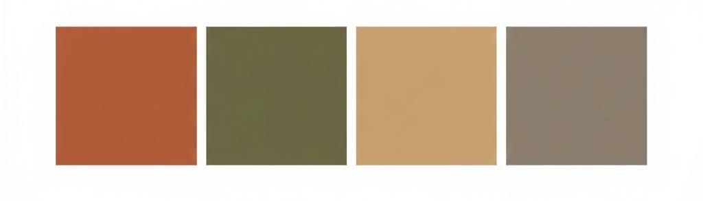
These colors reduce visual fatigue and improve long-term usability.
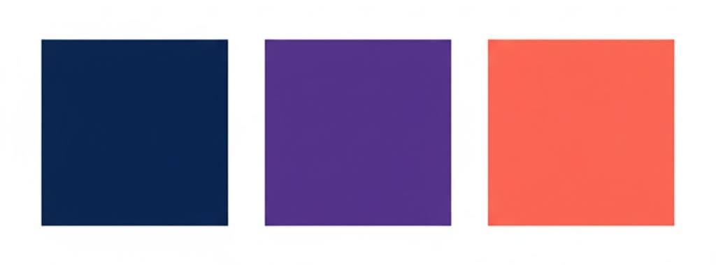
Accent colors
Bright colors are used selectively for:
• buttons
• calls to action
• key UI elements
Trending accents:
• deep blue
• rich purple
• coral red
Next-generation gradients
Gradients in 2026 are:
• soft
• low-contrast
• subtle and atmospheric
They are used mainly for backgrounds and hero sections.