
Google is testing a new card-style design for the Android Settings app
The Android Settings app could get a major design overhaul in an upcoming Android release.

In the beta version of Android 16, a new design for the "Settings" app has been discovered. This redesign aims to improve visual perception and ease of navigation for users.
How it looked before:
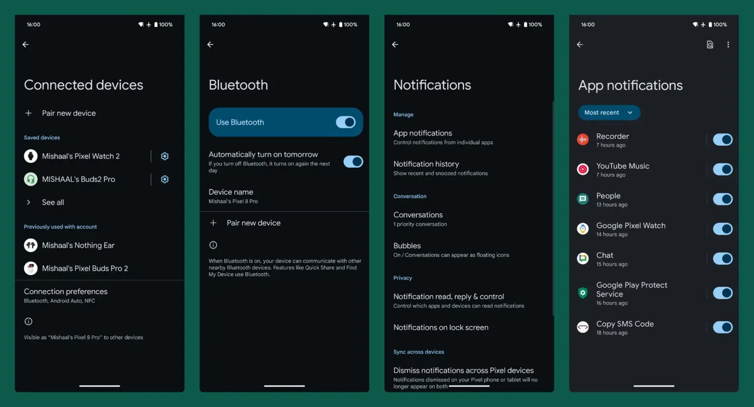
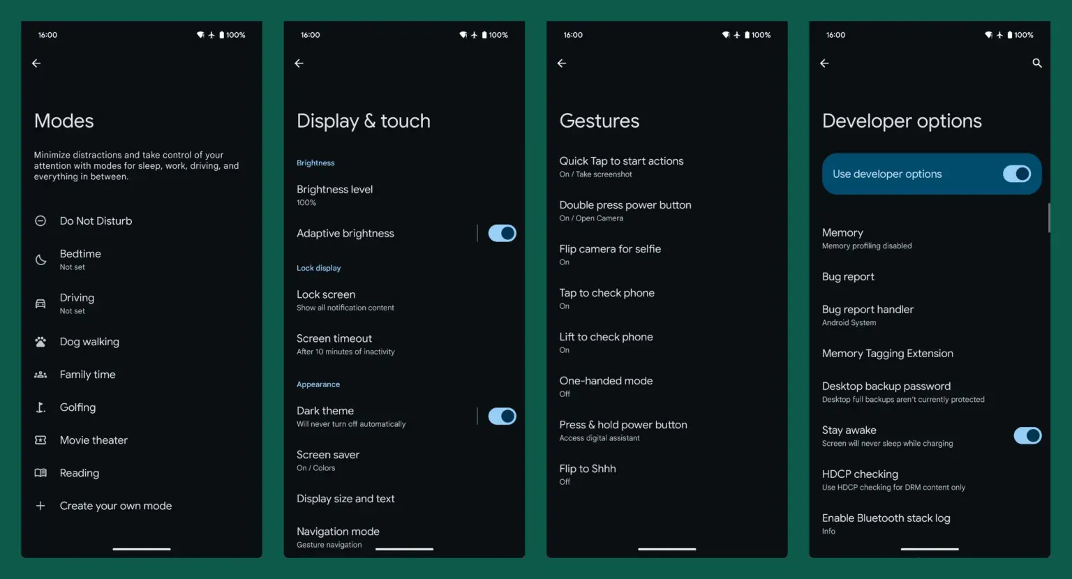
Previously, the "Settings" app in Android had a rather standard and simple interface with main categories. The menu items were listed in a long list without much visual separation, which could make it difficult to find the desired settings.
And now:

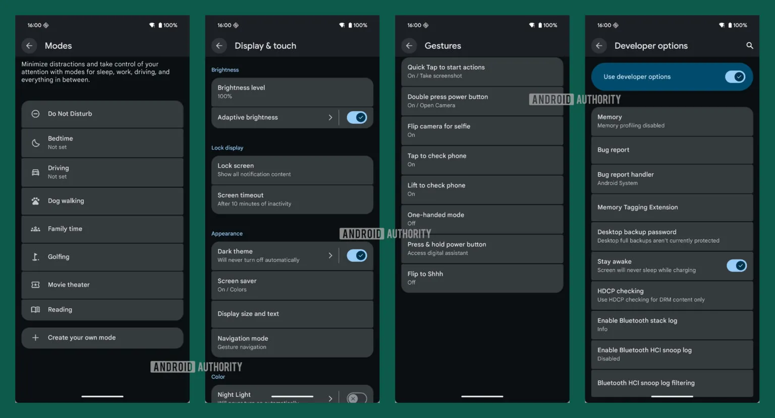
The key changes include:
- Updated Material You switches: The new design incorporates switches with “X” or “checkmark” icons on the toggle, making them more visually intuitive and easier for users to understand at a glance.
- Separation of elements into individual cards: Each menu item is now presented within its own visually distinct card, enhancing the overall layout and making the information more organized and easier to process.
- Use of arrows for submenus: Small arrows are now used to indicate the presence of submenus, making it clearer when a menu item has additional options, thus streamlining the navigation experience.
- Fixed page headers: Most pages now feature a static header at the top, which remains visible by default. This change allows for a more efficient use of screen space and makes it easier for users to access additional options without excessive scrolling.
These changes are not yet available in the current stable version of Android 16, but they are expected to be implemented in one of the upcoming quarterly updates or in Android 17.


